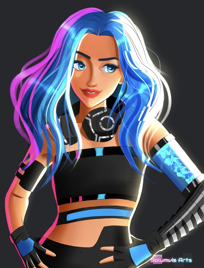
Splinterlands Art Contest
Hello guys, I hope everyone is having a great day. Before we begin I have some excellent news to share with you guys.
Last week Splinterlands conducted a different art contest called Spell Design Contest and my design was selected as the winning entry🤩!
What a surprise! I wasn't expecting this at all. All of the contestants had great designs as well so the competition was challenging hence I'm really happy and grateful for this honour.
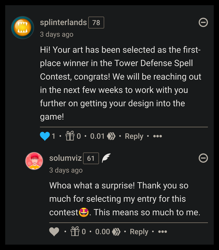
They notified me about this at midnight. I was working on something that night so I was able to see it haha. Our time zones are different so it's a bit difficult to get replies in time lolz. If you are interested then you can see my entry over here. Thanks for all the support so far guys so without wasting anytime let's begin the blog!
E-Girl (Original Character)
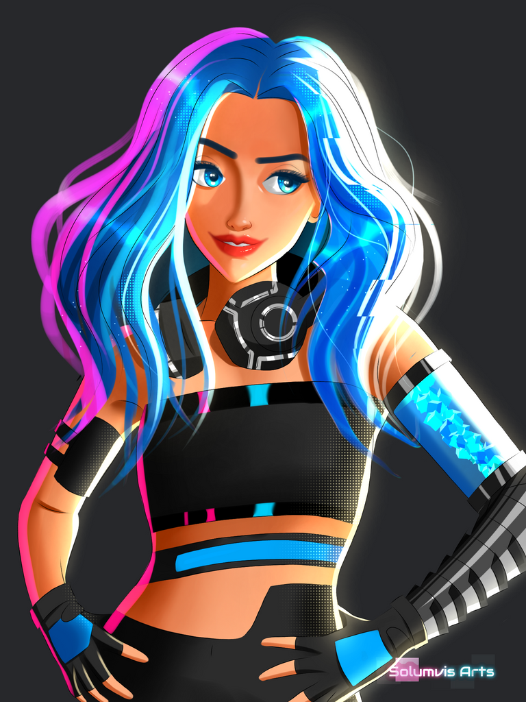
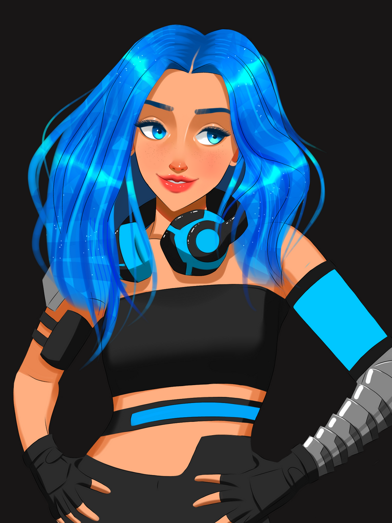
For this week I wanted to do something different. My recent Splinterlands entries were nature themed so I wanted to make something futuristic this time. When I hear the word futuristic it reminds me of the game Cyberpunk or the movie Blade Runner. More specifically I'm attracted to the choice of colours they use in there. I think you can get a similar vibe from the digital banners of Tokyo. In short, my character is a female with a futuristic metal arm, a cyberpunk-like colour scheme and a touch of halftone texture stylization.
I'm a big fan of complimentary colours. So blue and orange is complementary to each other so I painted the face with an orangish hue. As for the hair I used blue because of the complimentary factor. Pink is technically not a complimentary to blue but it does look great with blue hehe so I added this colour on the left side of her body. Now it gives off a Cyberpunk vibe hehe.
Enjoy the process!
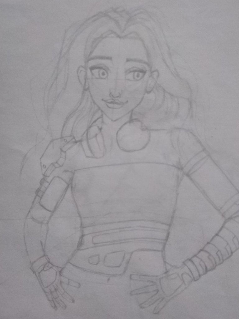
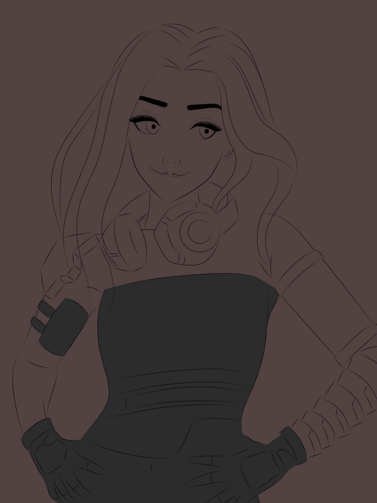
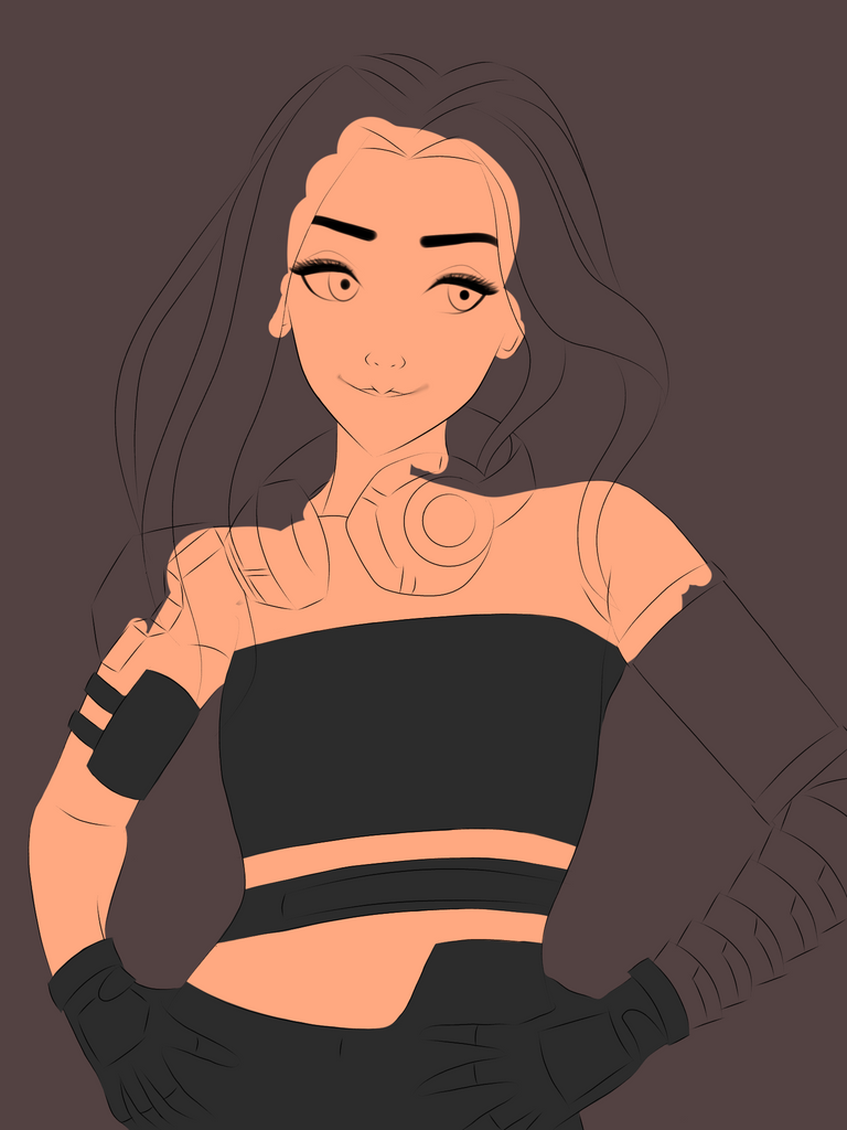
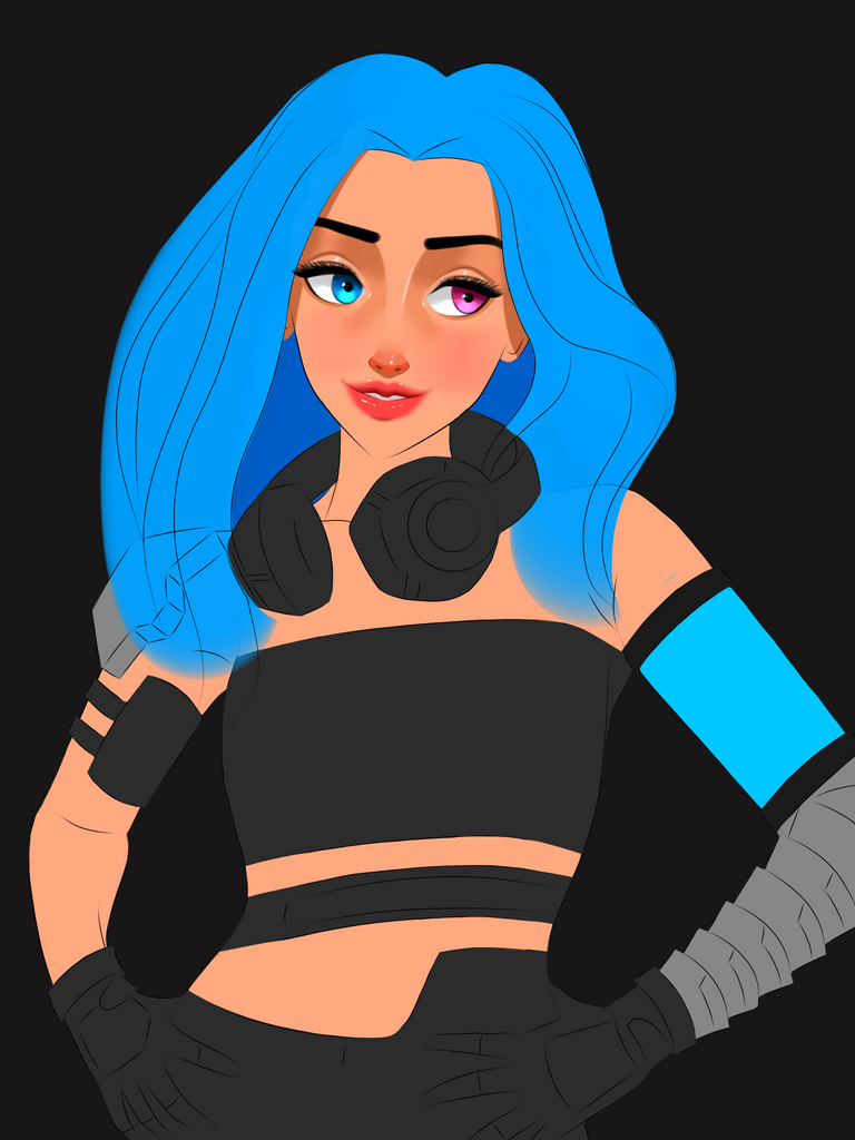
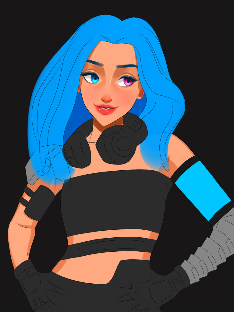
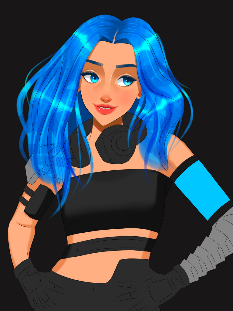
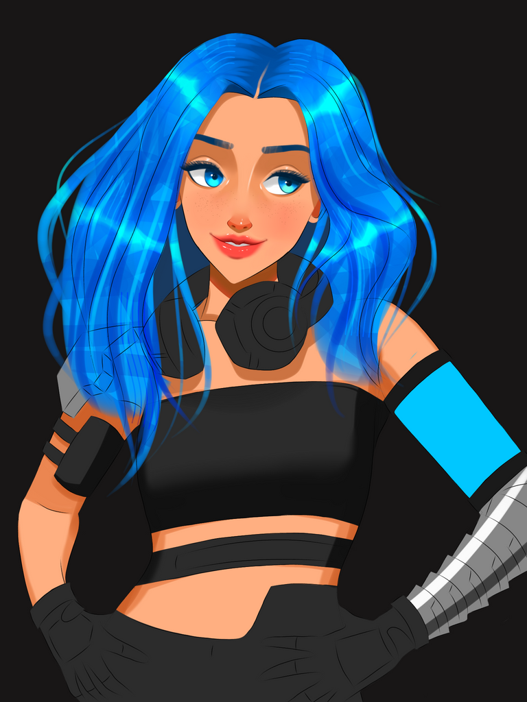
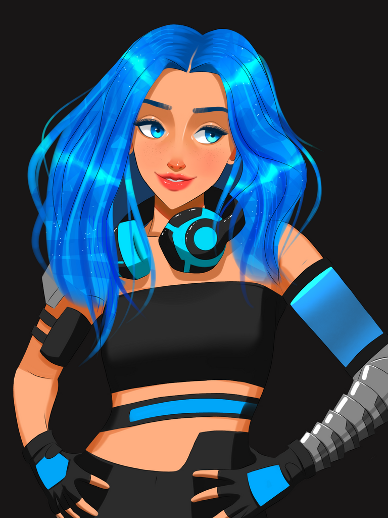
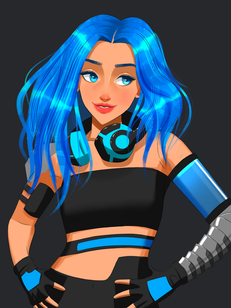
This right here was supposed to be the original finished version but when I saw it I knew that I wasted 6hrs of my time making it dull lolz. I know it doesn't look bad but it doesn't look good either. It stands somewhere in between which was not what I had in mind. So I stared at this painting occasionally until I went to sleep trying to figure out what I could have done differently. This happens sometimes and usually the mind comes up with better ideas later so I slept and came back to it the next day so here we go...
Process 2.0
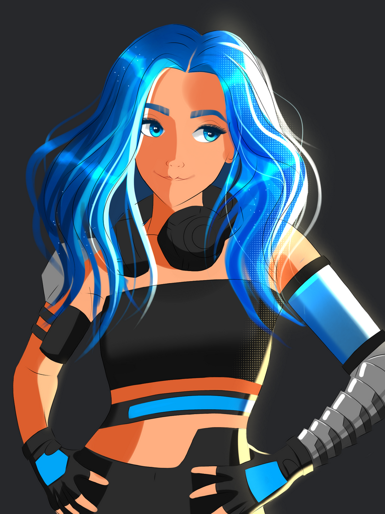

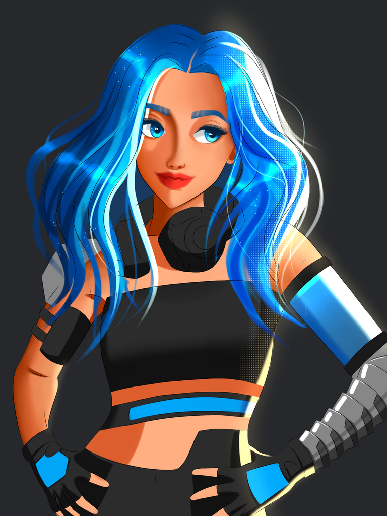
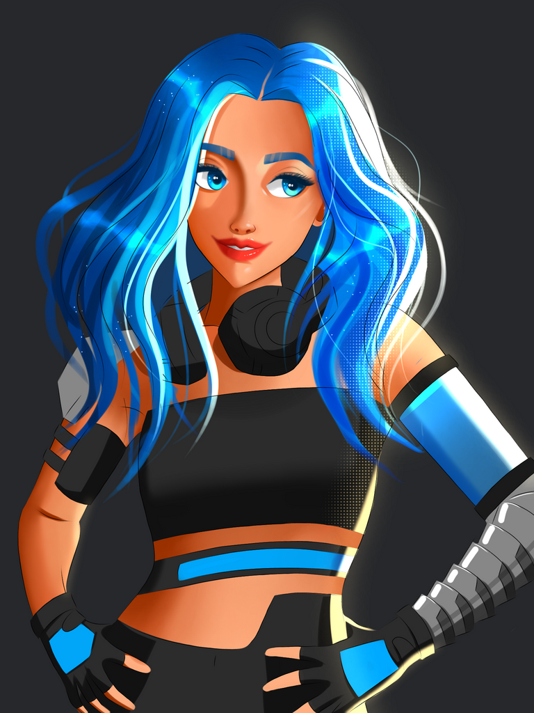
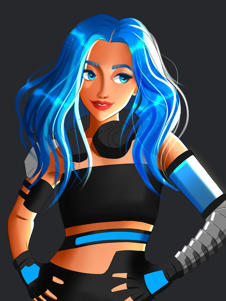
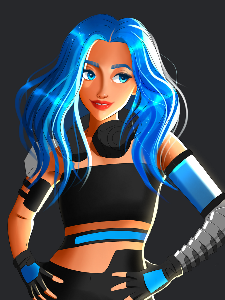
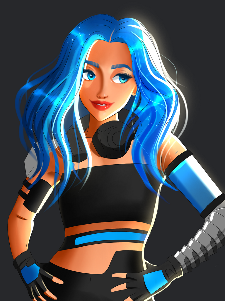
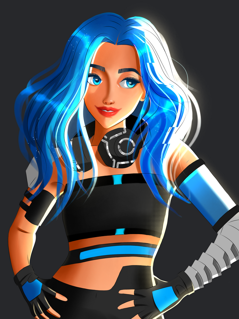
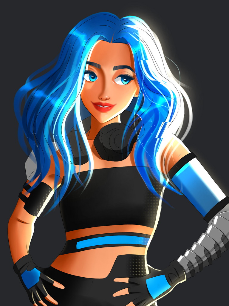
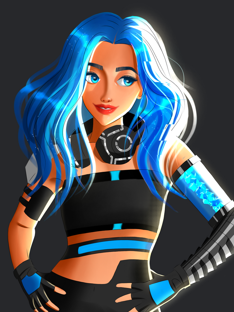
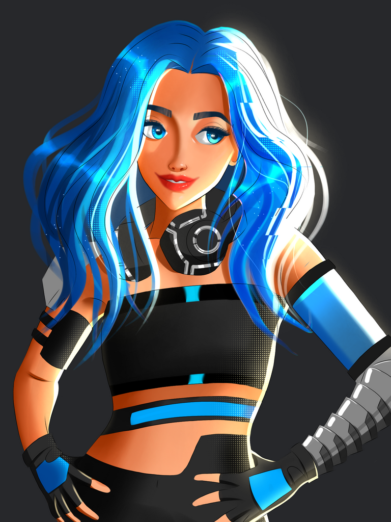
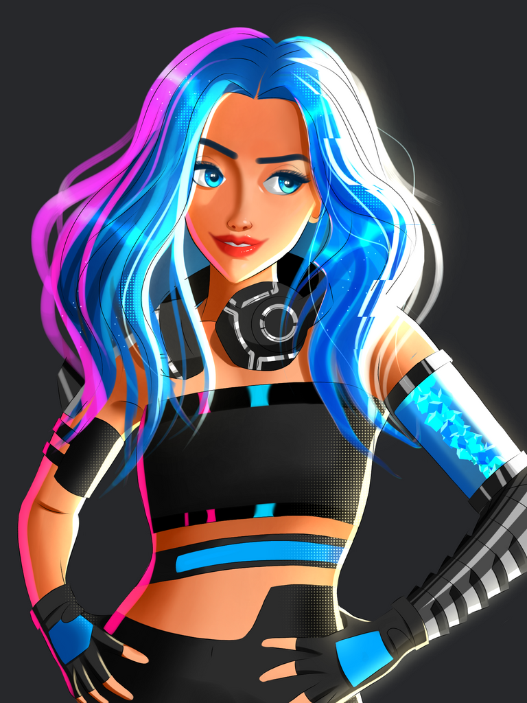


After seeing the finished version I can confidently say that this is one of the best drawings I did this year. I'm glad that I didn't ditch it and gave it a second chance. As you can see I'm testing out new stuff in there. The previous final version had 5 line brush' stylization but it didn't suit this time so it was time for something else so I used a halftone brush randomly where there was a presence of light. Also added some dots on the hair to look magical hehe.
Choosing a different area for the source of light changed the whole vibe of this painting I think. I was able to add stylized highlights and more darker shade details in there because of this. Tried my best to add Chromatic aberration in there with the white highlights but it only works on darker hues so I used a glitch-like feature on the highlights since it goes well with the futuristic theme here.
That's it hehe. I hope you enjoyed the blog :)
Tools used: Ibis paint x, pencil and notebook.
Duration: 12hrs+ (non-continuous).
Pose reference: Used Magic poser app for Android.
Thank you so much for your time guys :)


