
Firstly, I am really sorry for this being a bit Christmassy already. That was not my intention, it's just how things turned out.
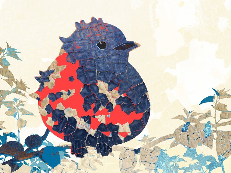
Secondly, I am not yet sure what to call this style. It is part illustration, part photography, part collage of the two. Lumping it together as digital art these days might make people think my computer did all the work. It certainly helped, but it took me personally hours to work out how to get to an initially unclear end-point that pleased me aesthetically. Down blind alleys I pulled out hair and along the twisted path I stumbled on techniques that worked but have already been forgotten. I will try to find them again tomorrow.

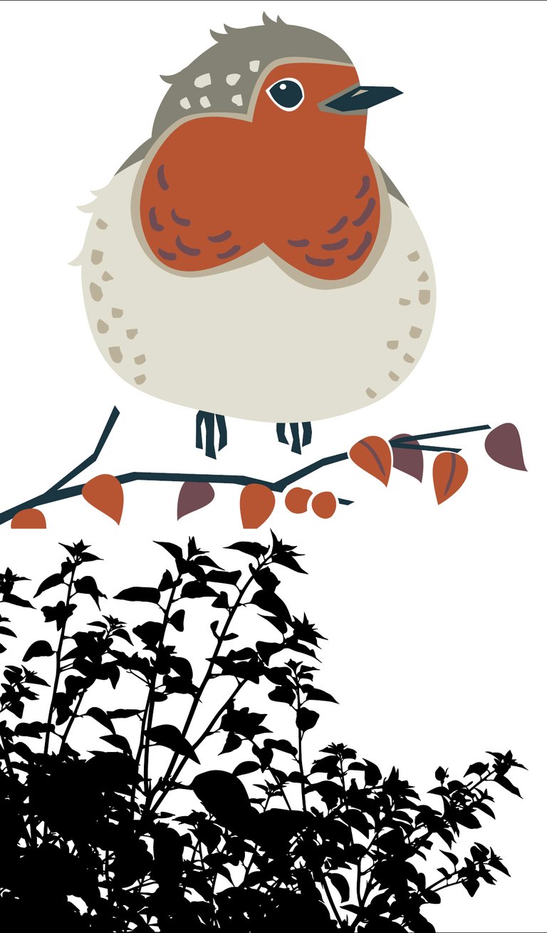
In compositing this image I used three photographs of the weathered paintwork of an old car plus three vector silhouettes that I re-used from earlier projects. All are shown below.


As you can see, I was more interested in the textures from the photographs than the colours, some of which stayed but most of which were shifted. This is one of those aspects that happens along the way rather than being intentional. I guess the more of these I do, the better I will see the final outcome when I start...or maybe it will always be a ramble in the dark.
Looking at it now, one small thing that I wish I had done differently is that the dark part of the bird's beak is too close to the eye. Things like this perhaps should not be too important except that every time I look at it now, that beak is what I see.

Here I also include an alternative version that features more of the fantastic paintwork that the car's owner probably doesn't appreciate as much as I do. I love that paintwork texture but as a whole I think this picture works better with less of it.

Merry Christmas! (sorry)


