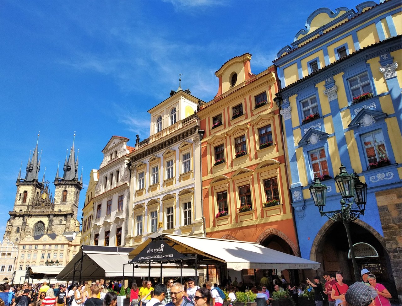
For the past few days I was shooting buildings, focusing on architecture and more important, focusing on taking more decent photos. In the light of my new knowledge, these days I'm paying more attention to details, setups, alignments and so on. This is why taking a photo takes 10 times more than before, but at leas now I know what to pay attention to.
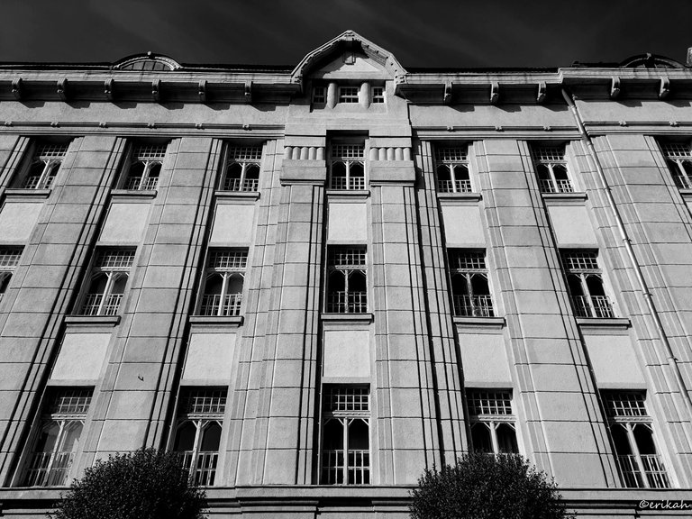
I stood in front of the building and looked at the details for 5 minutes, studying what I see. I suppose symmetry is what the eye is looking for, but there's no perfection in life, so why would be perfection here, right? Architectures have already broken symmetry, so no perfection here.
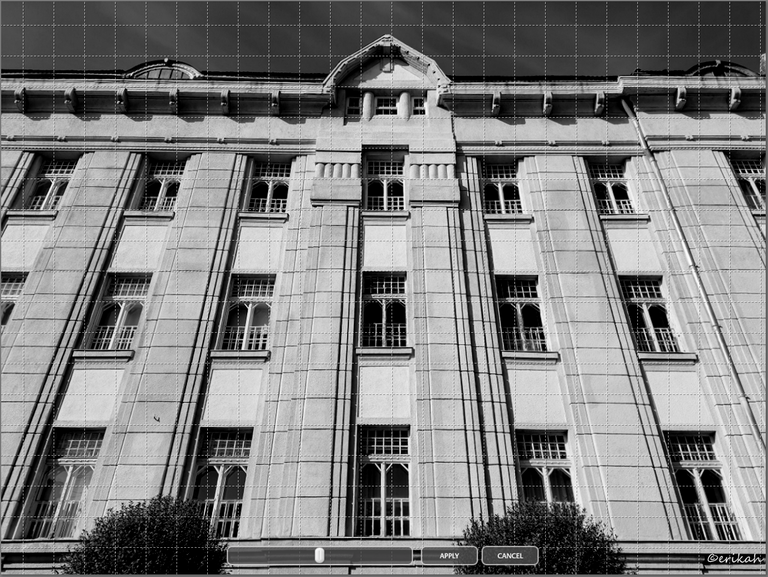
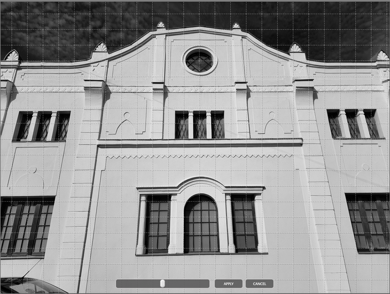
Nevertheless, I did what I could and here is the proof. This is the screenshot of the photo, with Google grid applied. You can see on the right, there's a vertical section, that is missing from the left side. That breaks everything. The other thing is the "peaks" at the top. There's no symmetry there either.
Otherwise the horizontal lines are pretty ok in my eyes. While I was trying to take this photo, I remembered what someone said on my last post, that I'm going to drive myself crazy looking for perfection, so I took the shot the best way I could and was happy with it.
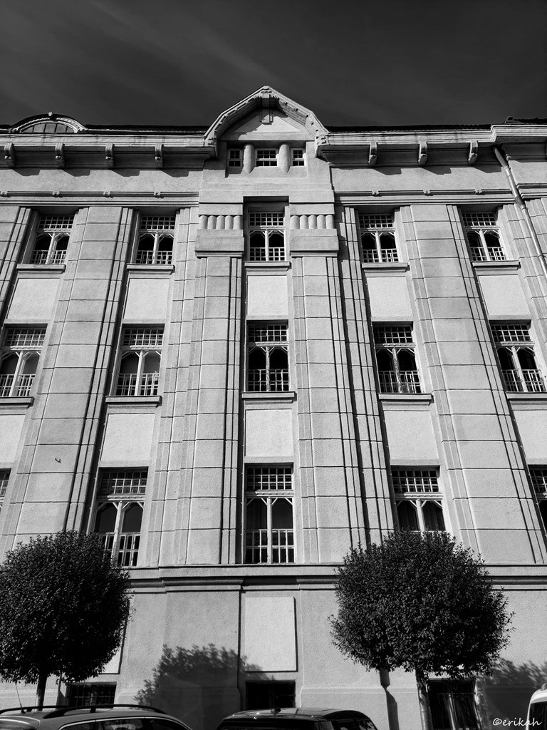
Here's a portrait orientation photo.
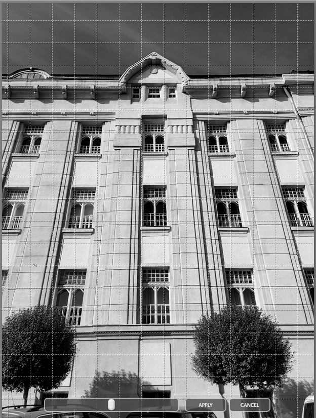
And with the grid applied. I must admit, using the grid on the scene helps a lot. Also, in these cases I case to make the sky darker, to direct attention to details.
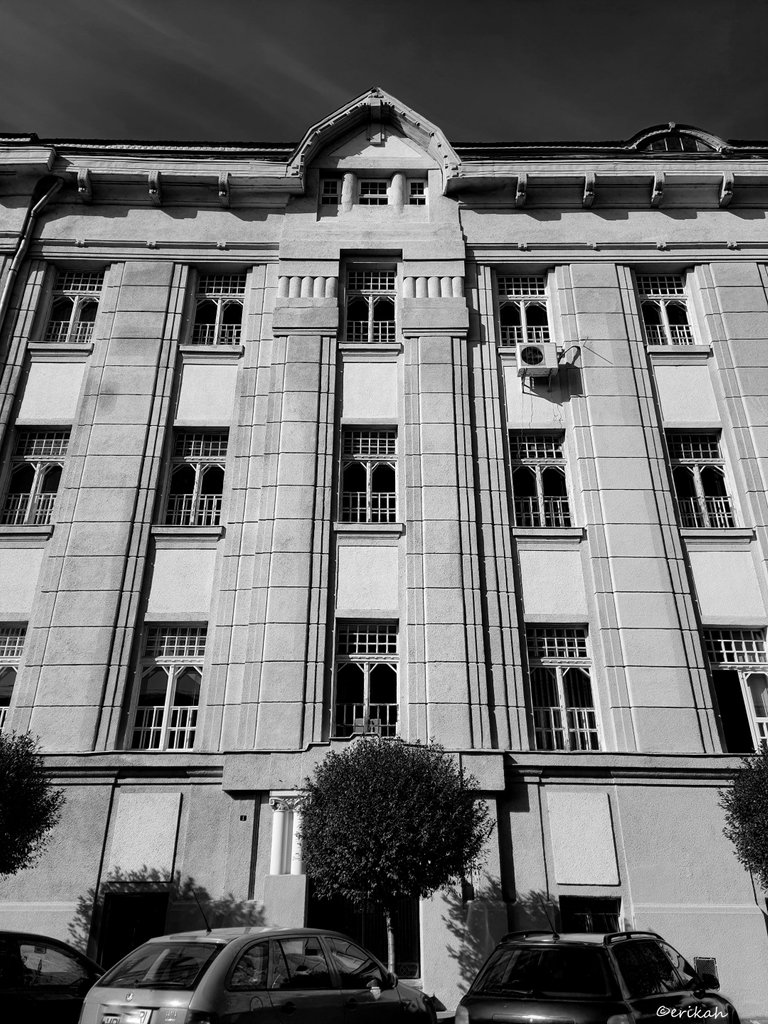
Next, I moved to another part of the building, to capture something with more symmetry. This is one of the side entrances that luckily was not in use. Like a bonus, there was a tree in front of the door, but a bit to the right though. You can imagine those who planted the tree, or made the sidewalk did not care about symmetry 😁
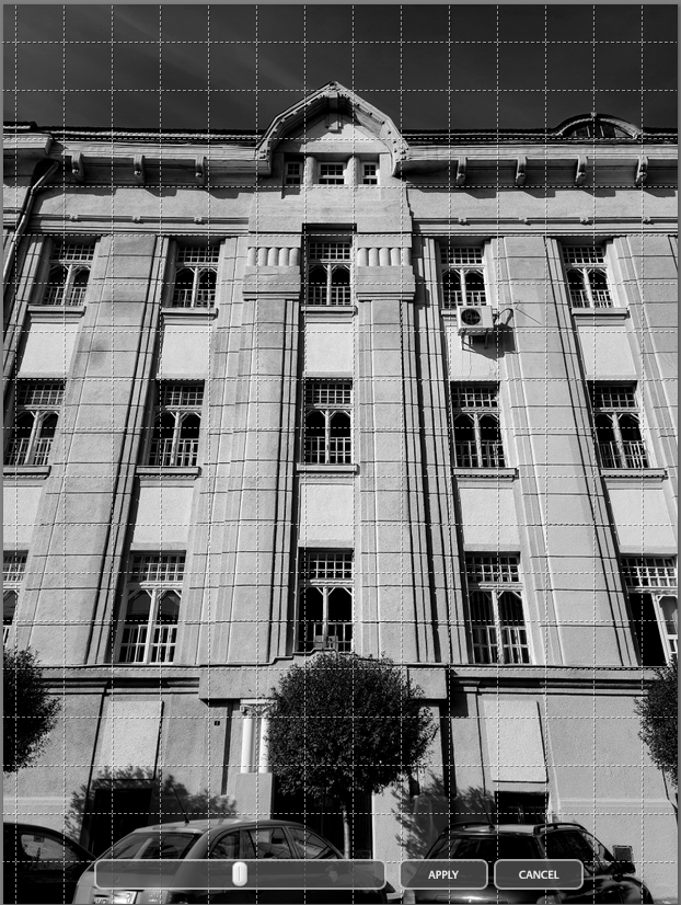
This photo has not been straightened, so I'm ok with how it looks.
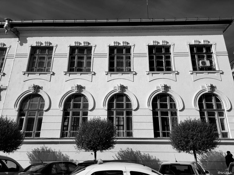
Next is a different building and not so nicely lined.
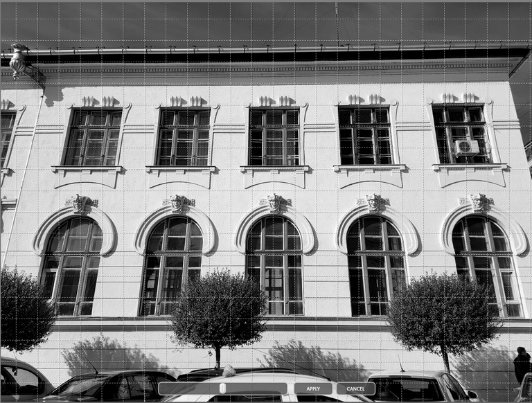
If you look at the base line, it is straight. If you look at the top, it's not. The difference is minimal but still visible, when you look at the eve. Regardless, enjoy the architecture and don't let the air conditioner box on the top right to ruin the beauty of it.
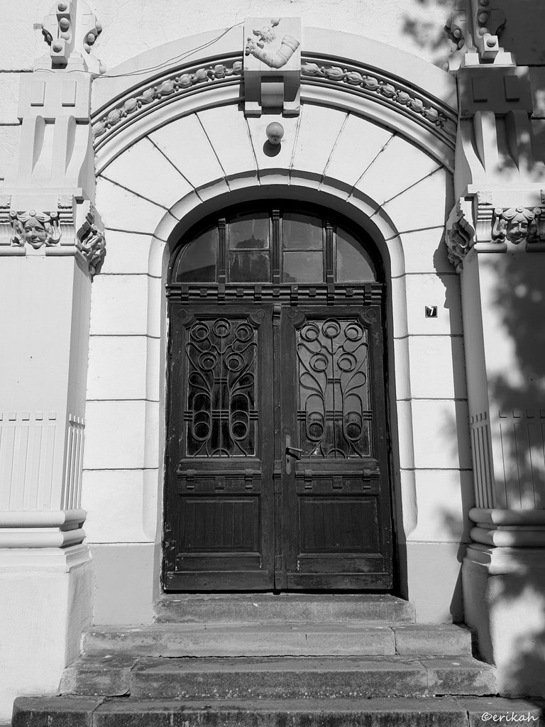
A nice door this time, that was also not in use, which was perfect for me as the door could remain closed while I was taking the photo.
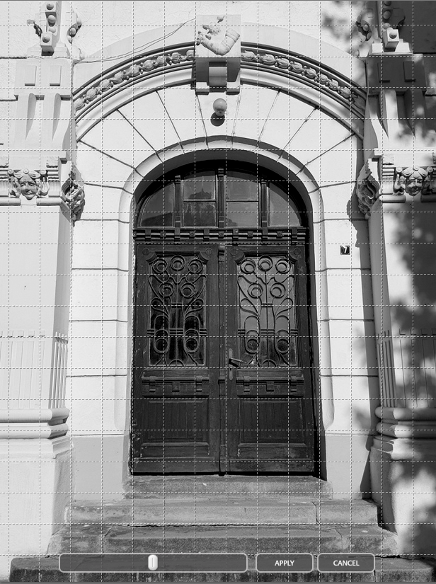
This photo hasn't been straightened either, in fact none of these were.
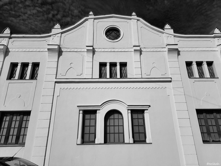
This is an interesting one as the bottom lines are not lining with the bottom of the window but the upper lines do.
The more I look at this, the more I like what I see.
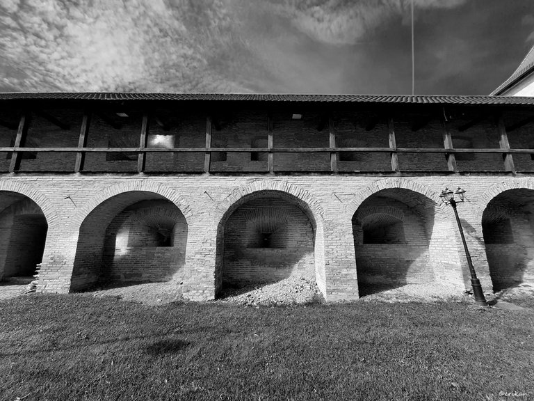
This is even more interesting. I've always loved bricks and combined with wood, these make a good combination.
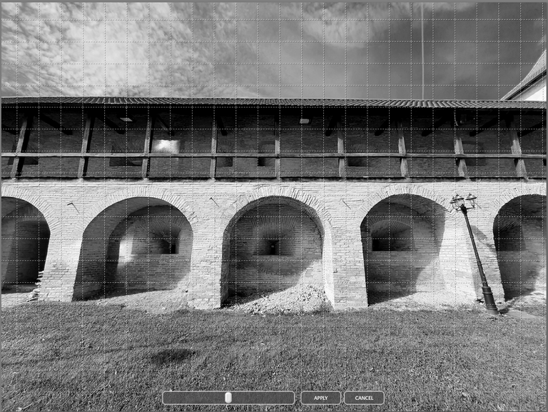
Now look at the lines. The base line and the railing are perfect, the roof is not, but let's not forget this is a medieval fortress wall, which means architects of those days may have not been millimeter precise, or restaurateurs have not thought this structure has to be millimeter perfect.
So which one is your favorite, if you like any of it at all :)

Conclusion
This was a nice exercise, to see if what I saw at the scene is confirmed on the big screen. I'm satisfied with the result, actually more than satisfied, even though I cheated using the grid on my phone. It helped me focus more and get used to pay attention to the details, be more patient and try to do better.
However, I'm not going to torture myself with it s it takes away the fun and makes you never be satisfied with the result, which eventually leads to quitting. I don't want that to happen as I love photography.
Now I can move on to another chapter, setting the light right and stuff like that.

If you're a newbie, you may want to check out these guides:
- Communities Explained - Newbie Guide
- Cross Posting And Reposting Explained, Using PeakD
- Hive Is Not For Me
- How To Pump Your Reputation Fast - Newbie Guide
- Tips And Tricks & Useful Hive Tools For Newbies
- Community List And Why It Is Important To Post In The Right Community

