It's been a while since I last posted about art. The truth is, I've been busy trading and studying and somehow it's difficult to switch my mind from trading to posting, but I'd like to get back to it as the summer holiday is over soon, the gallery is opening soon and I want to share the photos of the new exhibitions with you. If I want to be brutally honest, I missed art. It's world where your mind is taken to a totally different, interesting trip and it gives you the opportunity to define what you see, even though sometimes what we think about the artwork is miles away from what the artist meant.
Today I'm going to take you back to a wonderful exhibition I visited in June and haven't had the time to post the rest of the photos since.
It was a solo exhibition of Alexandru Herdelau, a very talented artist that has a lot to share with the world.
The beauty of the exhibition was that none of the paintings had a title gives, so everything was left to the viewer's imagination.
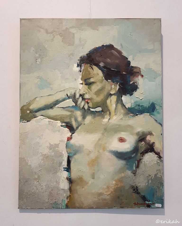
This was a wonderful nude in my eyes, for several reasons. The model is a nice lady with a lovely body but what I love the most here is the colors and most of all, the background. You can't distinguish anything, just the colors and the texture, but it's a perfect choice as it doesn't take the eye away from the model. I also love how the light falls on the body of the lady. The visible brushstrokes are also a huge plus here.
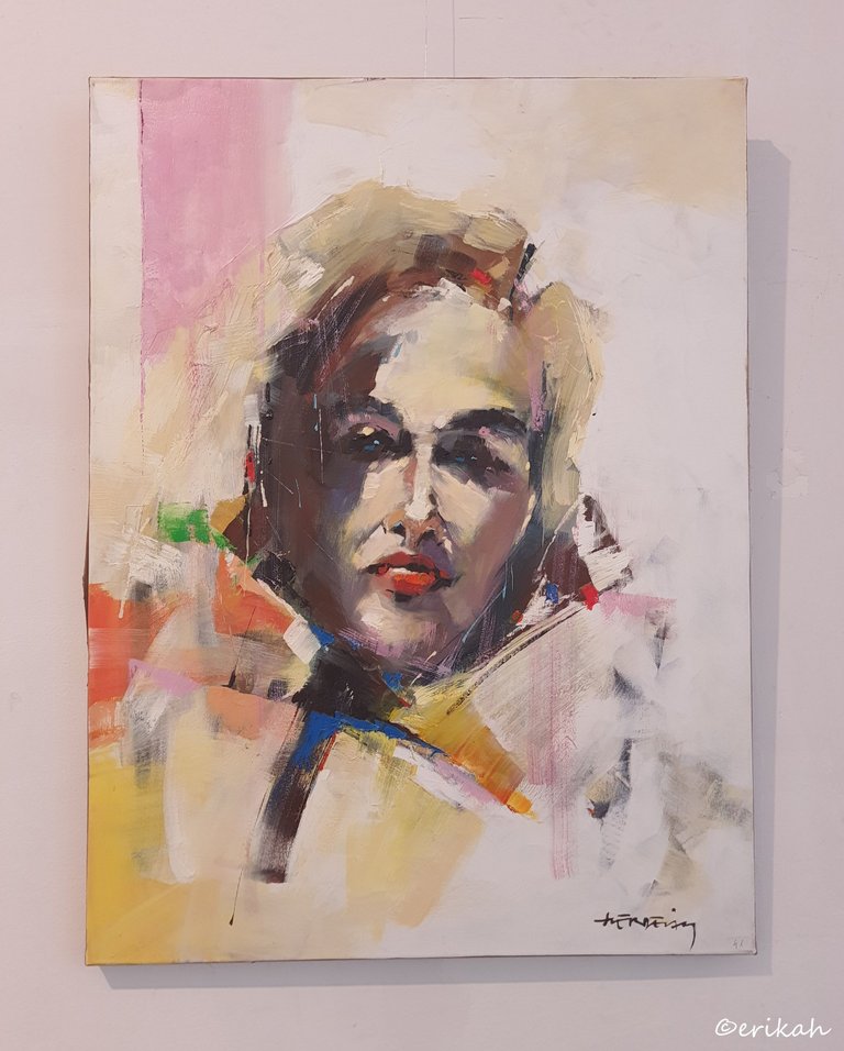
If I were to use three words to describe this painting, those would be: simplicity, colors and eyes, not necessarily in this order. I don't know what you first see, when you look at the painting, but for me, the point of attraction is the eyes. The artist is known to focus on the eyes and with great success I'd say. I said simplicity, because the model has no outlined body, which helps the eye in focusing on the face and the light pastel colors are also contributing to it. Again, the visible brushstrokes are a detail to appreciate.
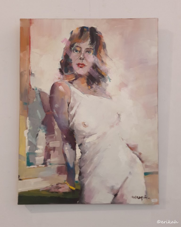
Lady with her back to the mirror. Same style to some degree. Lovely light pastel colors, no background to distract the eye and only the left side of the model is accentuated. I love this style.
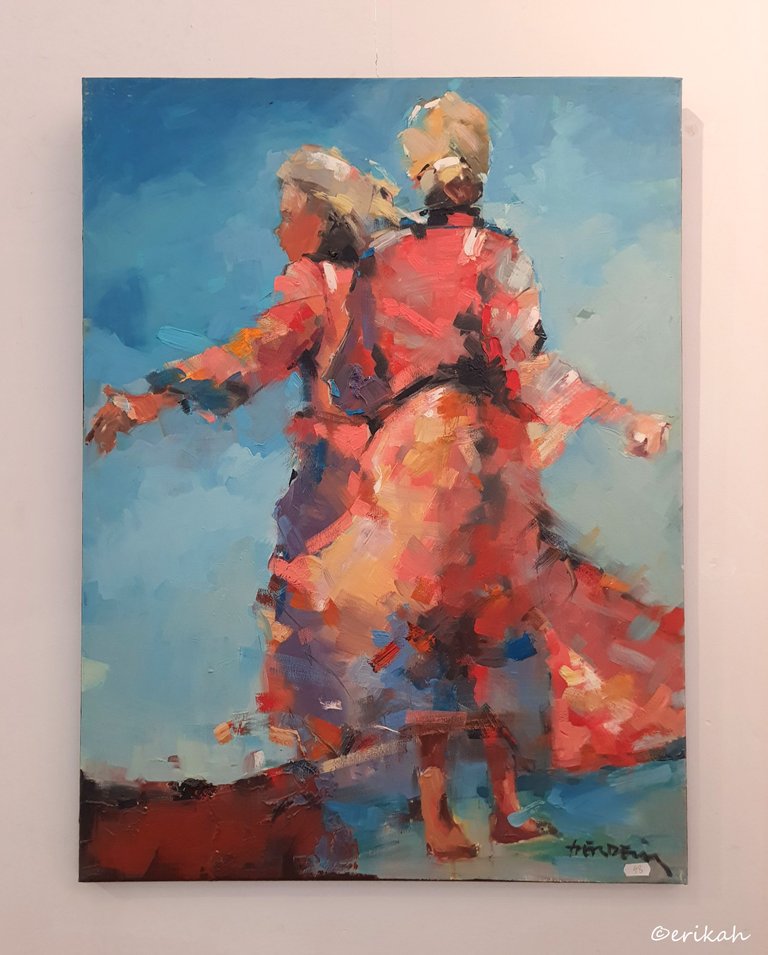
And after those lovely pastel colors, here's a more colorful painting, just as lovely as the previous ones. I hope you can see the similarities between this and the previous ones. Yes, the visible brushstrokes. Look at how nice the painter was able to paint the dresses, only using a few colors and the texture of the paint. I'm not sure who these ladies are, but I see them as Asian ladies from the region of Mongolia or Kazakhstan, but obviously I could be wrong. However, using that lovely blue background was an excellent idea.
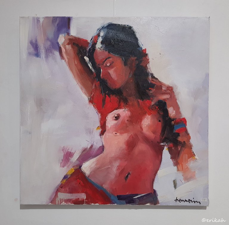
Another nude, or half nude, as you wish, a bit different from the previous ones, but just as lovely. Again, see how the artist chose to have a very light and plain background, which brings the model into the center of attention.
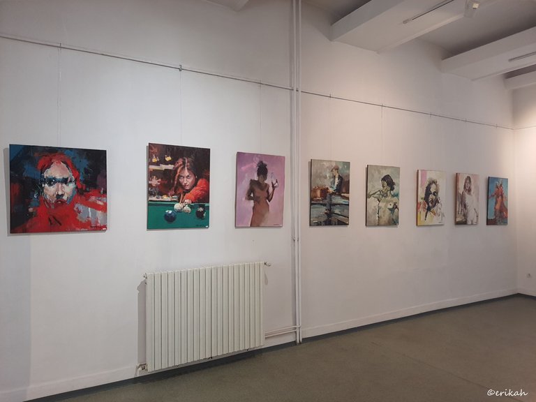
Next time I'd like to invite you to see a set of amazing portraits, something you've never seen so far. I've tried to select paintings of similar category and style, to be easier for you to compare them or choose from. There are still a lot of paintings that I'd like to post, so stay tuned.
As always, let me know which one your favorite is and why you like it. Enjoy :)

If you're a newbie, you may want to check out these guides:
- Communities Explained - Newbie Guide
- Cross Posting And Reposting Explained, Using PeakD
- Hive Is Not For Me
- How To Pump Your Reputation Fast - Newbie Guide
- Tips And Tricks & Useful Hive Tools For Newbies
- More Useful Tools On Hive - Newbie Guide
- Community List And Why It Is Important To Post In The Right Community
- Witnesses And Proposals Explained - Newbie Guide
- To Stake, Or Not To Stake - Newbie Guide
- Tags And Tagging - Newbie Guide
- Newbie Expectations And Reality
- About Dust Vote And Hive Reward Pool, by libertycrypto27

</center


