For me, these exhibitions are serving as a learning opportunity. I'm not going to learn technical things as there's no technical details in the description, but you can pick up a trick or two if you keep your eyes open. Every time there's something interesting to see and I bet it is motivating too, if you're interested in developing better photographing skills.
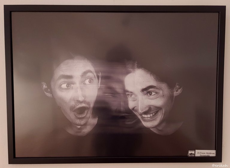
This was one of the interesting ones. Don't ask me how it was done as I have no idea, however, I would like to know. Sorry for the reflection, but could not find a better angle.
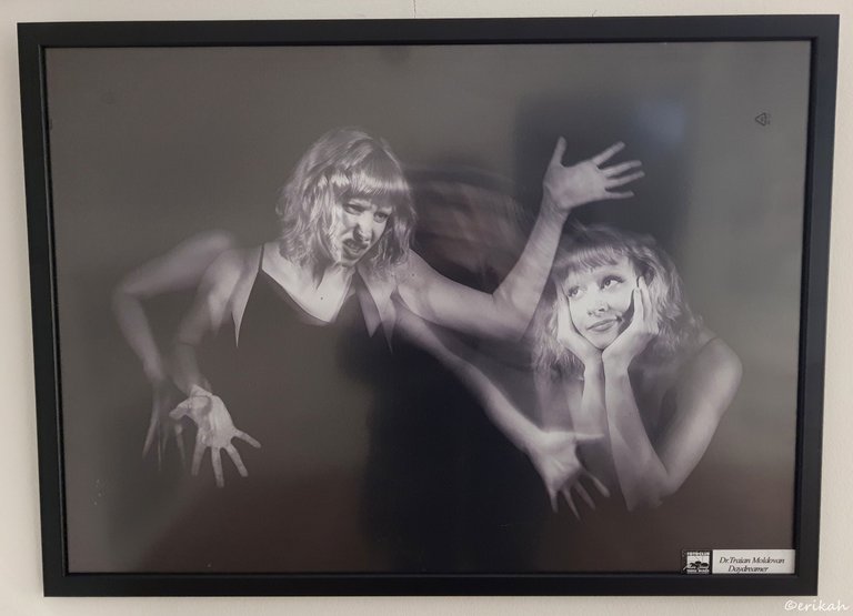
Same artist, same concept, different setup. I's not something I would focus on, but would definitely like to know the tricks behind it.
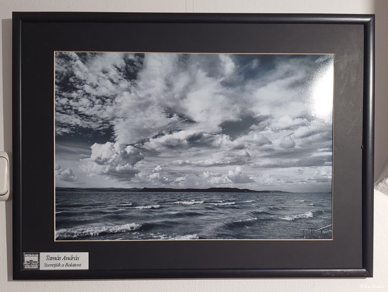
This is a photo of lake Balaton, which is the sea of Hungary. Hungary is a landlocked country, has no exit to any sea, so this is their sea, a favorite tourist destination.
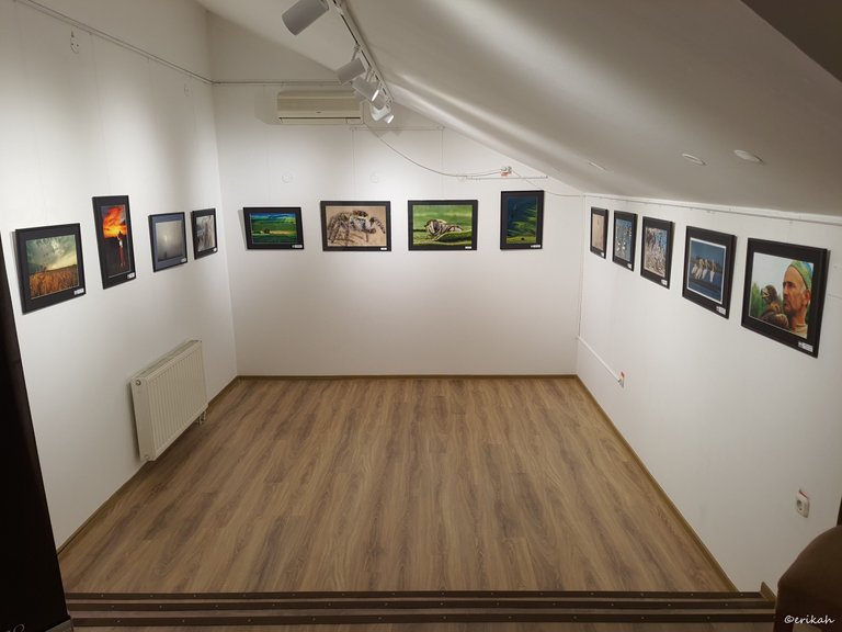
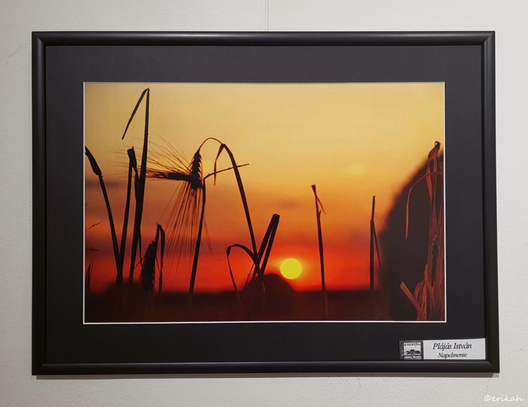
This is not an unusual scene, you see so many sunset photos on the internet, but this is a bit different, due to the focus of the photo. I took a similar one years ago, but chose to color it differently and that was at the corn field. I was planning to take some more photos, but we don't have corn anymore, so I would need to go to the neighbor's field for that. I like corn as the wide flat leaves.
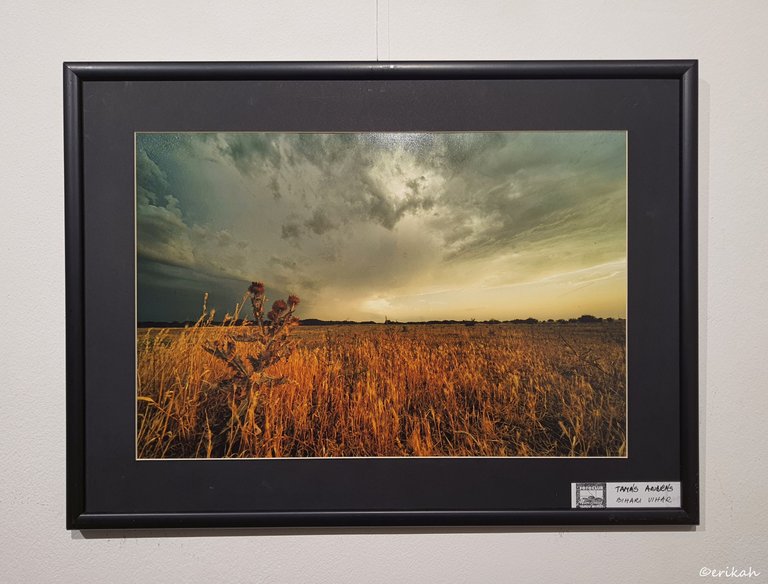
This was such a cool shot due to the tone of the photo. That dry, yellow cornfield and that dark, gray-yellowish sky is the perfect match in my opinion. The other thing I like about this composition (by nature of course as this setup is not man made) is that taller dry plant on the left.
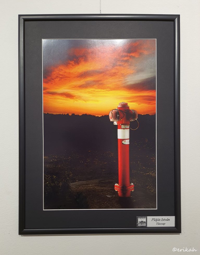
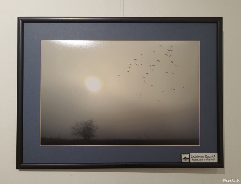
Soaring Towards The Light
This minimalist photo was also one of my favorites. You can only shoot such one in a foggy morning or day, if you're lucky to catch a bit of sun and the birds too. (I think I see some editing there, that would not be visible, but could be wrong, of course.)
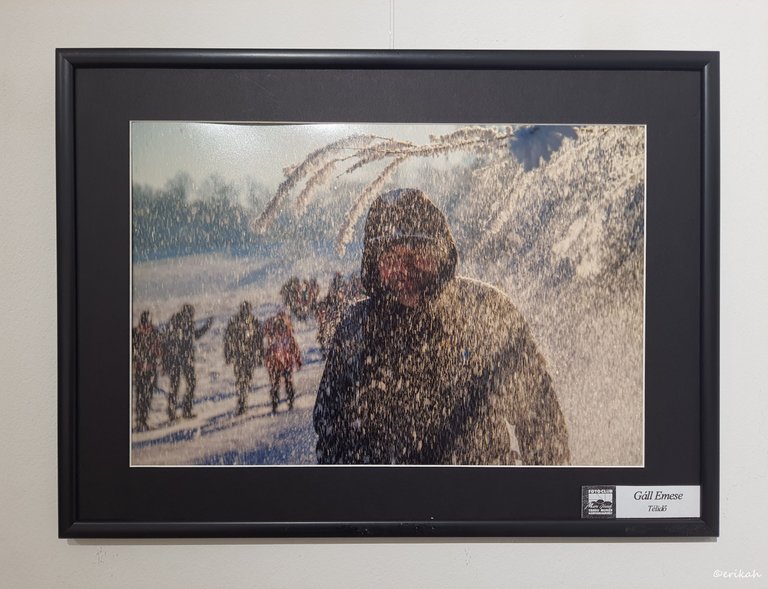
This was another good one as catching such a scene is rare. There were two possibilities in my opinion. Either the weather was what you see on the photo, snow was falling, or someone possibly shook a branch so the snow started falling. However, either way, that light was needed. I love it.
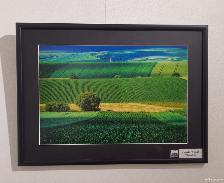
When I saw this photo, the first thing I could thing of was the expression as if drawn with a ruler. Obviously I was referring to those rows, not the photo. Then I remembered a painting I saw earlier that week, that looked like as if drawn with a ruler. One was done by nature, the other by an artist. The first is ok, but the second ... not really. I don't know if I can explain this properly, but when it comes to art, unless it's abstract, I don't think I like as if drawn with a ruler style. I don't want to put the photo of the painting here, prefer not to. This photo however looks great. I have always liked blue and green on a photo.
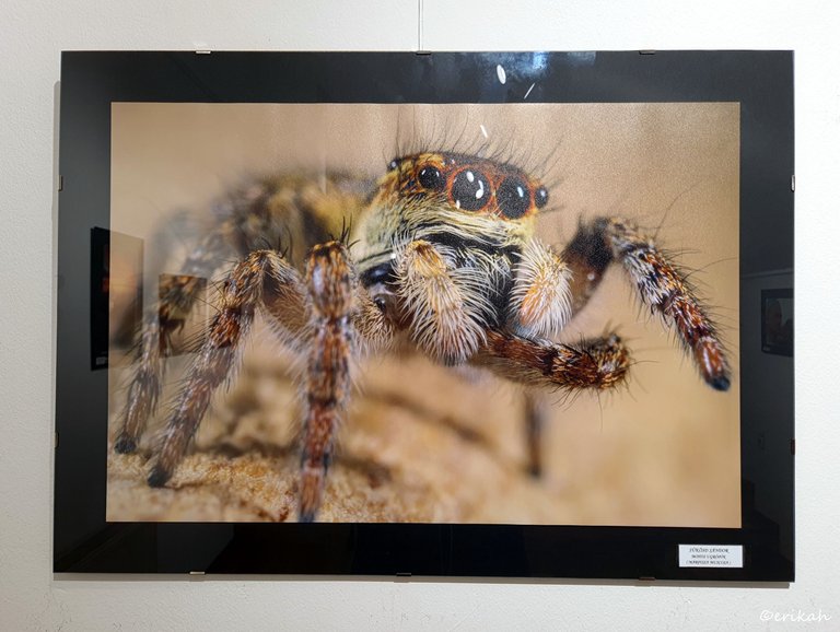
I hope this was the closest I can get to a spider like that. It's a great achievement to capture such a species, the details are fabulous, but ... brrrr, I don't like them.
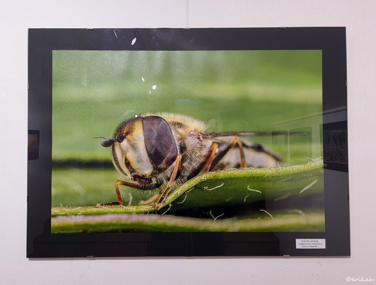
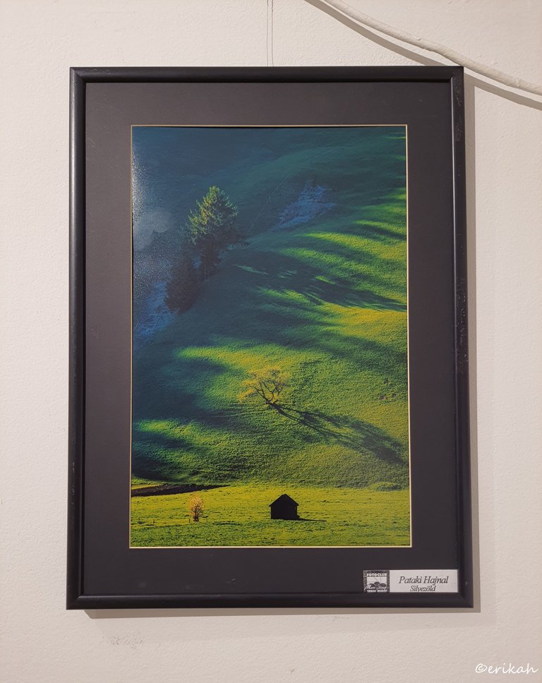
I loved this one too. That cable's position is unfortunate, otherwise it would be the perfect photo. I mean the photo is perfect, my photo isn't :)
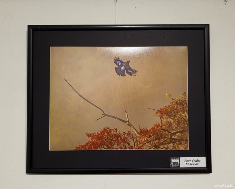
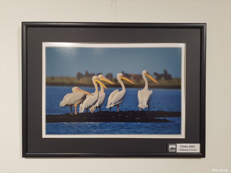
Lol, this was also a very food one. It reminded me of a photo I took in the Hague years ago, but that was of 3 pigeons. These moments are precious, so lucky is the one who can capture such moments.
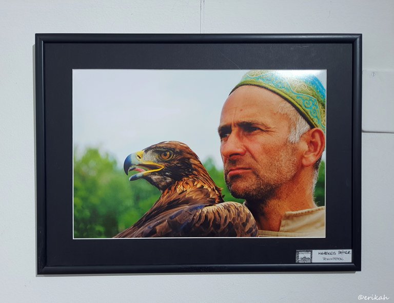
This photo is called Looks but I would name it Friends.
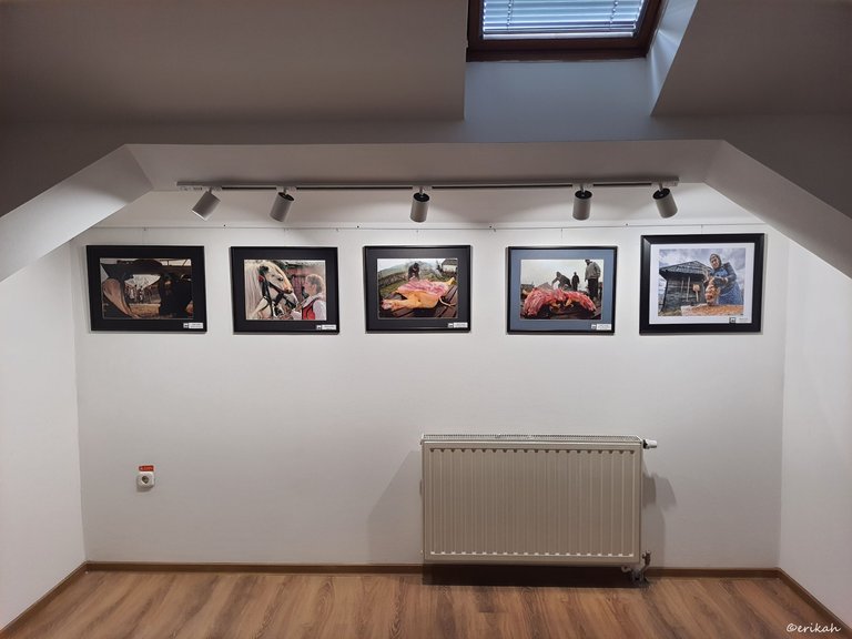
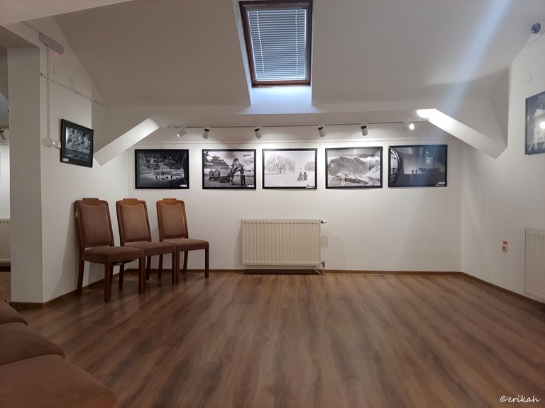
I'm already looking forward to see the next one.
Sooooo, which is your favorite today? I hope you have one.

If you're a newbie, you may want to check out these guides:
- Communities Explained - Newbie Guide
- Cross Posting And Reposting Explained, Using PeakD
- Hive Is Not For Me
- How To Pump Your Reputation Fast - Newbie Guide
- Tips And Tricks & Useful Hive Tools For Newbies
- Community List And Why It Is Important To Post In The Right Community
