Last April, there was an Epic Web conference in Utah. I couldn't attend physically but at least I watched the recordings so I could learn more and feel as if I also joined them in the conference.
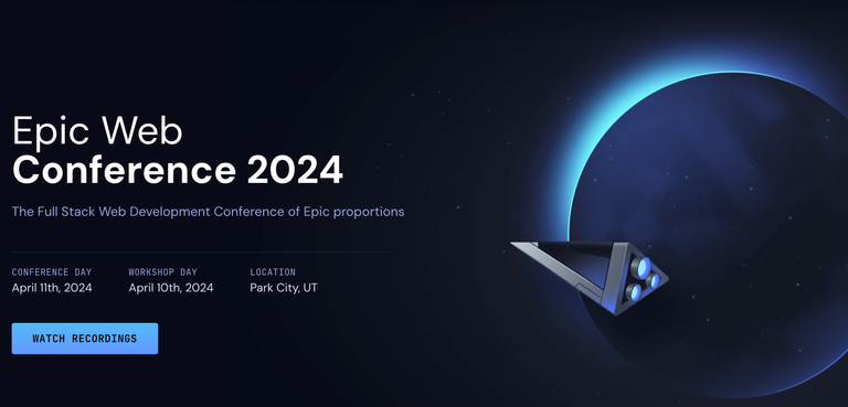
There were a lot of interesting topics. Besides learning, I also laughed a lot, which is nice because learning should be fun, right? Since this is Epic Web, it's not just about ReactJS but the overall web development. I came to know about this conference because I was doing the Epic React by Kent C. Dodds courses, and this Epic Web conference is from the same guy.
Introduction By Kent C. Dodds
The conference started by the talk from Kent C. Dodds of What Makes The Web Epic. He showed websites from long ago that are still running til today and will probably run until it's going to be taken down. Web isn't just limited to what you see in your desktop, they're also in home appliances now and even in space. "Web is everywhere," was what he said in his talk.
He introduced some websites that are interesting and I think might help me so I'll list them down here so I could explore them some other time.
HTML And CSS Talk By Una Kravets
The next session was a talk about HTML and CSS, the underdogs of web development, can also be powerful and eliminates writing complex javascript code. Una Kravets was like a superwoman demonstrating about scroll driven animations. I copied the code from the session so I could try it sometime.
@keyframes fly-in {
  from {
    opacity: 0;
    transform: translateX(-100px);
  }

  to {
    opacity: 1;
    transform: translateX(0px);
  }
}

blockquote {
  animation: fly-in auto linear;
  animation-timeline: view();
  animation-range: entry 0 cover 50%;
}
This code is about detecting overflows/scrolls. can-scroll will be set to 1 when there's a scroll (because of what we set in animation-timeline, it will call detect-scroll.
.container {
  height: 250px;
  width: 250px;
  overflow-y: auto;

  --can-scroll: 0;
  animation: detect-scroll;
  animation-timeline: scroll(self);
}

@keyframes detect-scroll {
  from, to {
    --can-scroll: 1;
  }
}
Read more: brm.us/css-can-scroll
Because of these tricks, there's no need for scripting. It could take away the heavy load off the page, thus, improving performance. CSS can now do these tricks!
Read more: scroll-driven-animations.style for more info about scroll driven animations.
She also introduced a new API on the web, the popover. Because of this, now we don't have to write complicated code regarding modals, selects, etc. No more coding of z-index level XXX because popover is a different layer that will always be on top of the page. No more manual coding of closing the popover when clicked outside the popover element. It's a great addition to the web however, old browsers cannot support this. I don't mind though, I hope everyone uses newest version of the browser always.
Here's a simple example of the popover.
<button popovertarget="my-popover">
  Open Me
</button>

<div id="my-popover" popover>
  I am a popover!
</div>
There's a need to define an id and declare popover which means that's your popover. Now in the button, give the popovertarget the id of your popover so when the button is clicked, it will open up your popover.
Did you know Github is even using popover? 😅
Popovers can also be animated and anchored, however the anchor positioning is only available in chrome latest version as of now, and not yet in safari and firefox.
<button popovertarget="my-popover" id="toggle-btn">
  Open Me
</button>

<div id="my-popover" popover anchor="toggle-btn">
  I am a popover!
</div>
Now your popover is anchored to your button, not in the center of the screen.
You can use css to define the position. There are keywords like @position-try, @position-try-options and many more. You can read more in Una Kravets' post here.
I've become a fan of Una Kravets after listening to her talk about fun things of the web particularly CSS. She's not just got the brains, she got the looks and the humor as well. 😅
Tailwind CSS
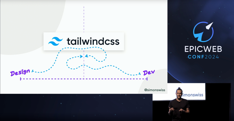
I was so impressed when Simon Vrachliotis talked about Tailwind CSS. I've heard about Tailwind from the Epic Web discord but I thought it's just another CSS library like bootstrap. Turns out, it's so different!
Usually designers make their designs in Figma, and developers, well, they try to implement those designs on their own capabilities. The point is, now designers and developers can work together in Tailwind, reducing the gap and a great collaboration tool between designers and developers.
Tailwind invites DESIGNERS to write code.
Tailwind invites DEVELOPERS to design and prototype.
from Simon's slides
Tailwind lets designers write the code, and usually this is a prototype code but this code can already be deployed to production. Now developers can just focus on the main stuff while designers can focus on the actual design of the page like animations on hover, etc. It's very cool because Tailwind writes the CSS code for you. I admit I'm not so good at CSS and sometimes I struggle a lot, and I'm not a designer, but because of Tailwind, maybe I don't have to mind that anymore and let the designer work on that part.
The only problem is we don't really have a dedicated designer in the company I worked for. Maybe it's time to hire one 😶😂
To End
There were a lot of different talks like:
- about web accessibility,
- CSS custom properties (that made my mind got confused because there's a SQL code in CSS!?),
- how APIs can affect performance and reliability so you move the code into the background,
- the history and the misconception of
const, - how learning in public can strengthened your career and expand your network,
- visual testing via Storybook (but Storybook couldn't keep up anymore),
- about the moral considerations of AI and how developers shouldn't trust user input,
- improving page performance using remix,
- and even a topic related to one's health.
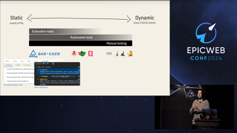
In one talk, the speaker suggested tools like Radix and React Aria that have web accessibility in mind and Accessibility Insights for Web, a chrome extension that will provide insights for your page in terms of accessibility.
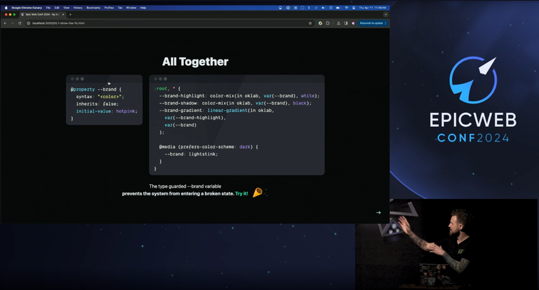
I even learned that you can define a type for a CSS variables with the help of @property. Very cool! In the screenshot above, --brand is given a type <color> and even has an initial value of hotpink. There are so much more types that you can choose from like <time>, <url> and even a <custom> type.
Overall, it was all fun! Most of the topics were new to me which means there's really a big and deeper world out there that I'm not yet exposed to. Listening to the speakers talk and increasing my knowledge on these things made me more and more enthusiastic about web development and its endless capabilities.
To know more about the conference, here's the link: epicweb.dev/conf.
Thanks for reading!
See you around! じゃあ、またね!
Lead image is made using canva and all other photos are taken from the Epic Web conference unless stated otherwise.
