HELLO! This is my first time creating fan art in holozing that isn't connected to Zingtober. This means it’s no longer monochromatic, and the challenge of coloring begins.
DRAWING PROCESS
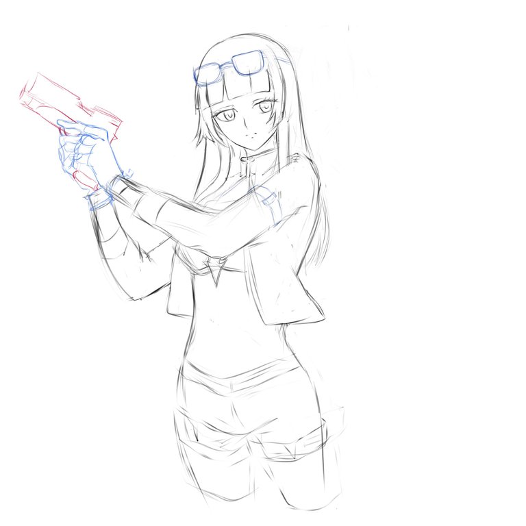
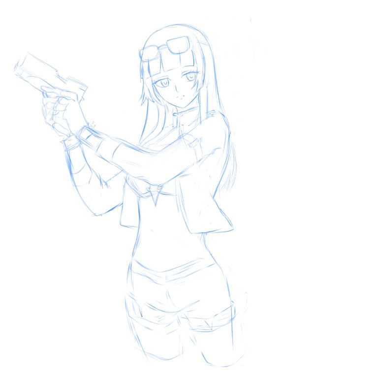
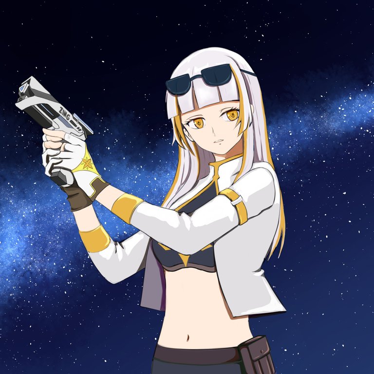
When I first saw the characters on Holozing, the one that caught my attention the most was female light healer.
Have you ever had a crush on a character? I do all the time, especially when they have white hair and are well drawn. At the same time, I often feel the urge to draw that character if I really, really like them. anyways I used a reference to it's gesture ~
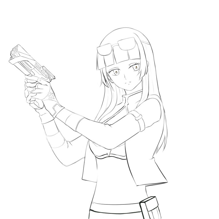
you know the thing about finding a good brush in Clip Studio Paint really helps with line art drawing, I downloaded a lot of free brushes in csp assets and I'm happy I found a good one that matches what my drawing skills I need.
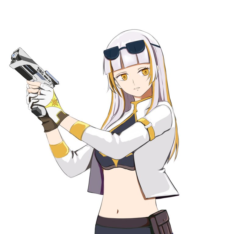
The thing about participating in the Zingtober challenges last month was that I learned how to use CSP (Clip Studio Paint). I wouldn't say I'm an expert yet, but I focused on understanding the layering functions. so far I already know how to use multiply for shadows and screen for highlights. I still need to explore other functions like add, add glow, darken etc. I'm a bit afraid of making mistakes, even if I'm practicing when I get disappointed I get frustrated and erase everything so I need more guidance, but I plan to try them out no matter how frustrating it gets, but If I have more time. For now, I want to see how far I can go with the techniques I already know.
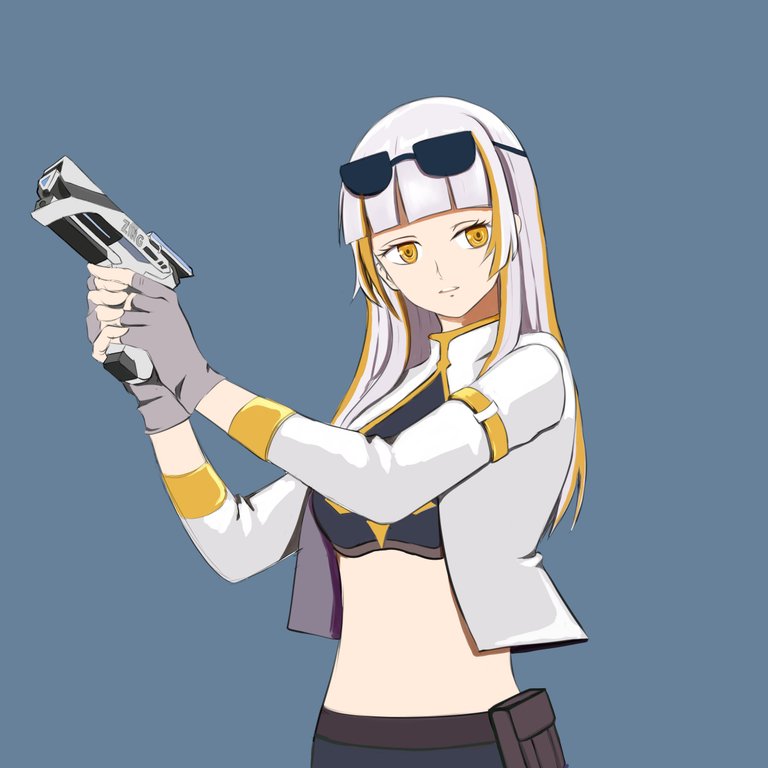
I know there’s still a lot to fix, but if I try to overdo it, I’ll end up erasing everything. So for now, I just want to keep things simple. I played around with a plain background to see what colors go well with the character, but I wasn’t feeling it. The plain look just isn’t doing it for me. Making a background takes a ton of time, and I don’t know enough about the software yet. I’ve tried looking up tutorials on YouTube, but the explanations just aren’t clicking for me. I really just need a simple guide. It’s one of those days where I need to dig around for something that makes sense to me.
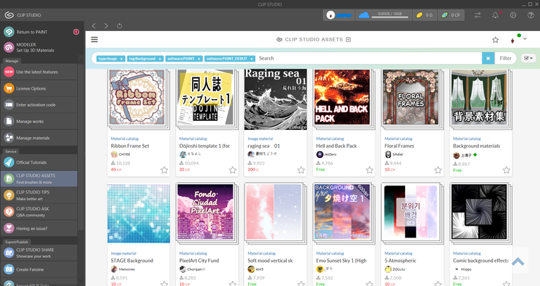
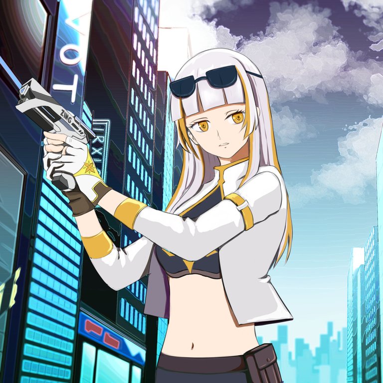
I looked at the free background materials offered by CSP and ended up selecting some good ones to download.
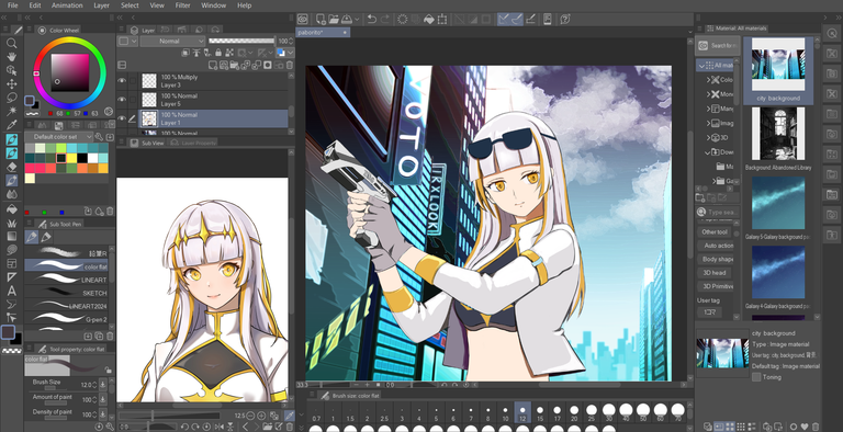
I was looking for my files in the materials and pulled the downloaded background out to see if they fit female light healer vibe. To my surprise, it actually did ! I was like, "Wow! whoever made this city background is amazing" If I find some time, I definitely want to practice working on backgrounds, especially like this city pop drawing. I’m starting to think I can pull it off with my current skills, But the more I think about it, the more I realize I’ll probably need to explore some other layer functions to achieve the same outcome.
 |  |  |
|---|
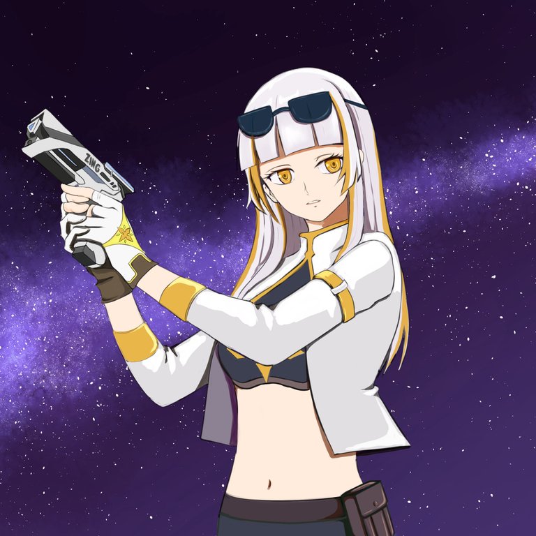
I also tried the other backgrounds I downloaded, and they still match the color scheme of female light healers. I can't help but admire the artist of Holozing. I admire the artist so much that I aspire to be as talented as that person.

Of all the backgrounds I've tried, this one's my favorite! It's not mine, but I have to give a shoutout to Clip Studio Paint material asset for it. If you use CSP and want to give the background a try, just comment for the content ID.
TIMELAPSE

There’s still a ton I want to improve and fix with the character I made. I could point out everything that needs work and fix them, but honestly, that would take me a week or two, and I don’t have that kind of time to spend on just one character right now. If I had more time without the stress of making ends meet, I could really make it shine. I’ll get to it someday, though! For now, I’m happy with how this turned out, and I really enjoyed making this fan art with my favorite character, female light healer.
Working with digital art this past month makes me not want to return to traditional painting, hahaha!
