Greetings dear Hivers!!! Triz here!!
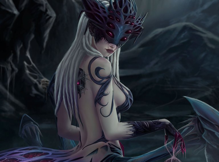
I have returned after a few day, I hope my dear Hivers and fans of #Splinterlands are having a nice day !!! We are halfway through the week and almost the end of the month. Today I want to show you my entry for the #Splinterlands contest. This time I wanted to do something different, since I always do the character my way but it's still the same character.
In this opportunity I just took the character as an inspiration and worked on something different, although adding the essence of the design. I must admit that this one did not take me long, but I have been a bit busy with some things and I did not feel so good in health, the bad internet also makes its magnificent contribution to this so uploading the images, as stupid as it may seem, has been a long work.

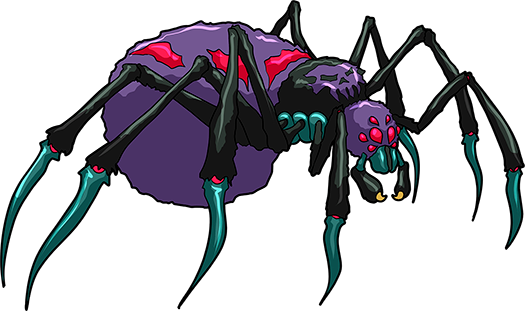
The card that I selected is one of the oldest, when I was looking for a character to do as I always saw this cute spider and I preferred to take that option.
To make this drawing I was seeing many spiders aahh and besides that I looked for the Jorogumo, that if we say so it would be like the girl I wanted to create. Something funny happened and it is that a few years ago I made a drawing of Jorōgumo, when I searched for references on the internet to my surprise, my drawing appeared, that made me laugh a lot, even though it was great to see it there hahha, I opened it and it seems to me that now it would change quite a few things, but at the time it was decent.
Last week I got the cable that I needed for the computer. When I put it together I bought two monitors that came together but I only used one since I lacked the cable for the other, the computer was a pirate. The good thing is that now I can use both and I can have a little more order when drawing, I will be able to make the videos again, although I had some setbacks and I have to solve them.
Going back to what matters, making this drawing was quite good, I made some changes and improvements that I didn't use to do before, it was faster, I was looking for something different and I don't know but it was very easy to get it, I think the portraits are working. I don't know if the next one will stay like this hahahaha.

Now if I will show you how the process of this was 😁
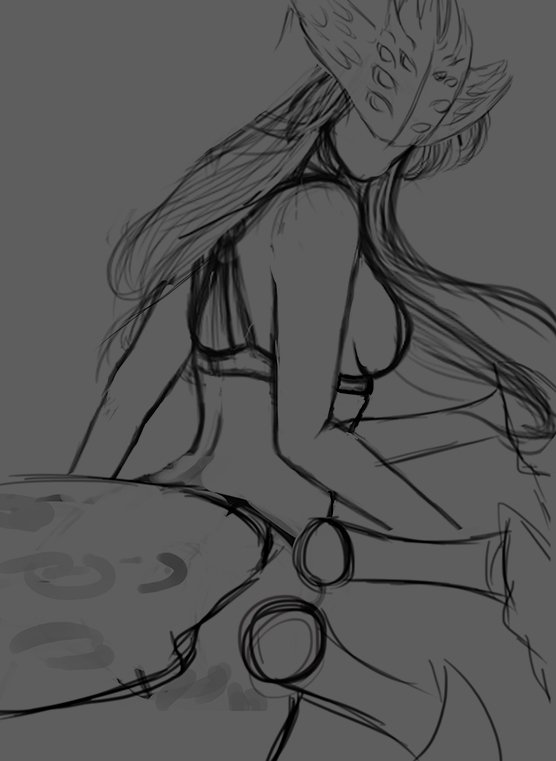
The sketch as always was very simple, although it is always subject to change, at first I had a very different idea with the character, since it was not going to have as much background and she would look closer, but as you saw in the previous image, I changed of idea.
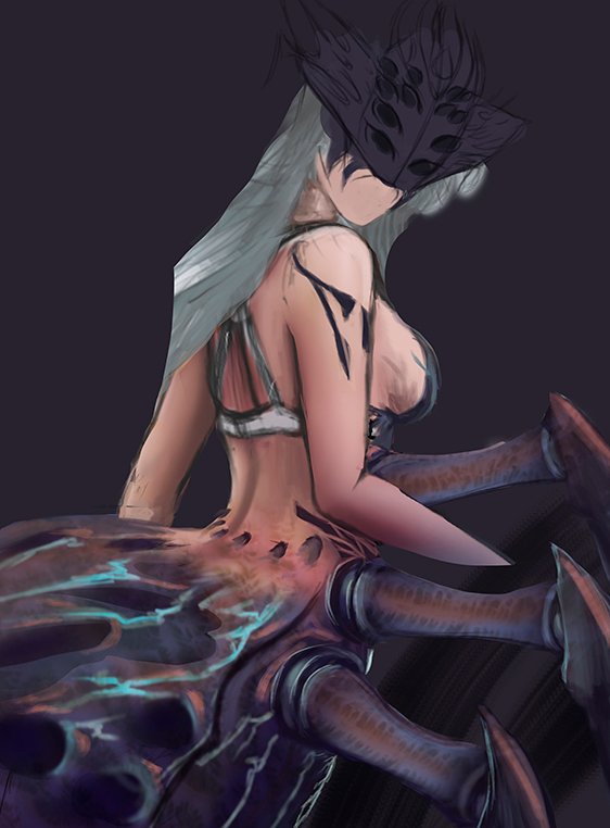
When I was doing this drawing it was partly funny when I started drawing it seemed like I was learning to draw a couple of years ago, I don't know if it was because I added the other monitor, the Tablet behaved a bit strange, although that was no excuse for Weird colors like that, I don't know, it just looks like plastic to me, but it was a start, so it's ok I guess. In the sketch it looked like she was going to fall over, so I straightened her up a bit.
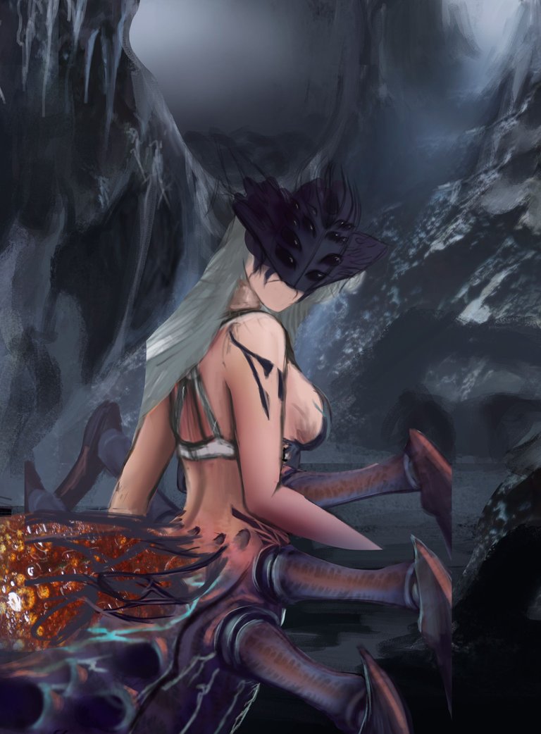
I decided to do something in the background and a cave seemed fine to me although the girl was a bit big and the size is not convincing me, so I did what I thought would be better, that would also help me get more space and I could make the legs larger.
This is a clear example that the photos I take of anything are useful. The eggs that I placed on top of the spider's butt, so far it was one of the photos that I have in my textures folder, just a base so far. What was that photo of? hahhahhahh that's so funny I was unexpected.
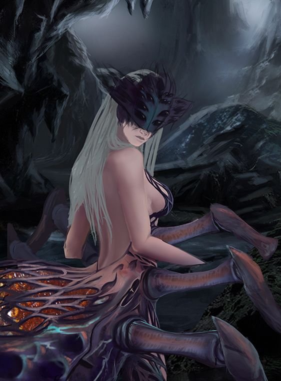
I've been drawing and I've done a couple of things in the background, but I decided that it was time to do something more on the girl, so I kept adding more, the spider legs were bigger. At first she didn't have legs so she put them on to see how she looked and the result convinced me so I left them like that.
To make the skin I used a normal brush, I changed the tone of the colors since before it looked more orange and since it was going to be a cave this was not the right thing to do. The part of the butt and what was the detail on the leg was on a better path, I didn't want the eggs to be left out in the open.
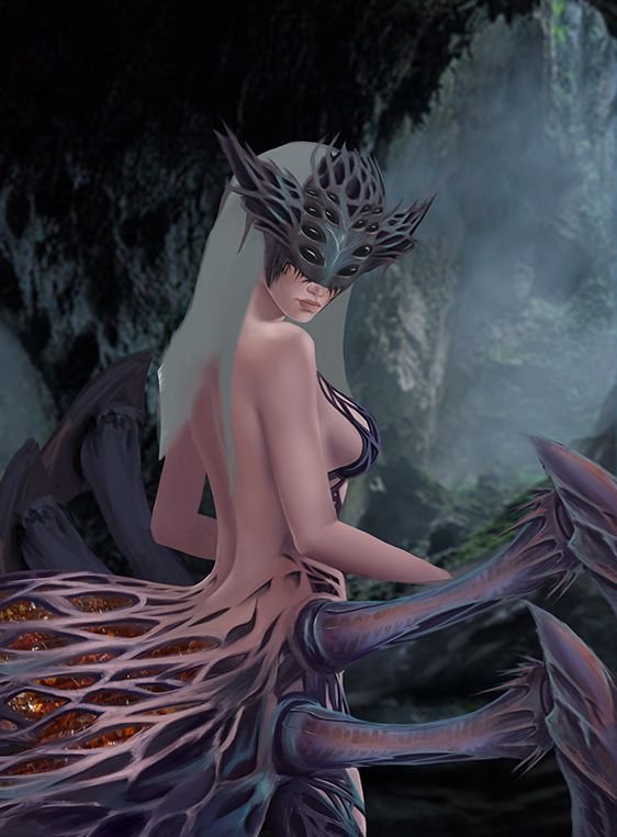
The details in her were improving although the colors the skin is looking better seemed boring to me and it was more reddish. I did the face but I didn't want that to look like a mask but it was part of her as well as the butt, the legs and so on. The eggs were safe, I changed a little how the spider's butt looked, it was already part of the girl and not just an accessory. I tried to do something different in the background, but it didn't work.
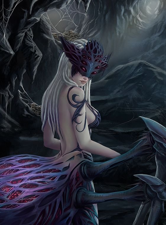
As I said before the color of the skin was not what I wanted, but I did some tests, some adjustments with the curves, saturation and then doing magic she obtained a paler color, I did not want it to look dead either, I got it by placing some shadows a little more purple and try to avoid black or brown, add some details on the arm of the same material as the little clothes she had.
In this step I finished what was missing in the rear of the spider, to that and to the legs I also adjusted the colors, in terms of the position and the number of legs I also adjusted that, the background returned as it was in previous steps and I only finish fixing.
In the previous steps the body looked a bit shapeless so I thinned the waist a bit and gave the leg more shape.

Final Result
In the arms throughout the process I did not do much until I reached this point, I made the hand and added a small detail to it, I kept adjusting the colors, the shadows, the lights and others.
Something that could not be missing was the skull that has the design of the card, so I added it to the girl's sword, I did some blurring of the background a little and I thought that with that this character was ready.
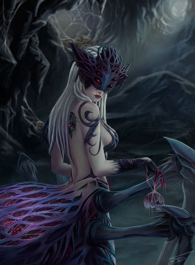

Tell me, what did you think of all this? I would love to know your opinion. And if you have reached this point, I thank you very much for taking the time to read me 🤗🥰😉.
Some of the most recent pieces here😌

See you soon Hive 😏!

