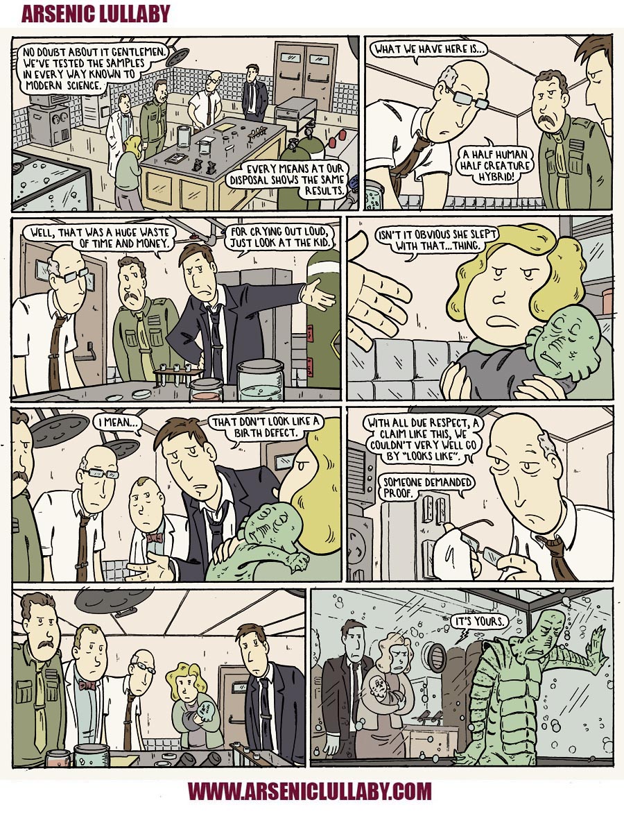
Let's start with this one page story from Arsenic Lullaby, as published...then I'll dissect for you some of the things I did to make sure it worked well visually
Just the briefest of review of the basics of laying out a comic book page...then onto something more advanced...
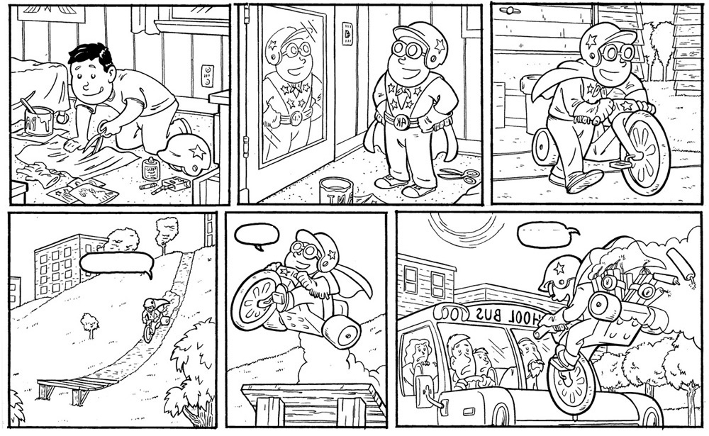
The reader reads from left to right, and top to bottom. and As much as possible, unless doing otherwise for some effect, you want the visuals to follow that natural pattern.
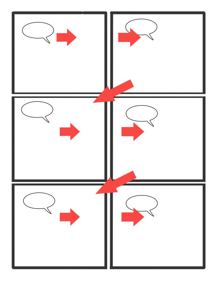
About the simplest and most common way of doing this is to have the action follow that flow...
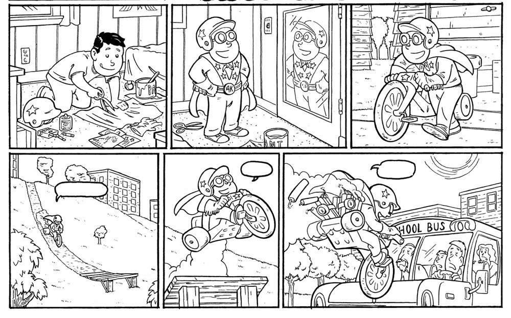
The kid is leaning, motioning, looking, walking, riding in the same direction of the natural eye flow (left to right/top to bottom)
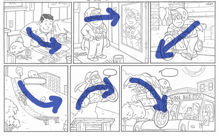
Makes the pictures all work together, keeps the reader sucked into the story...it's very natural and comfortable.
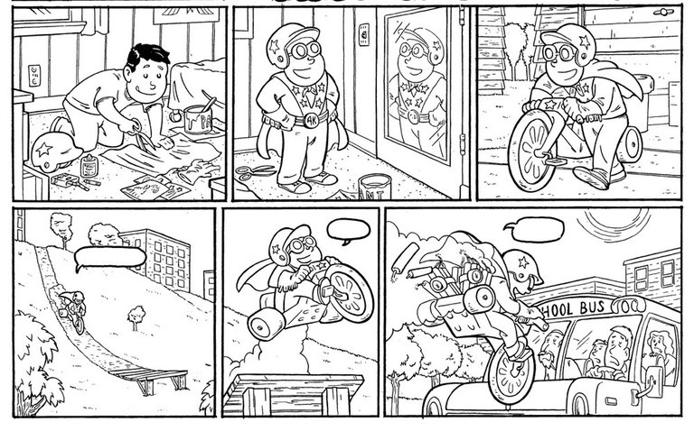
Let's look at it again...but done wrong...so you can see how less appealing and natural of a read it is.
bad
good
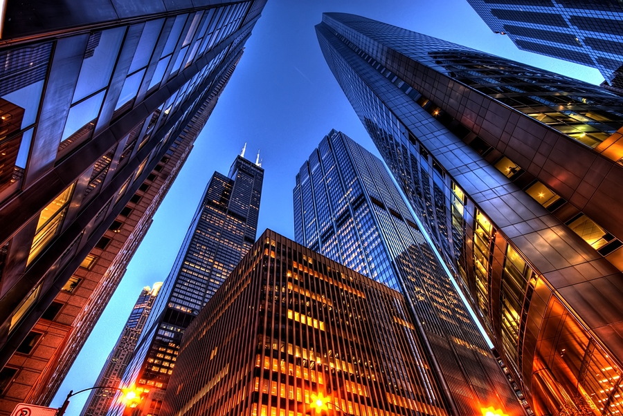
Okay...now that we're all up to speed. There are other ways of setting up the panels/page to suck the reader in and keep that natural flow. But we need to understand that there is a strange relationship the reader has with the page, that no other medium has. We all understand that in say a movie, wherever the camera is placed, is where the viewer feels like they are.
below the action looking up...
above the action looking down
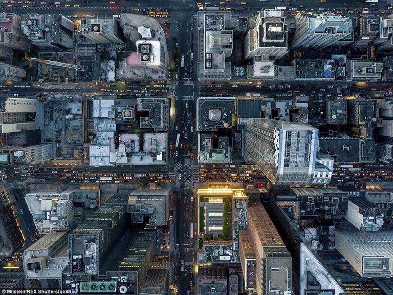
or a regular height on the left or right or close or far away. Where they feel like they are changes with every shot.
HOWEVER in a comic book the reader has the entire page, all the panels in front of him/her at once. Even though they may (hopefully) focus on one at a time, all those panels are there...at once. SO...unlike a movie where the viewer is in one position and then the next. The reader of a comic book is in one position in relation to the action AND where they feel like they are on the page. I'm going to do my best to explain that in case it's confusing.
This panel below, the camera is below and a bit to the left of the figures and that's were the reader would feel like they are to the action BUT ALSO as far as the large page itself they feel like they are on the lower left hand side of the panel
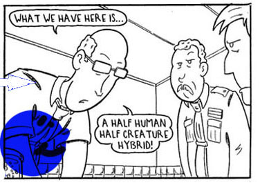
Where they are, is two things at once. Where they are in the action and where they are on the page. Understanding this, you can use the camera itself to make going from one panel to the next feel very natural.
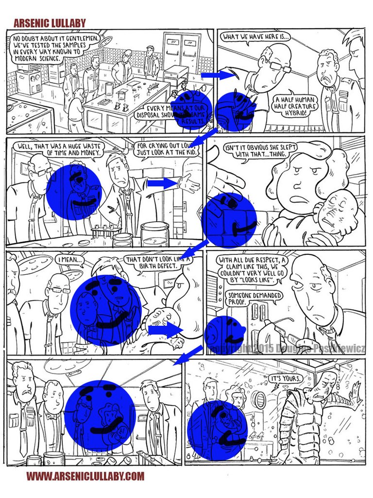
Panel 1- is a establishing shot. And I placed the camera to look down from the lower right of the panel. This makes the reader feel as though that is where they are on the page itself- Lower right-this makes the transition to the next panel pretty natural.
Panel 2- the reader, again via camera angle, is in the lower left corner. So even though the position of the camera is vastly different in the story reality, the page reality is that the read only feels like they turned their head. Also in the second panel the men are looking down leaving the reader in that corner…making it again as though the readers is only turning slightly to wind up in the next tier.
Panel 4- .Just for good measure the word balloon and their tails are all hugging the top of this panel drawing them back to the proper starting point –top left.
A nice regular height and angel of the camera. The reader is basically at the table with the figures and the mans arm directs the eye to the next frame.
In panel 4 - as though the viewers head had turned and followed the man's gesture from panel 3 to panel 4...so does the camera angle and zoom. the woman is looking in and her back is a thicker line than the background, creating a barrier against going off the page...kind of bouncing the viewer back.
Panel 5 has the camera again at a standard height and closer to the side of the woman. The child's arm is reaching towards the next panel.
Panel 6 The camera is looking up from that tier again making a comfortable transition down.
Panel 7 is all about a pause but it also pushed the reader back. This is important because in the next panel the reader is inside the tank with the creature. If in panel 7 the reader was among the people the transition to the next panel/being in the tank would not be as effective.
All of these wild camera angles also add to the suspense and feeling of something supernatural going on. With out all this it would just be a bunch of talking heads in front of a counter and the punch line would seem odd and perhaps out of place. The brunt of this joke is that the supernatural creature is just a deadbeat dad. The more supernatural it all seemed in the early panels, the funnier (in theory) it is to find out how ordinary the creature is.
There is a time and a place for pages of talking heads too. When you are talking about a longer story they
can be a nice set up for a page or two of impactful pages. You may notice that I do this with the donut and voodoo joe from time to time. A series of pages with standard shots only to out of the blue jump to trickier shots when something bizarre is happening. That's what I call the "long con" not every page can or should be a visual master piece. A boring page or two when well placed is a nice tool to use.
Hopefully I didn't lose to many of you or bore the rest.
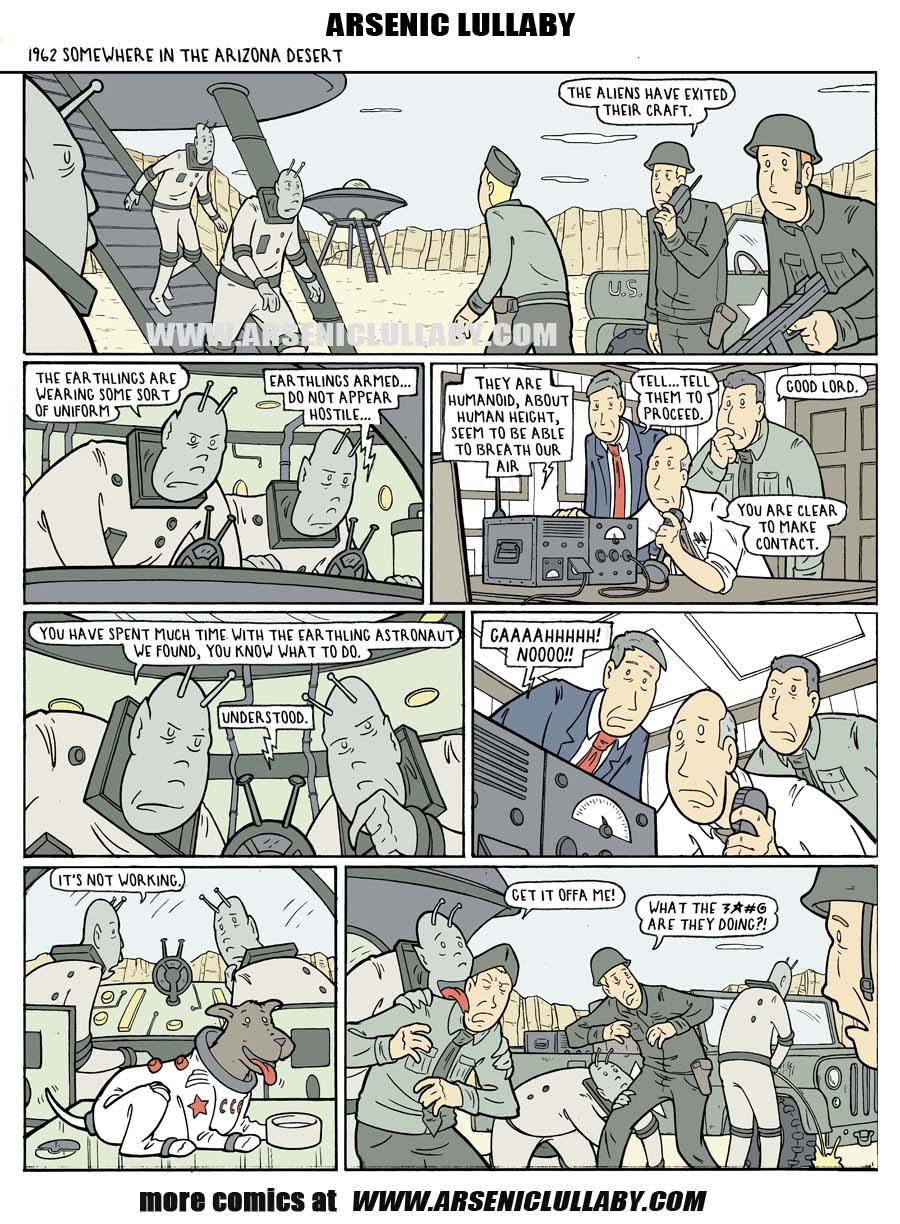
Here's another one page story for you. You can read it just for laughs or try to break down on your own how and why I set it up the way I did
As always, homebase is here
https://www.arseniclullabies.com
NFT work here-
https://nftshowroom.com/arseniclullaby/gallery
https://makersplace.com/arseniclullaby/
Here are the other places to find me...my use of them is fluid, inconstant, susceptible to the whims and shifts of the paradigm
Torum-https://www.torum.com/u/arseniclullaby
Instagram- https://www.instagram.com/arsenic_lullaby_official/
twitter- https://twitter.com/arsenic_lullaby
bitchute- https://www.bitchute.com/channel/arsenic_lullaby/
youtube- https://www.youtube.com/user/arseniclullabycomics