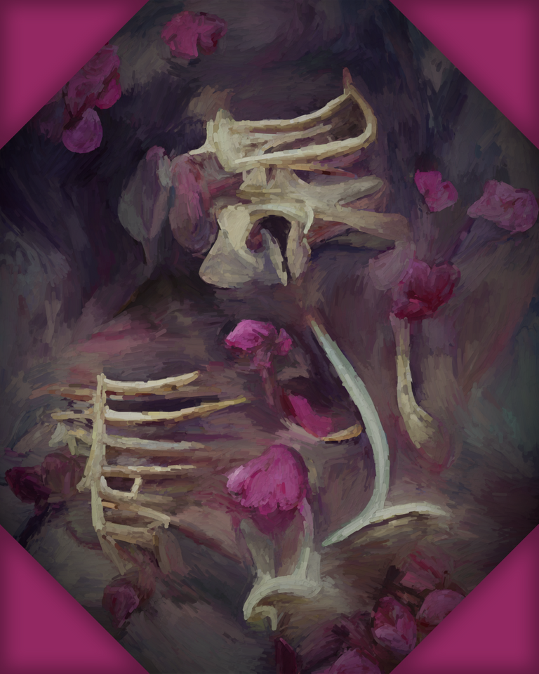
Hey people of the hive! It took me a bit longer to write this because I've been a bit busy working and learning. I've noticed that I wasn't most transparent when it comes to details of creating my pieces. I still cannot give all of the details because it would take me too much time... So let's start!
Inspiration
Sometimes I have lucid dreams. It's a thing I've trained for years and I still haven't mastered it yet cause it's excrutiatingly exhausting when you gotta write down your dreams when you wake up so you don't forget them....
One night I was dreaming that someone was chasing me through the forest and I couldn't run away... It was dark and the trees were made out of bones. You couldn't recognize if it was a tree with holes in it or a murderer skeleton trying to get you.
Once when one being was getting closer and I couldn't run I've realized it was one of my dream signs and then it just popped out in my mind to do a reality check. I quickly covered mu nose and mouth and took a deep breath. The fact that I could breathe through blocked airways just confirmed the fact.
"This is a dream!", I thought and when I turned towards my murdered I just said, "Just... Just move I gotta go...."
The being was gone, but the forest stayed. It was so depressing so I thought why not give it some flowers and turn the night into day at least...
When nature started sprouting it was so fascinating that you really can't imagine it awake and it just clicked. I'm gonna make a series of my digital pieces with that motive!
Tools
- Wacom Intuos S drawing tablet
- Adobe Photoshop (I use CS6)
- Gimp (2.10.28)
- Secret image processing algorithm and gimp plugin that I wrote when I was student (I'll write a bit more later).
Color palette (in hex):
- D1CCB1
- A3917E
- 7C7176
- 9E467B
- 6D5C63
Process
So my creative process is a bit different from orthodox digital painting because it automates some parts of itself, but also cannot be considered generative because most of it requires manually drawing and coloring.
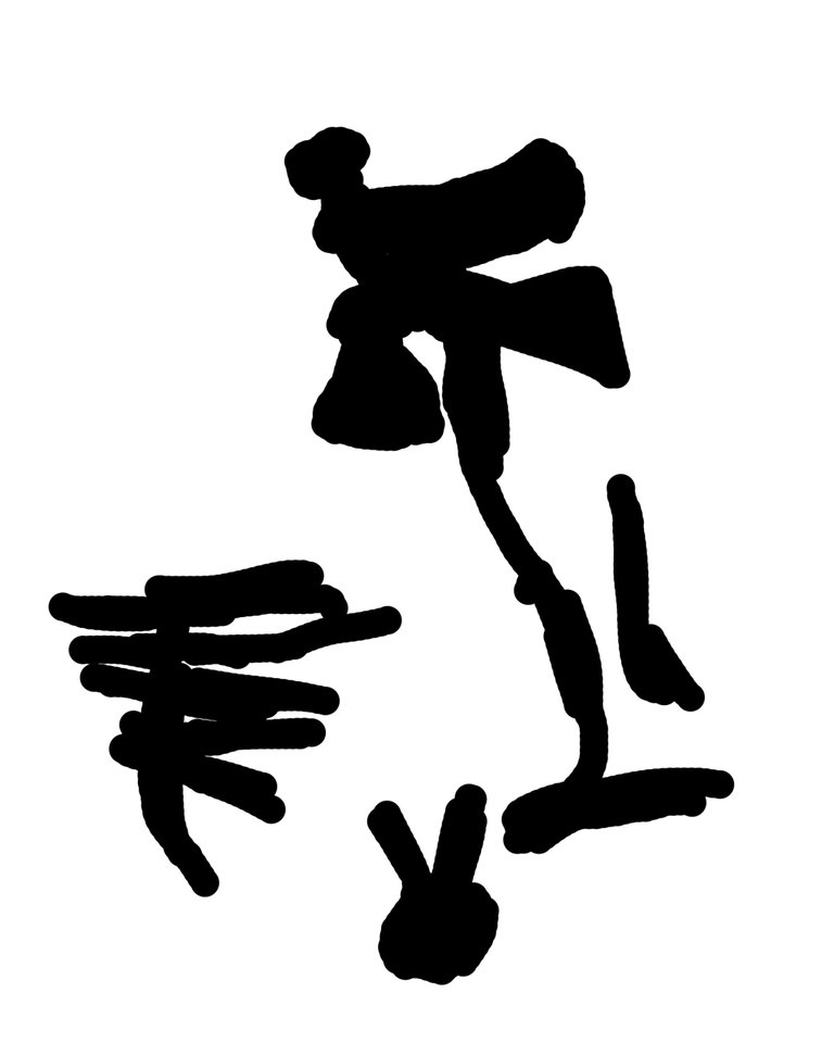
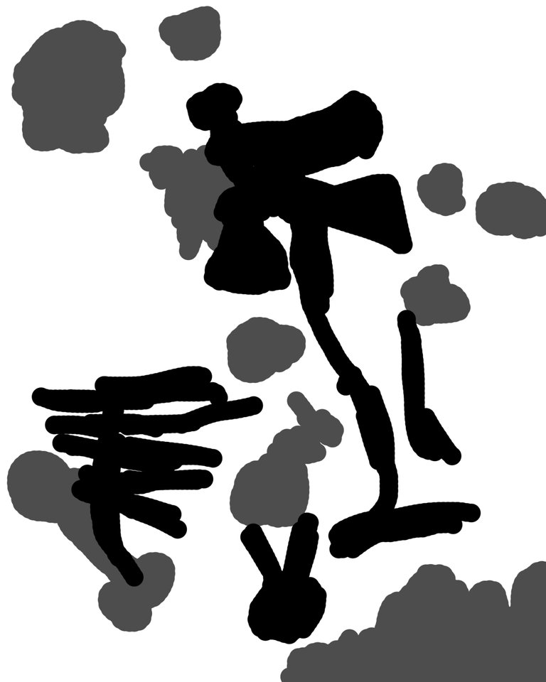
First part is getting rough composition.
I decided to put 4 major bones (see the image left). It was enough to roughly color the area.
On the right image you can see the foundation with roughly added area for flowers.
First lines
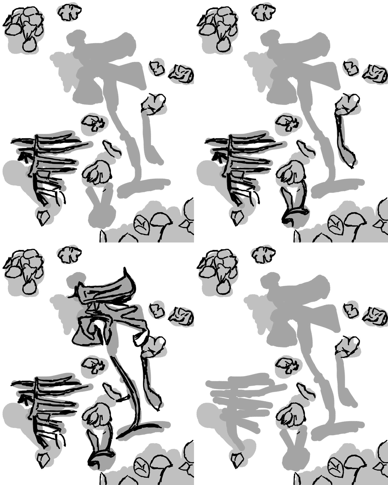
Ok as you see I've reduced the opacity for the base layer. What you don't see is that I've turned on the plugin which records my strokes (and makes my computer scream). For some reason it doesn't work well with stroke stabilization. Probably some driver issues which I have to look into when I get the time...
Anyways I was dropping here some outlines for flowers done arbitrarily in order to fit. Grey zones that I left out are either skipped or are done in less detail.

Outline of the bones
I've just continued the same stuff with the bones. From the start I decided that I want something that resembles a ribcage bones to the left. The big one on the right is just a bundh of lines I drew to represent bones of some non-human being. Maybe an animal of some sort...
Secret
The part with most undo buttons pressed was when I introduced color palette.
Recorded strokes are now being used to get the colored outline with my little DSP algo. I gave it a color palette and zones which it should convert to color. It pseudorandomly gave the color to the strokes I made before onto a new layer. This saved me so much time when it comes to getting edges properly.
Flowers got violet and brownish tones from the palette, and bones got like all the shades of grey, brown and that yellowish-white colors specific to bones.
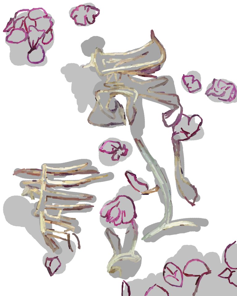
Coloring
With new plugin on, now coloring in real time. Color is picked from the nearby pixels and getting mixed with the selected color from my palette. This is something that I love so much because it saves me so much time when picking colors. I'm a bit control freak when it comes to strokes and I want to control many, if not almost all visible strokes on the piece.
The algo I use is also flaky sometimes (That's what you get when you give a student to write code) and occasionally spawns strange artifacts instead of colored piece of screen. My guess is that sampling the surrounding pixels malfunctions in some cases, but it just means that I have to pass more strokes per part of the image until I get it right.

Background
When it comes to my work. I must say I'm not a fan of too much details. Sometimes I like when I make a piece where you always have to look at something, but most of the times I give some space for viewers to rest their eyes.
Upping the size of the brush gives me exactly what I want in this sense. Also this is one of the most satisfying parts of my creative work.
Larger brush with multiple lines and semirandom coloring gives life to each part of the background without too much hassle.

Finished
And when I finished everything and fixed some little mistakes I made I exported the image into photoshop and added the frame. I also added a hard light layer with vignette effect to make it a bit more dramatic for the display! And it's done, I hope you enjoy and I'd love to hear what you think of it!

[This is my own work, ALL images are mine unless stated otherwise]
P.S. I hope you like the gifs I made, I felt like it would be spammy to add all images one by another and it would make this post an endless scroll...
