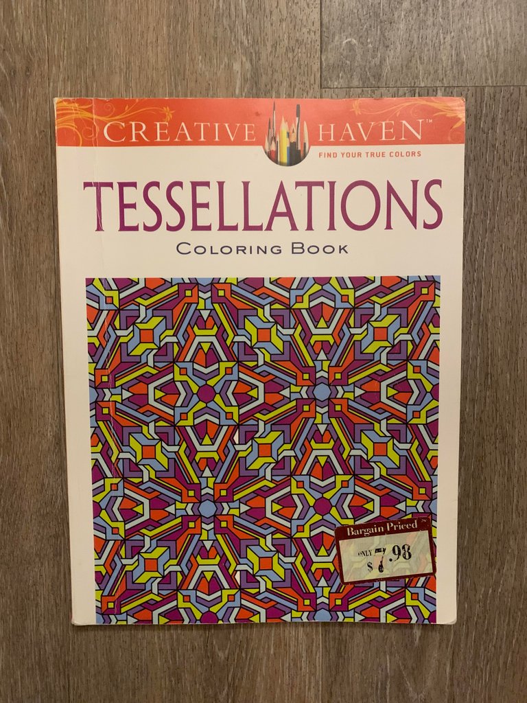
Remember that time when everyone was buying those adult coloring books? Well I definitely do, and I still have mine.
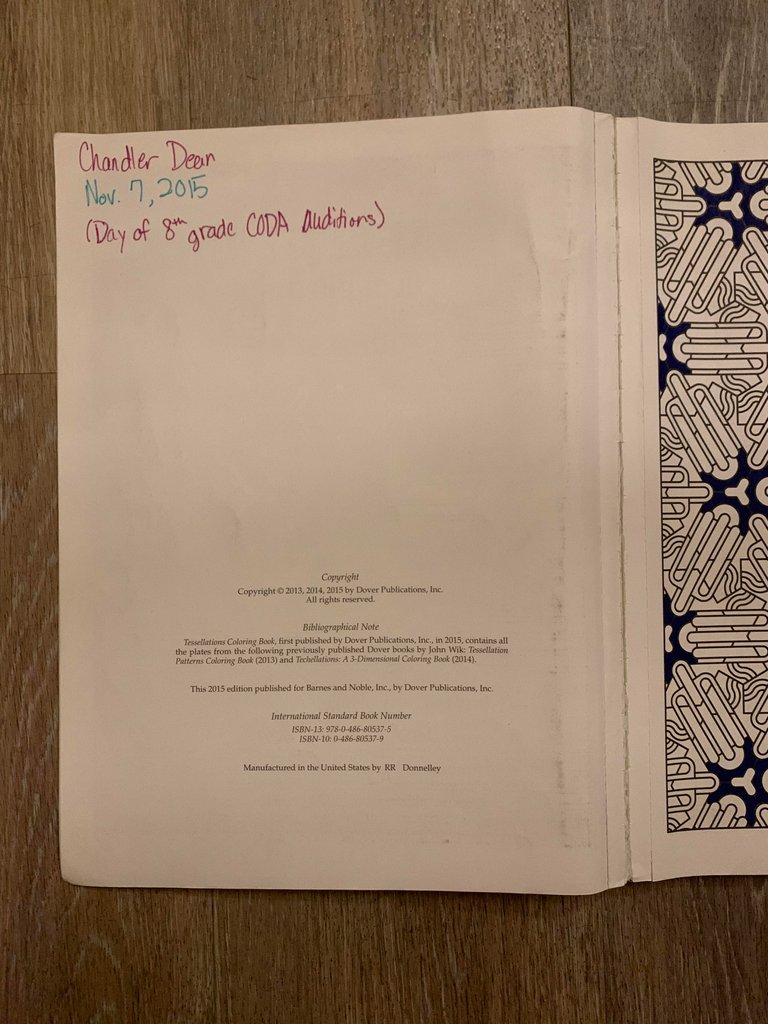
I bought this one on November 7, 2015, the "Day of 8th grade CODA Auditions"
CODA stands for Central Oklahoma Director's Association, which is the organization that puts on the honor band competition for middle and high schoolers across central Oklahoma.
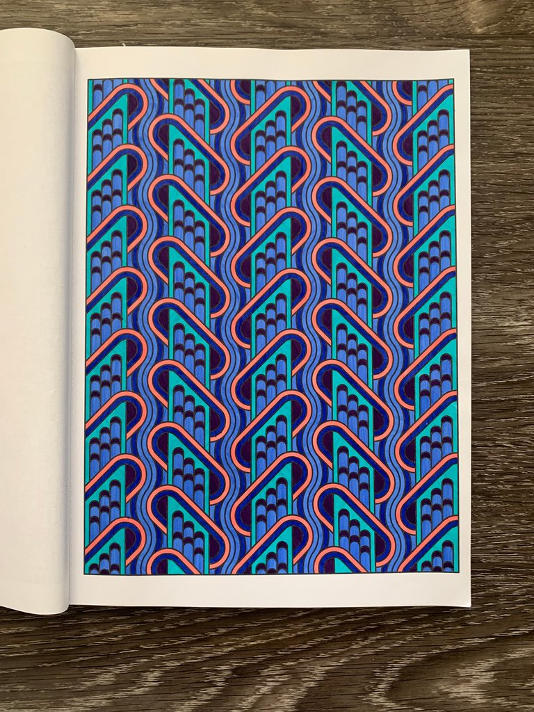
I tried to play with blues and purples here, getting all of the shades together on one page.
The day of CODA auditions was always a stressful time. Students in high schools across central Oklahoma had worked for months preparing all of the songs for their level that they had to play for the judges. Everyone warmed up in their warm up area, secretly judged other peoples' performances, hung out with friends, got food at the concession stand and waited anxiously for their five minutes with the judges.
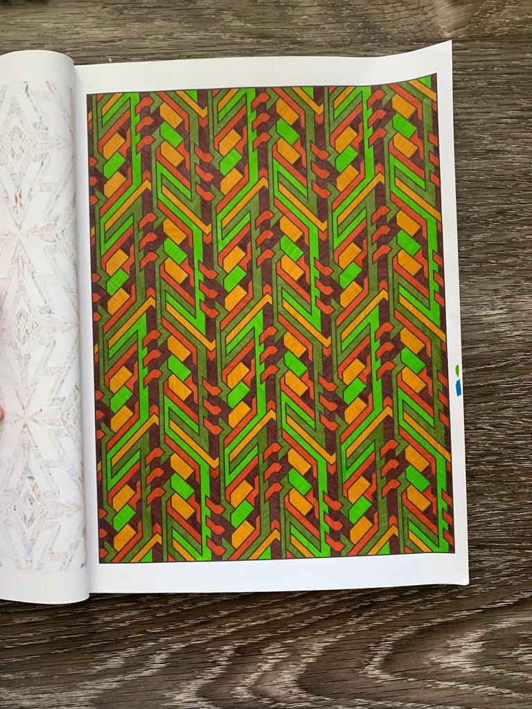
Because of the long lines running vertically across this page I went with a forest/jungle theme here, playing with browns and greens.
The time between warming up and when I had to perform was always hard to handle. I didn't want to get out of focus mode so I couldn't watch TV, I didn't want to overplay so I couldn't keep warming up, and I couldn't just sit there or the anxiety would overtake me.
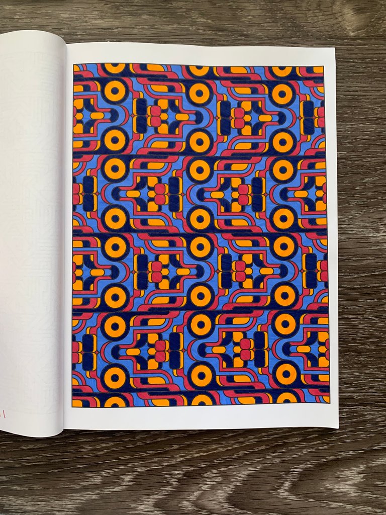
For some reason red and yellow together, along with the dark navy blue really got me excited. So much so that...
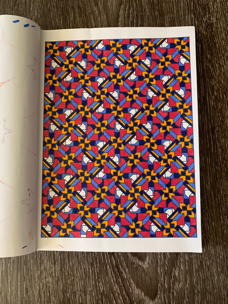
I did it again in this unfinished work.
This is why I turned to coloring. It was just the right amount of mental stimulation to take my mind off the anxiety but not enough to take me out of focus mode. I could pick it up and put it down quickly and honestly it was satisfying to see the geometrical patterns come together.
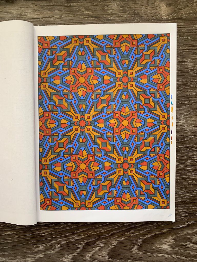
This is my most recently finished page. I was inspired by Ahsoka's colors and wanted a page to honor her character (you knew I was going to mention Star Wars, lol)
You might be wondering, why not flowers or nature pictures or pictures of things besides shapes? Well, I can never decide what colors to choose for those pictures. My perfectionist tendencies kick in and I get stressed about it being just right. I can however, just choose a color and repeat it across the same shape in the pattern. It almost doesn't even matter what you put where, as long as the colors are cohesive, it'll probably look good in the end.
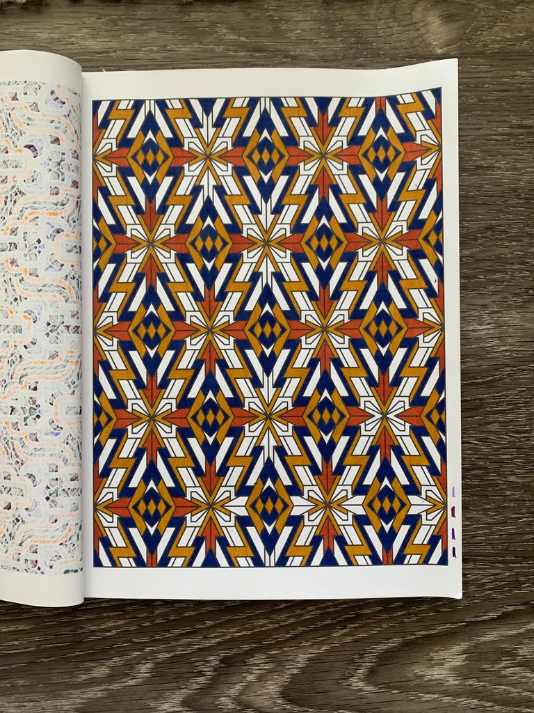
For example, here's a partially finished design that I've been working on during some of my zoom classes lately. It's a good example of the way that I choose a repeating shape to color in a color all of those shapes the same color.
I took this coloring book back to every single audition I participated in during high school.
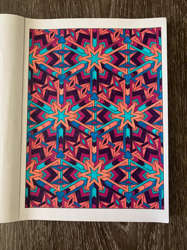
This was the first page that I colored back in 2015. You can tell that I hadn't yet mastered the way to color the shapes yet because you can see all of my pen lines. Also I repeated patterns a little differently here.
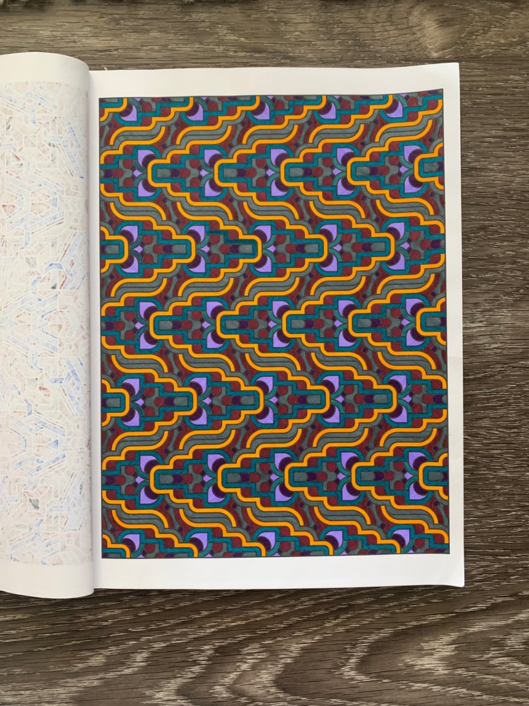
Here's an example of one that didn't turn out as well as I'd hoped. I chose several random colors and just added them as I went, hoping for an eventual good result. After that, I decided it was better to just pick four or five colors and repeat those throughout the design.
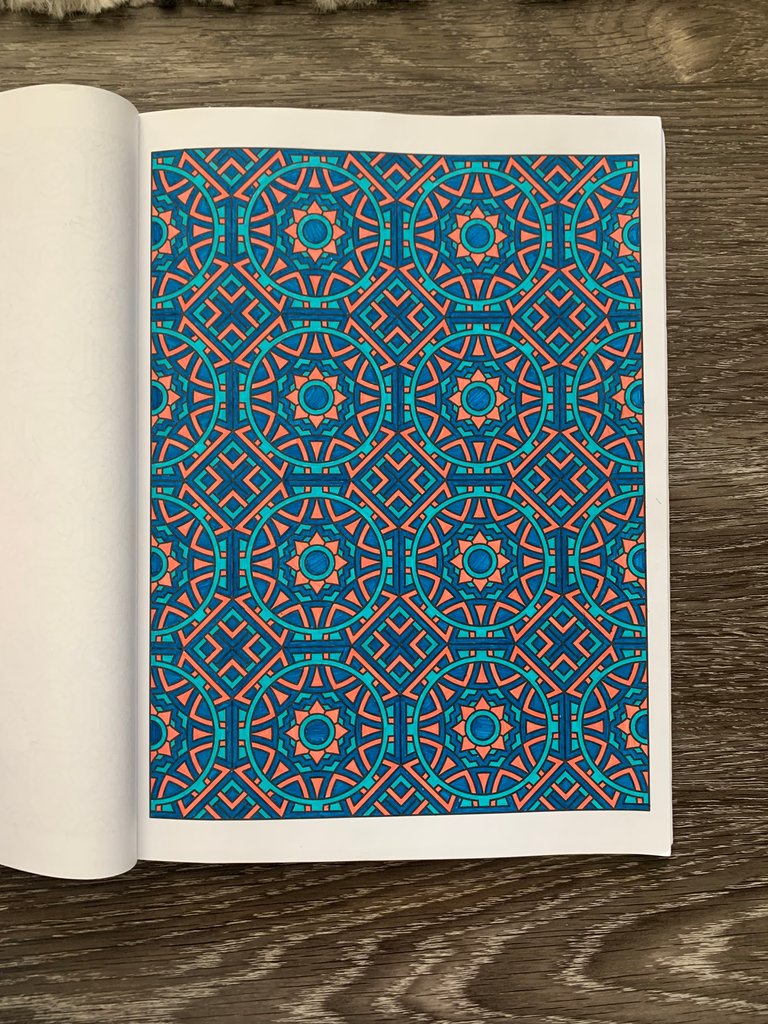
That's how I came to this design. This is my favorite page of the book. The several different colors of blue accented with the peach create something so peaceful and satisfying.
It is fun to look back through the years at all of my different "stress creations," and I hope it has been fun for you too!
All photos taken by me, pattern credits to Creative Haven.


