In this post, we look at How to Create Scatter Plot in Python. Previously we looked at the pair plot in python using seaborn. In this tutorial, I am going to be covering the scatter plot and this time I would be making use of the Seaborn library of the Python language.
Scatter plot can be both 2D and 3D depending on the type of the variables that you use. And for this particular tutorial I am making use of the fmri dataset. You can check that dataset here. I am linking github source file for you to explore.
I am assuming that you have python installed. We can verify the installation and also talk about other libraries to install with the current setup. I am making use of the jupyter notebook. And hopefully you can follow along and get the results at the end of the tutorial.
And I have created a video to give you an overview on How to Create Scatter Plot in Python using Seaborn. You should give this below video a look.
First thing to do is making sure that you have the python installed on your machine. And for that you can make use of the command below.
python --version
Second thing make sure to setup the following libraries. You can use the below commands to set the libraries up there.
pip install numpy pandas jupyter seaborn matplotlib
Next thing is we make sure to run the jupyter notebook. This would help us open up the jupyter for running the notebook.
jupyter notebook
Let's talk about code once you open the python notebook. Below is the first thing is reference to the seaborn library.
import seaborn
next thing you should think of the fmri dataset that we have just given the reference. We also set the style there.
seaborn.set(style='whitegrid')
fmri = seaborn.load_dataset("fmri")
Next thing we are going to plot this data. And we are going to use configs that we can pass on and plot the scatter plot.
seaborn.scatterplot(x="timepoint",
y="signal",
hue="region",
style="event",
data=fmri)
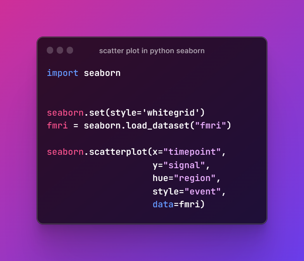
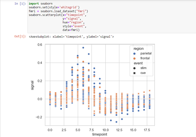
Run the code in the notebook and that would give you the plot. So here's the image reference of entire code.

Next thing once you run the code you would be able to get the plot. And you would see that changing the variables, dataset and the few styles would change the way the scatter plot would be looking at.

That's it. We have made a simple scatter chart. You can always make changes to this data and choose your own look for the scatter plot. I would say you should try with the dataset like tips and few others. So it would be a fun to try there for the variety of the configurations.
I hope you like the tutorial. I have just added the simple example but if you choose you can make it even more complex based on the data and also experiment with the styles that you can make use of. So this would be a good option. Now make sure to like, share and subscribe to the channel by visiting the video posted above. This should help you get regular such good content.
If you happen to like this content, do give me feedback over there and that would help me improve my efforts in near future.


