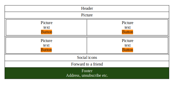
I took on a customer who uses MailChimp to send out their Newsletter, or should I say, they send over what they want in the Newsletter I just have to add it to a template they already have. "Sounds like money for old rope Pete?" I hear you ask, but there's one issue. Mailchimp's Templates are not interchangeable, so whichever base template you choose, you're kind of stuck with it unless you want to create a new one all over again. The templates are based on blocks, and you choose the column type you want, which in this case is 1+2+1

What that means is you can have as many blocks in the single column, it's drag & drop, Block 1 Header Block 2, in this case, a picture. Blocks 3 & 4 are, in fact, single column, but the block will split into two. After block four, there is, in fact, [a single] two columns row, but the original creator chose not to use it. Blocks 5, 6 and 7 should be pretty self-obvious; however, take note of the green footer.
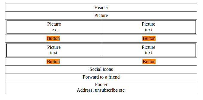
The problem with this is when the text is added, if the number of words is not equal or a line is in all caps, the buttons are then not horizontally aligned. Now I can manipulate it via HTML in the source view, but it's horrible and a lot of work, so I decided to create my own using a different base template that is 1+2+1+2.

Given the buttons would now be in a row of their own, this would mean it was irrelevant how much or what sizes the texts were the buttons would always be horizontally aligned. Perfect! until I came to the footer. As I said, MailChimp has this insane idea of making the basics of each template different, what I mean is, items you have on one template you can't have on another, which in my opinion is insane! and so the original template has the ability to manipulate the colour however the template I create does not have that capability or at least not in the same style as the original. I contacted my customer and said: "Hey, Samantha, I'm having a real nightmare with your template, so I created a new one. The only problem is I cannot reproduce the green block at the bottom, which is the only difference you can see between the two. I'll send you over the one I created, and let me know what you think."
About twenty minutes later, I had this response: "Hi Pete, the one you created is not really eye-catching! Can we stick with the original one please?"
They both look 99% the same! How can my one not be "Eye-Catching"?


My actual name is Pete. Here is why I have the username dickturpin.
You can also find me on Social Media
 |
https://mastodon.org.uk/@dick_turpin |
 |
https://castlecannon.house/profile/srednivashtar |

|
https://twitter.com/dick_turpin |
 |
https://www.facebook.com/peter.cannon3 |
This work is licensed under a Creative Commons Attribution 4.0 International License.
License explained: ExamplesCreate your license: Choose
Podcaster. FOSS, Linux & Creative Commons Advocate.
"Be who you are and say what you feel because those who mind don't matter and those who matter don't mind."

