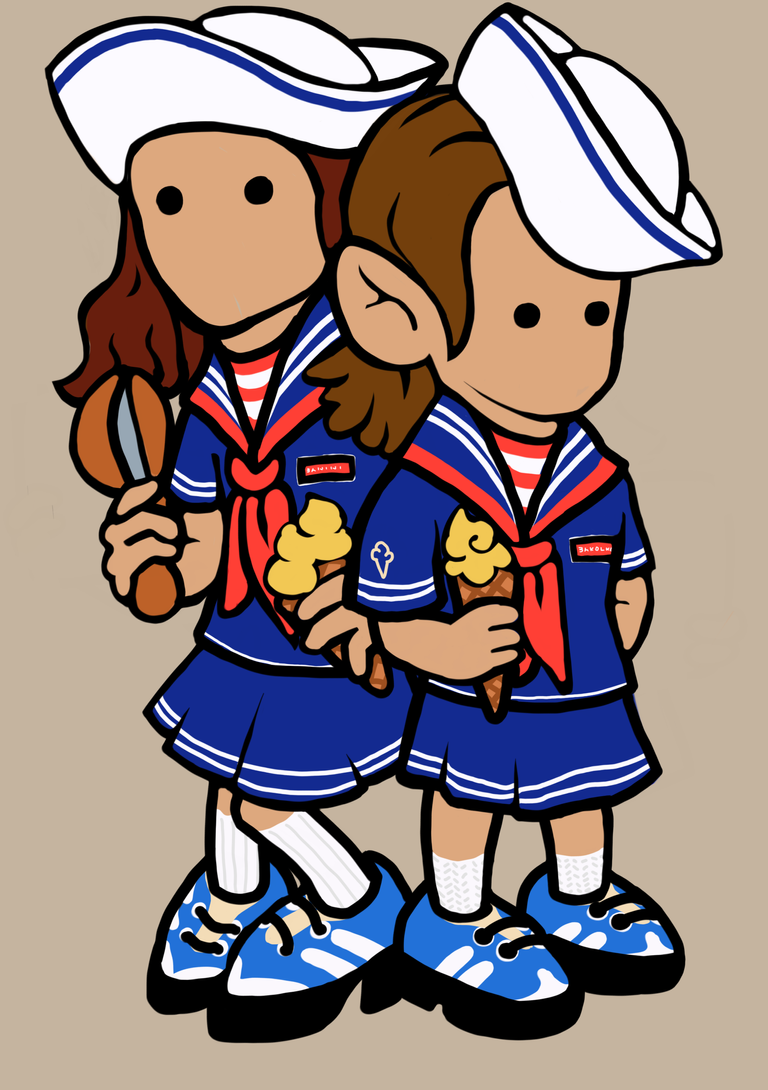
The Sailor Tweens
This took some iterations before it got to this. Usually I do such kind of drawing in one go. This one though I took a break slept on it then do minor edits took another day before doing another edit. I guess not pressuring myself to finish and meet a personal deadline helped. That rest in between gave me a different perspective while editing
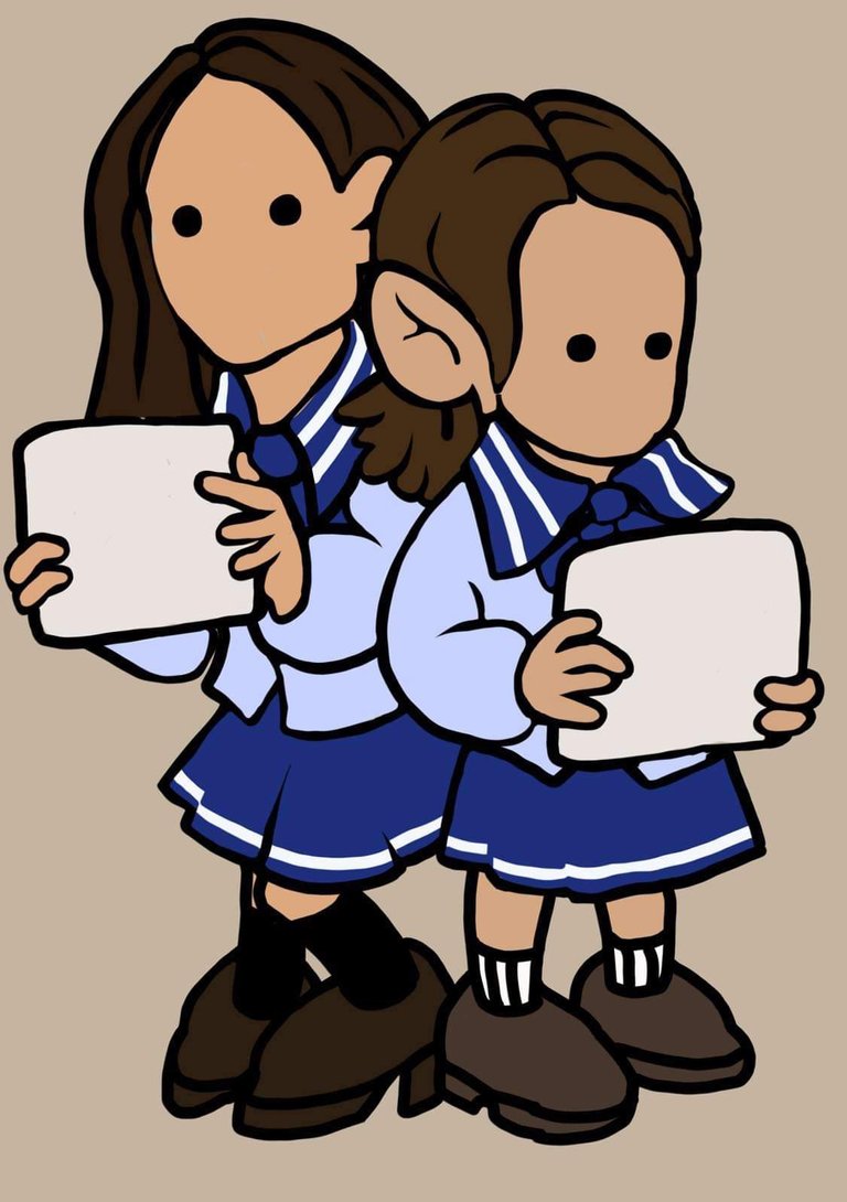
I am already ok with this after finishing it in one go but when I revisited it after a day I had a few more ideas coming. This drawing is inspired by a real photo of school girls holding white boards that would explain the lack of interesting palette
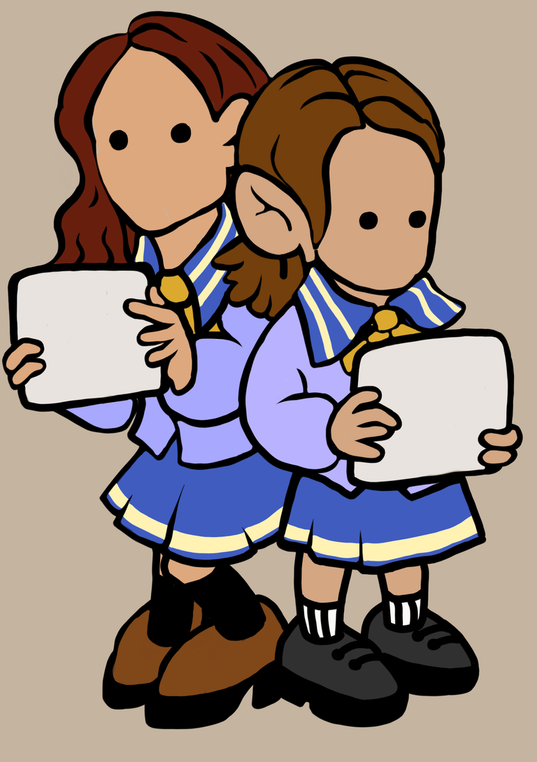
The next day I changed the colors of the hair for both girls made them more lighter so the details would be more noticeable and at this point I am thinking that the clothes should also be lighter but I was not happy with the results
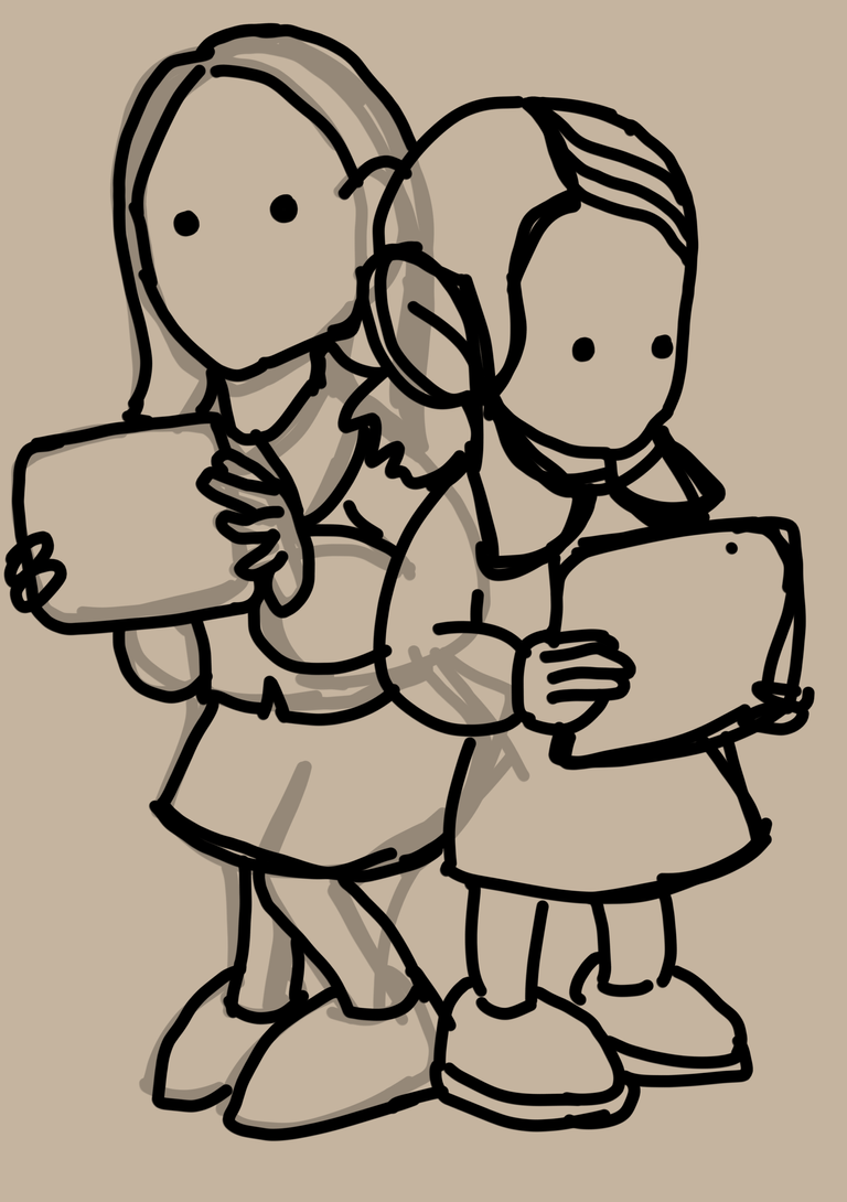
This is the initial draft / very rough line drawing
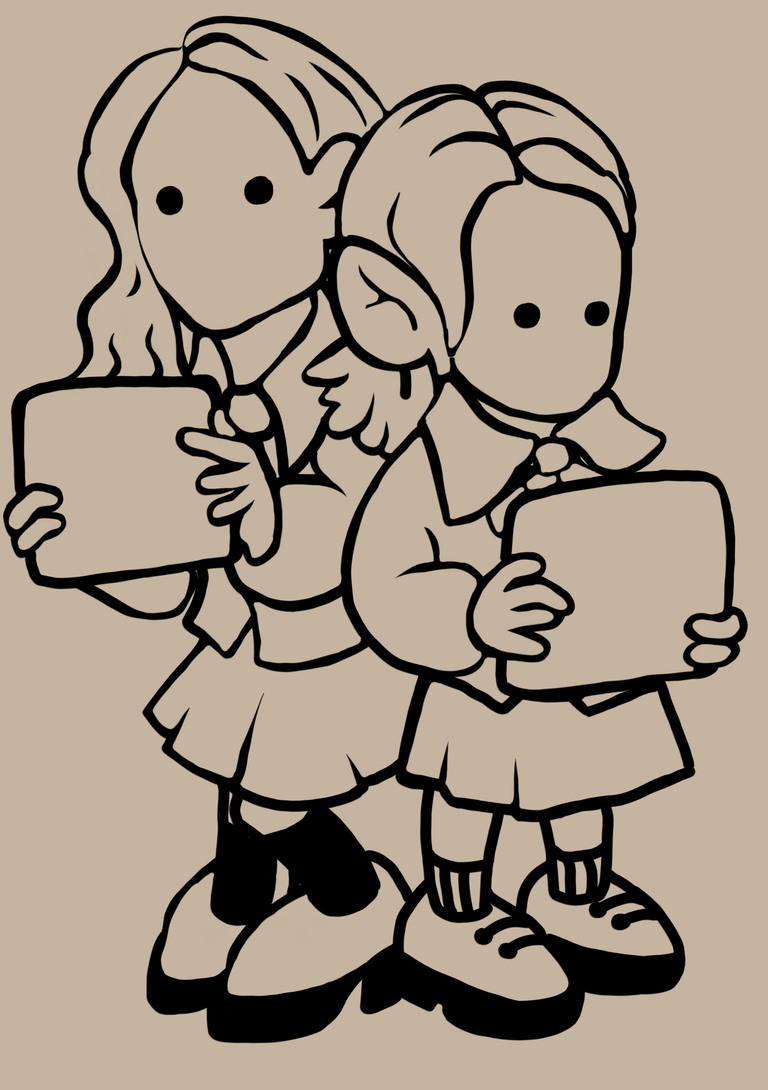
Here I started to make the lines more detailed and defined after adjusting some squiggly and misaligned lines
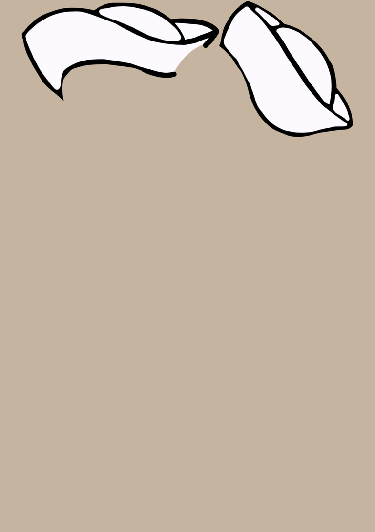
I am thinking about the school uniforms I think I must go for that sailor look. It was a challenge for me to add the white sailor caps starting with their size one is overlapping the other so I had to revise a few times
The girls transformed from school girls to sailors I dropped the whiteboards for ice cream scoop and sugar cone the outfits are more vibrant in color and I love it
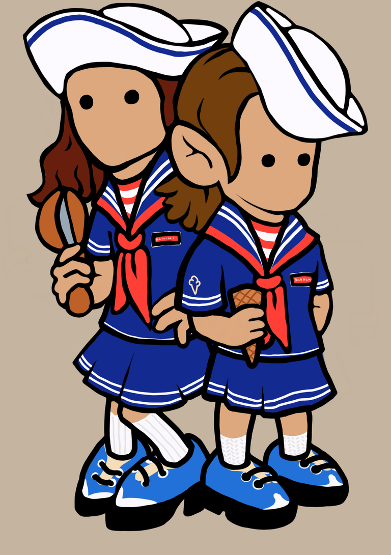
The girl on the left looks awkward with one hand empty so I gave her a sugar cone too initially her one hand is hidden but it doesn’t look right. I am glad I made a revision
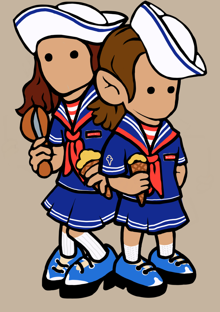
I am debating whether to add ice cream on the cones or not … I thought that I can add another color in there to balance the red white and blue IYKYK that this was inspired by a tv show. At first I was thinking pink and green but I settled for yellow. Here the ice cream looks sparse I know that it should be massive and exaggerated but didn’t have the time to make another edit so on my final version I made the ice cream a little bigger than the previous
That is it hope you enjoyed reading about the process