Today my post will be another puzzle or a guessing game if you like. I'm going to post some graphics, which in my eyes is the hardest to read. This doesn't mean it is indeed the hardest to read. I hope there are many out there who have a better read on this type of art. Regardless f my capabilities, I'm going to do my best to describe what I see.
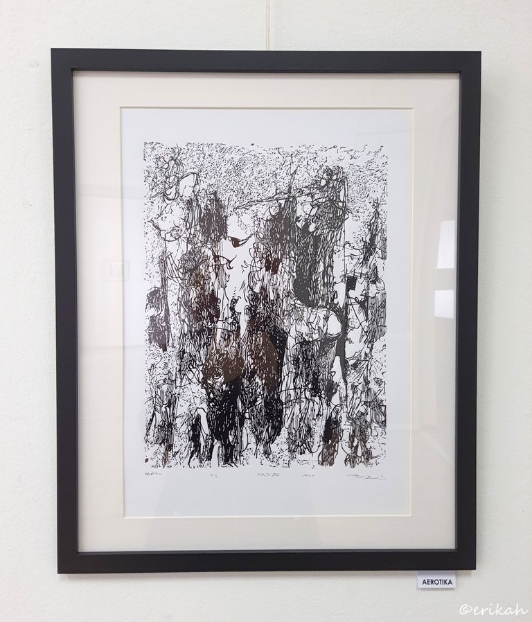
Aerotica
Reading the title of the graphic, you may expect some curvy silhouettes. It's not wrong to expect such things and you can find those here, you just have to look harder to find them :) It's a good exercise for your eyes and mind as well.
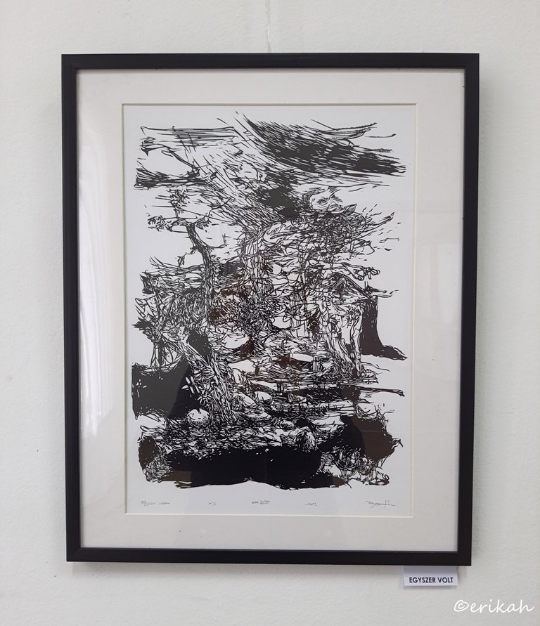
Once Upon A Time
Once upon a time usually is how a story starts. I'm sure there's a story here and I twisted my brain for a good few minutes with this one, but all I can see is a rooftop, a tree and maybe a storm. What about you? How do you interpret this?
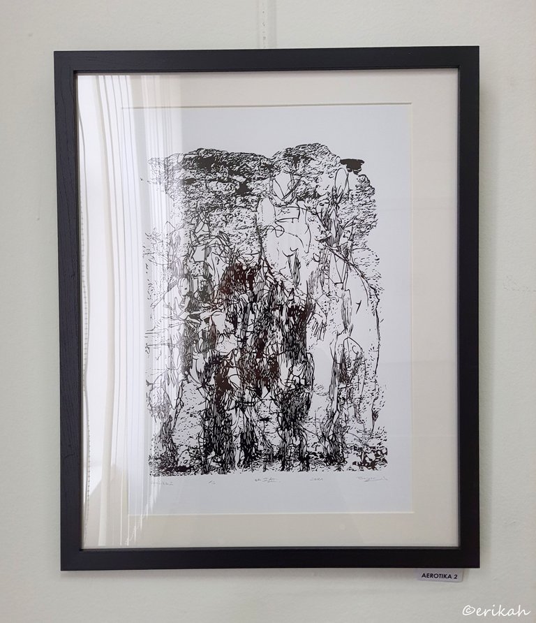
Aerotica 2
Another aerotica graphics, but this one is more confusing for me. I think I see a silhouette there, and there must be a silhouette as otherwise we can't really talk about aerotica, but this is just guessing. I need to get better at reading graphics.
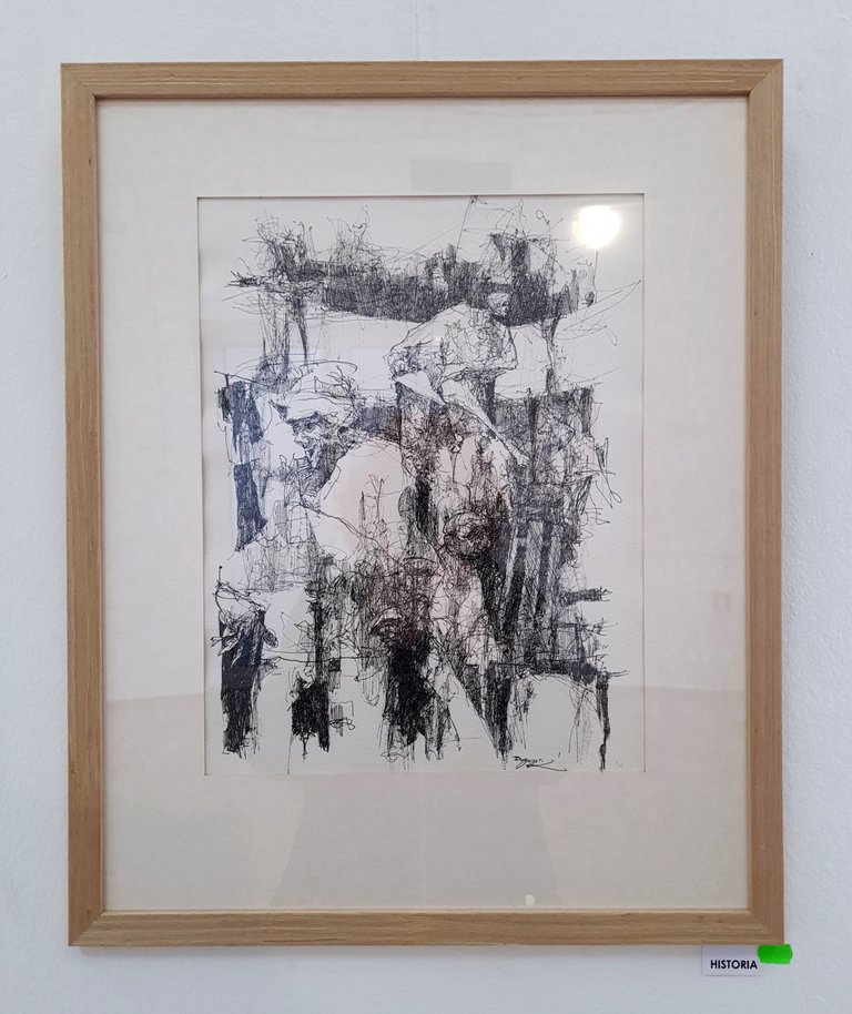
Historia
Historia means history in English, if you couldn't figure it out :) You could already have figured out that graphics is not my favorite art type, but regardless, I appreciate it as a lot of work goes into a good graphics. No matter how confusing sometimes these works can be, this is a lovely one. Looking at it from a fair and necessary distance, you can see the meaning. I actually like this one.
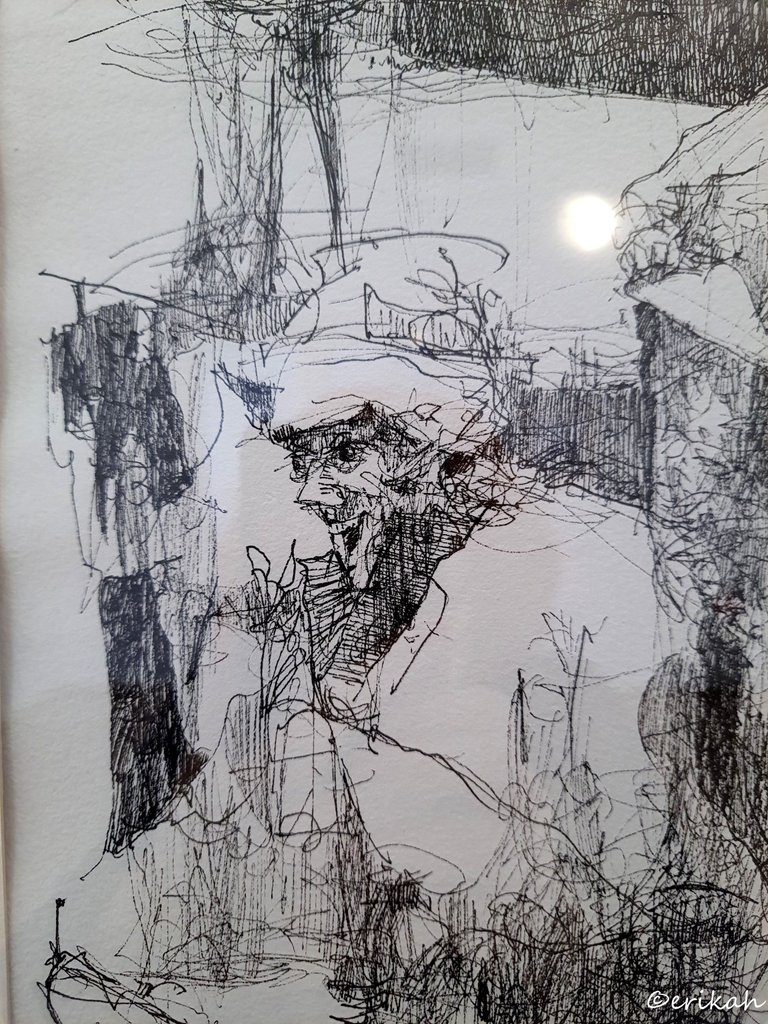
Here's a few close-up photos, showing the details. It's still fascinating how these graphics are done. A lot of squiggly lines in my eyes, but looked at it from the necessary distance, forms something wonderful.
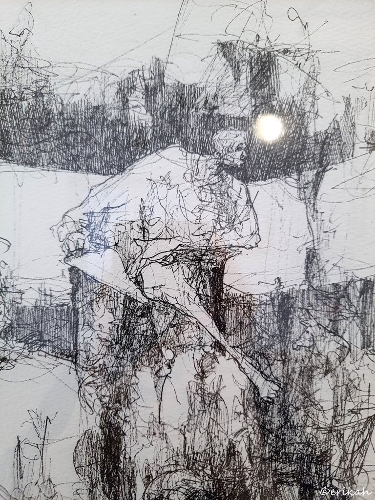
Seeing the details from close, can help you go back and see it as a whole.
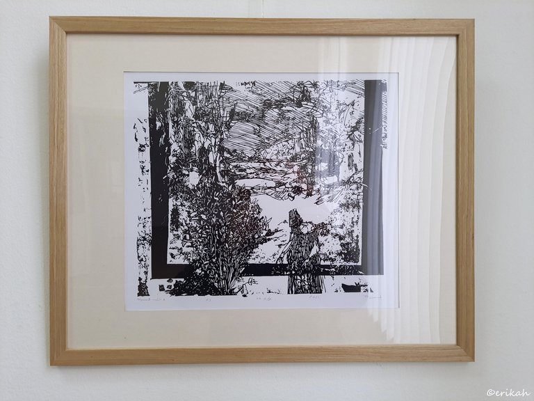
Streamside Archive
There were several series at the exhibition, made up of three or four pieces. This was the first piece of a series made of five pieces.
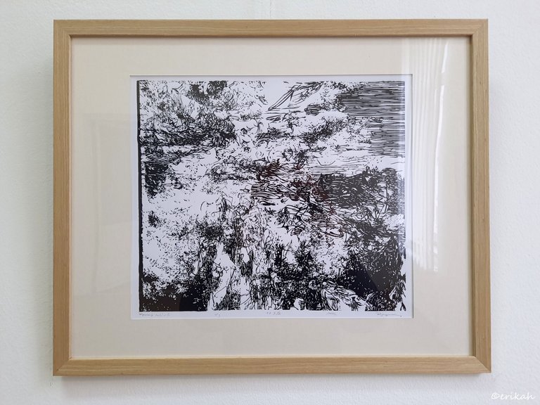
The second piece of the series, just as confusing as the first one :) Maybe I can see the river and the coast, with appropriate vegetation.
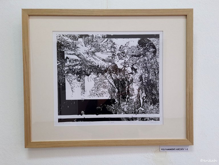
This series was a bit different from the other graphics. You can see a black frame like part on all three works, some thin, some of a more considerable size.I can see a tree in the one above, which is kind of a must when we talk about riversides.
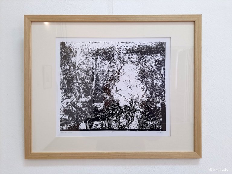
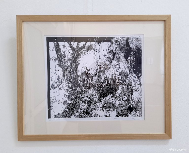
These were the last two pieces of the series. The last one is clearer in my opinion, you can see an actual landscape there, even if it's black and white.
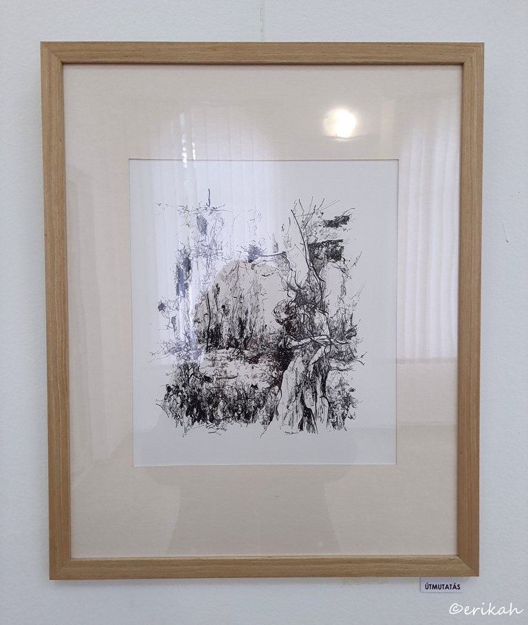
Guidance
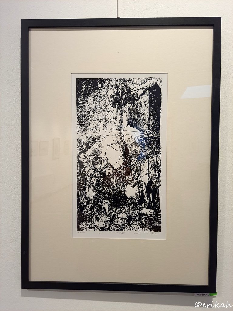
Tragedy
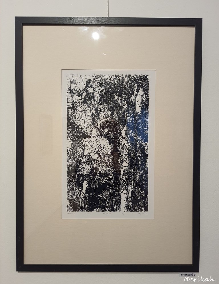
Attraction II.
Here, at first, I saw nothing. Then zooming out I saw a woman. Let's see if you can find the woman or if you can identify more :)
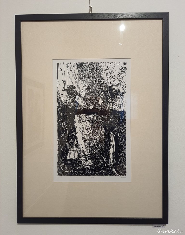
Attraction I.
I think it's needless to say, this was the most difficult exhibition to write about. This shows my lack of understanding, but I don't take it as a bad thing. It's more like acknowledging that there's room for improvement regarding my knowledge.

If you're a newbie, you may want to check out these guides:
- Communities Explained - Newbie Guide
- Cross Posting And Reposting Explained, Using PeakD
- Hive Is Not For Me
- How To Pump Your Reputation Fast - Newbie Guide
- Tips And Tricks & Useful Hive Tools For Newbies
- More Useful Tools On Hive - Newbie Guide
- Community List And Why It Is Important To Post In The Right Community
- Witnesses And Proposals Explained - Newbie Guide
- To Stake, Or Not To Stake - Newbie Guide
- Tags And Tagging - Newbie Guide
- Newbie Expectations And Reality
- About Dust Vote And Hive Reward Pool, by libertycrypto27


