A couple of days ago I asked you, how do you illustrate data? How would you present data to be visualized by the public? I showed you a few methods in my post, called Hidden Patterns. Today I'm going to show you a lot more interesting data illustration you may have never seen before.
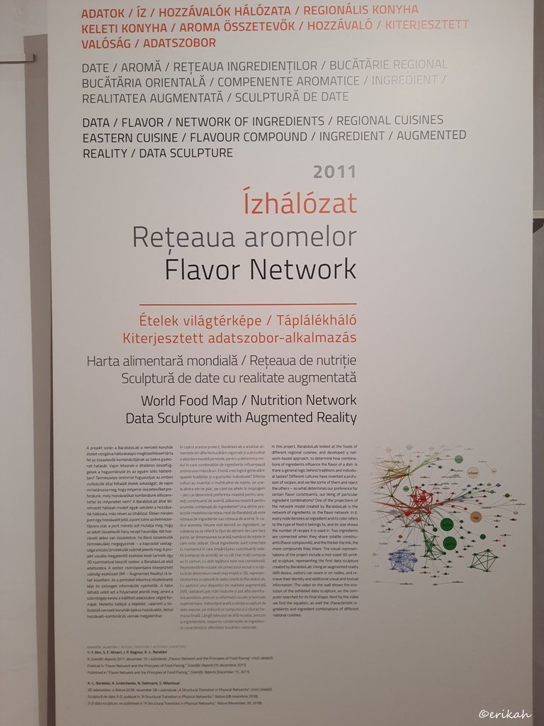
Data, flavor, network of ingredients, regional cuisines and so on.
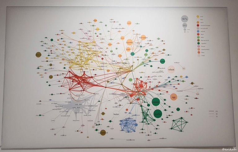
And this is how it looks like.
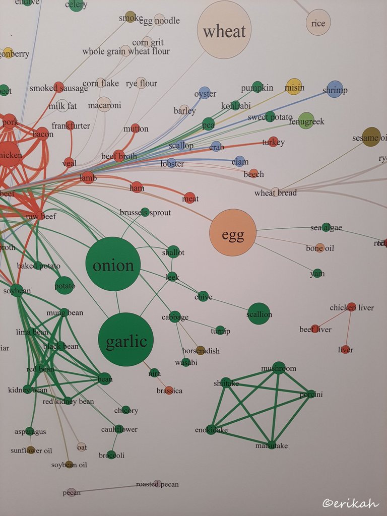
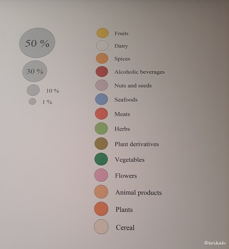
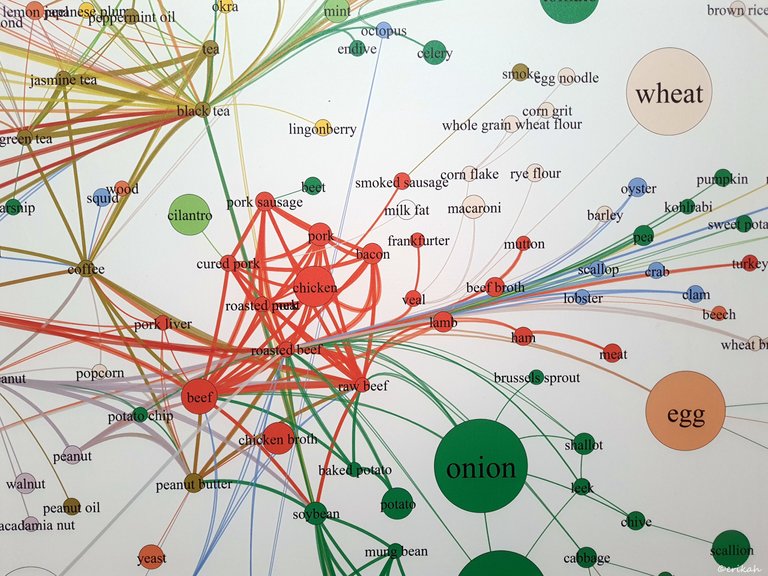
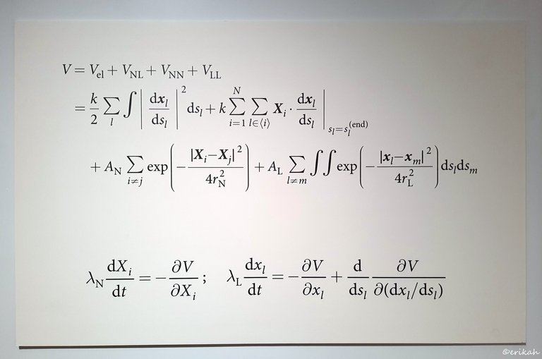
Now if you're bored, here's some formulas, to calculate, whatever these are serving for :) Looking at it now, oh God! Seems like it's been ages.
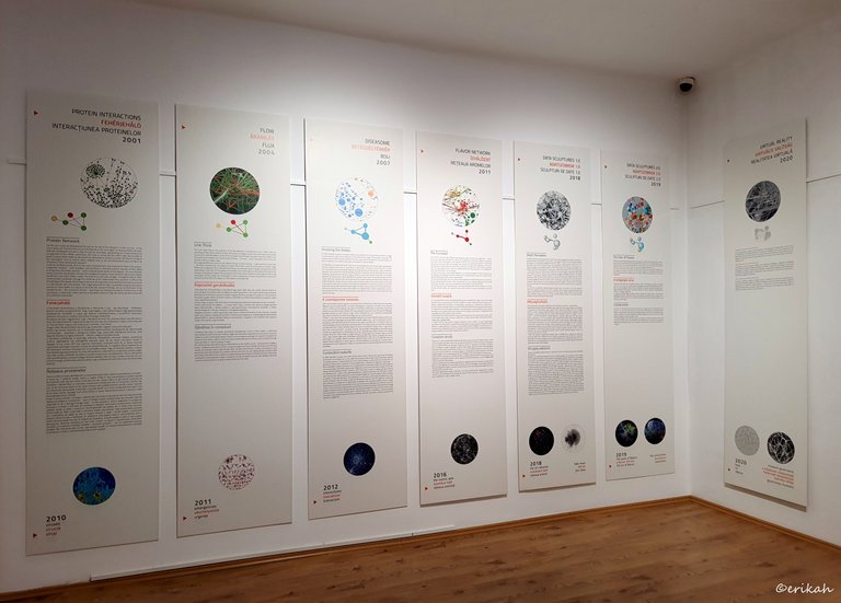
So those boards above illustrate network canons, protein networks, link thinking, knowing the nodes, curveballs, depth perception, the color of diseases, virtual reality and so on.
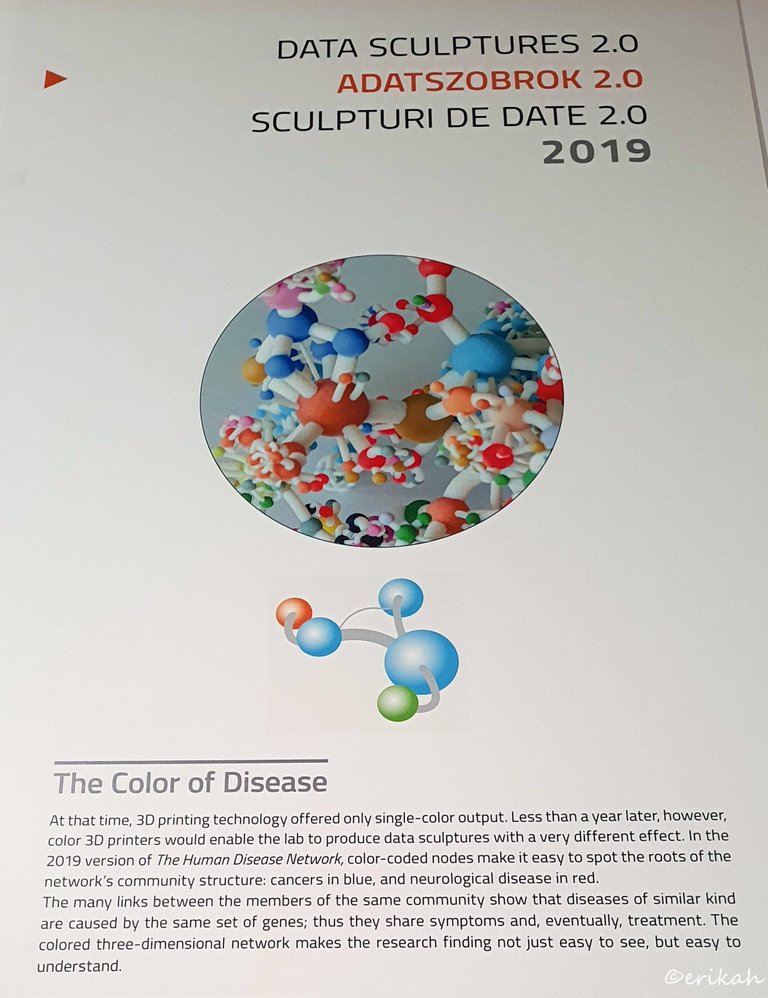
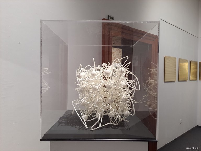
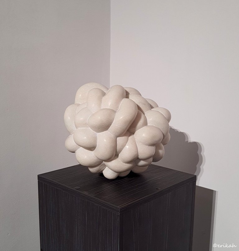
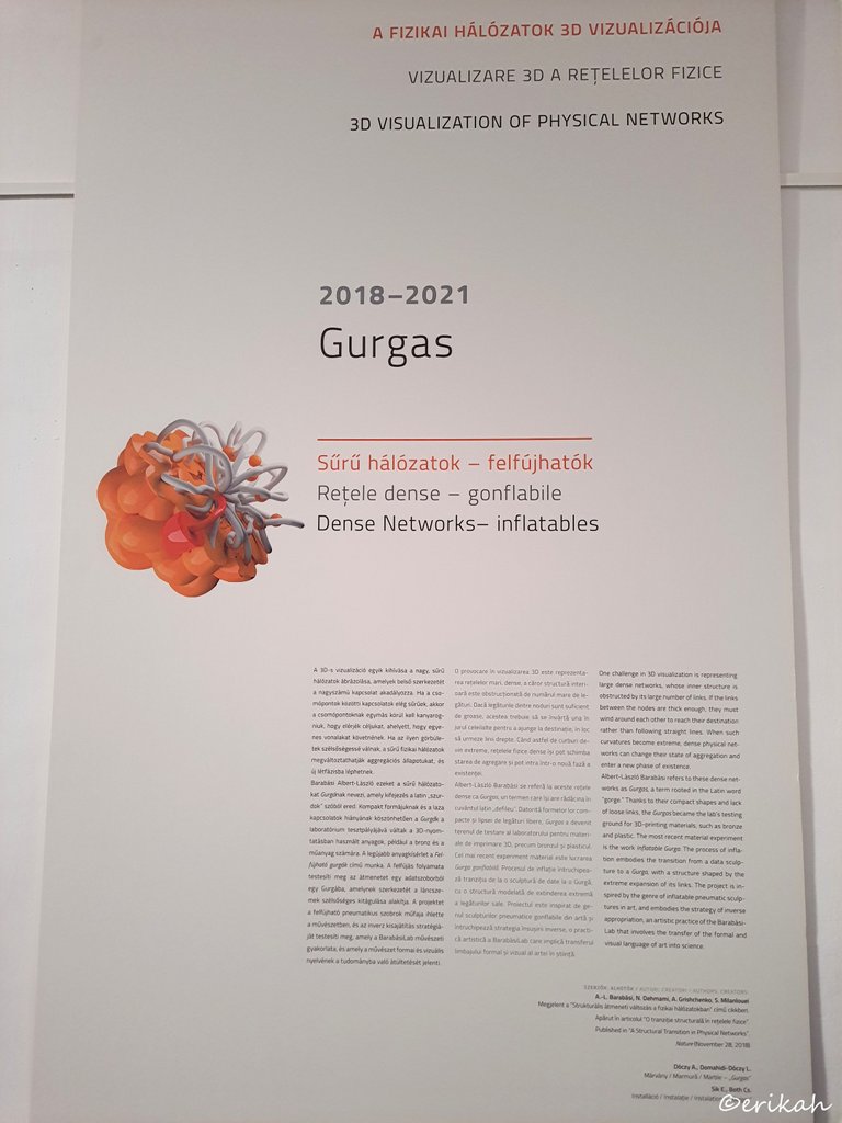
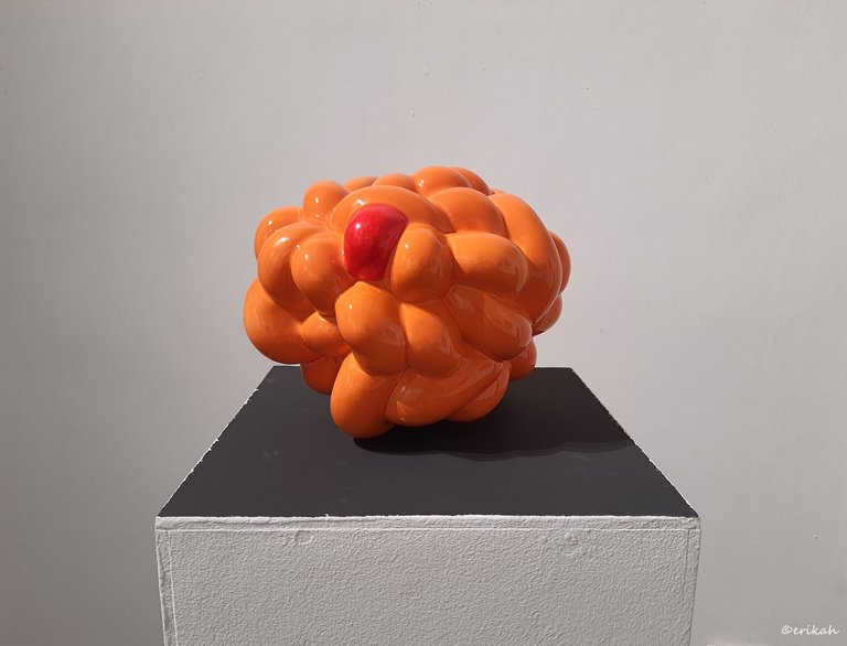
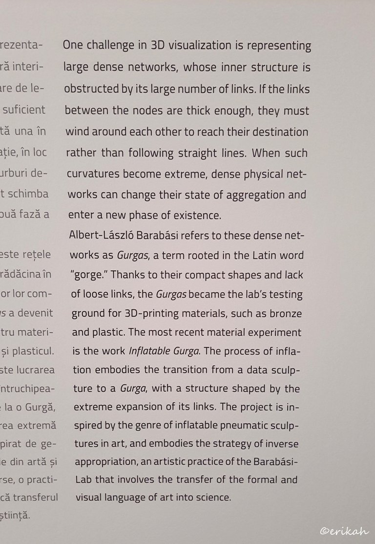
Now we're talking about data sculpture and 3D printing is contributing to that a lot. As you can see, today we have colored 3D printing which can help illustrate data.
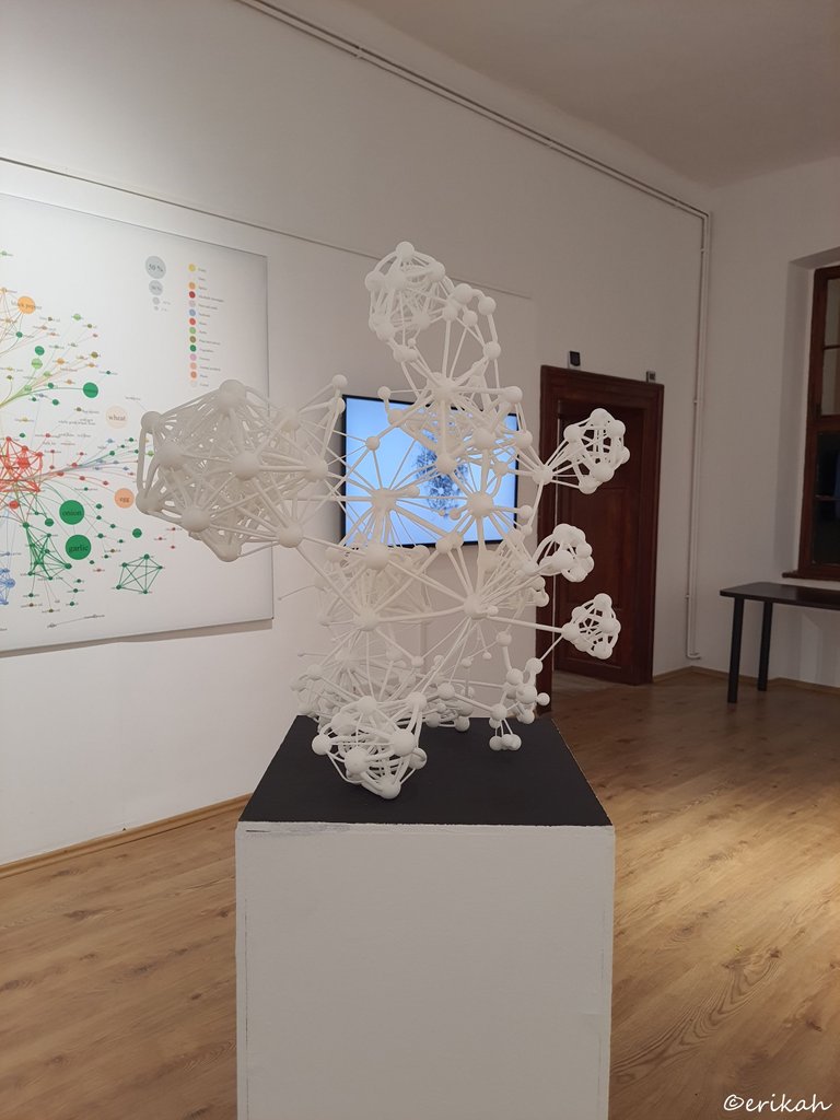
This is how 3D printing looked like before applying colors. I'm sure it's not what scientists would have wanted.
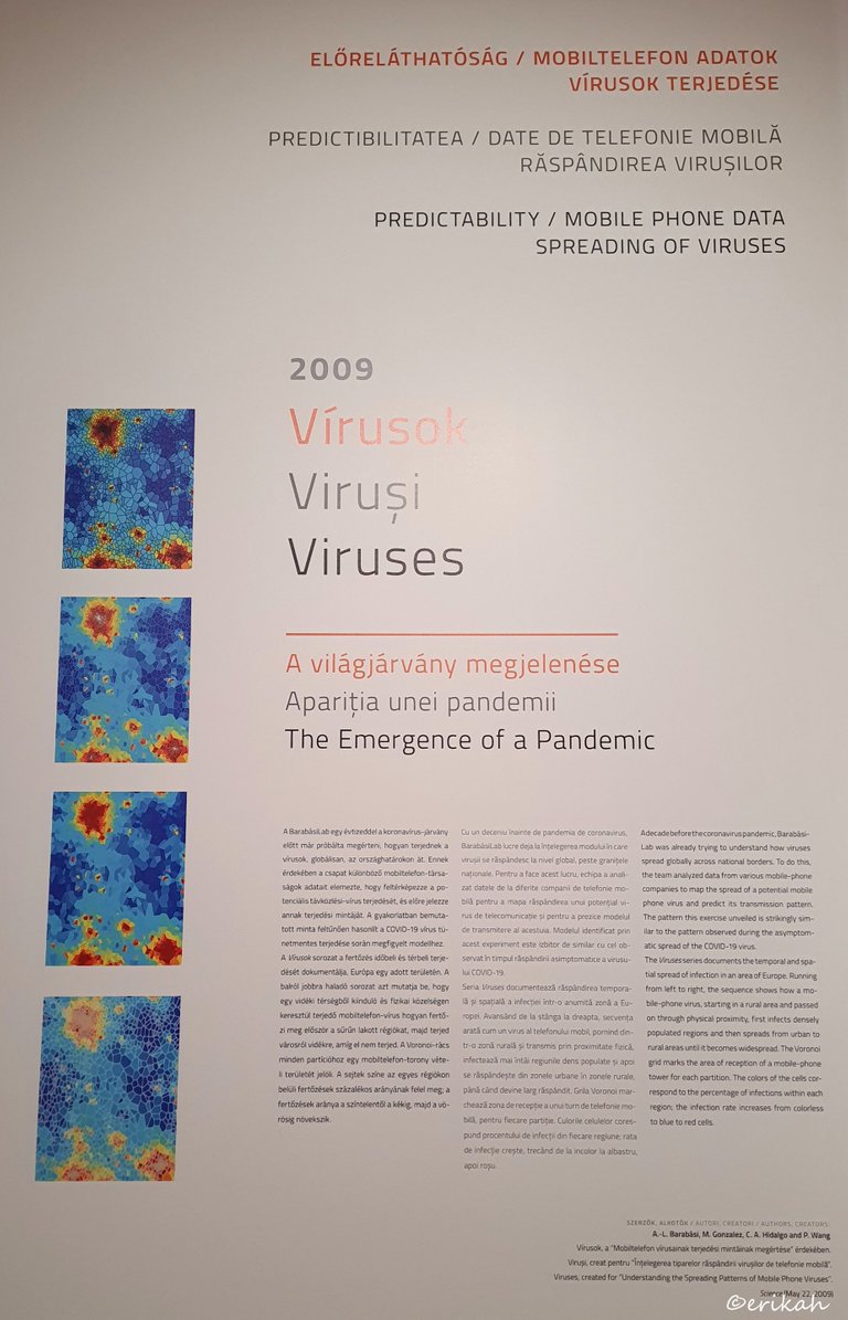
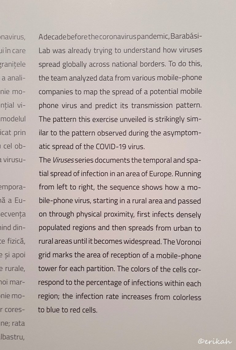
As you can see, the analysis of virus spreading started in 2009. Covid-19 is mentioned here, but please note, I'm not interested in discussing Covid, if it was real or not or conspiracy theories and so on. All the comments about Covid will be disregarded. The purpose of this post is to show you how data can be analyzed and illustrated.
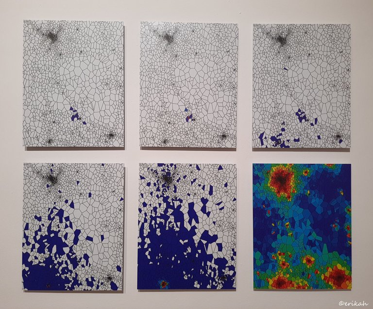
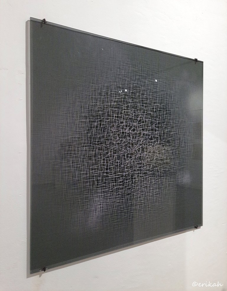
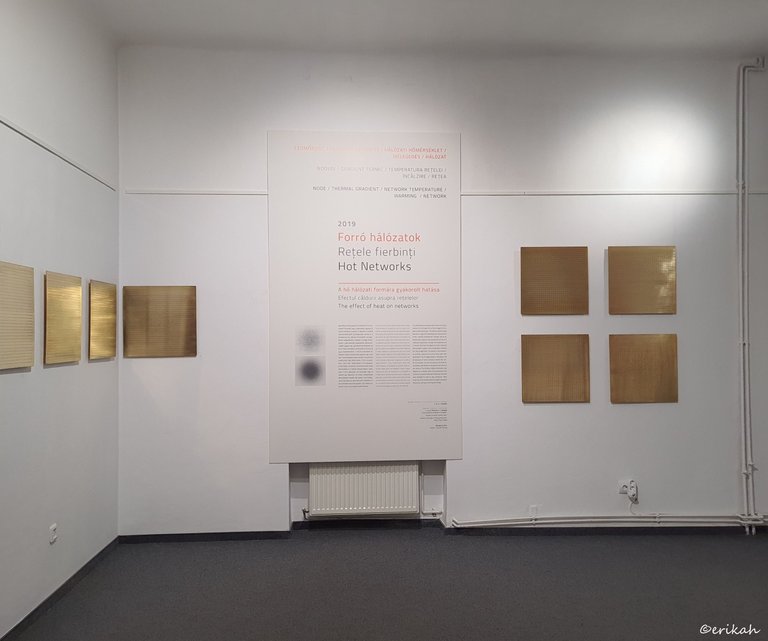
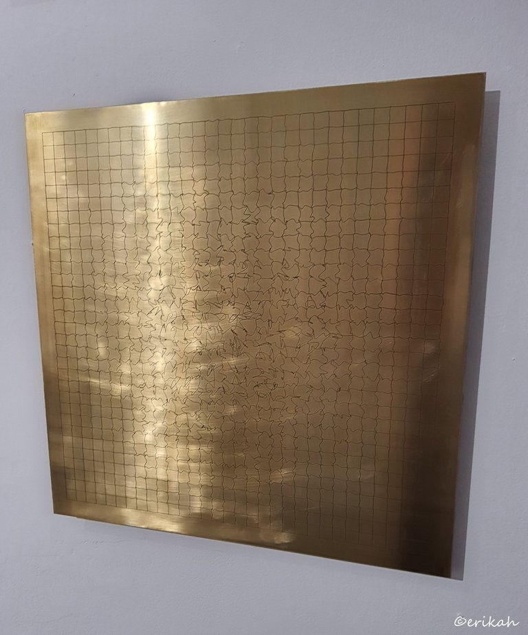
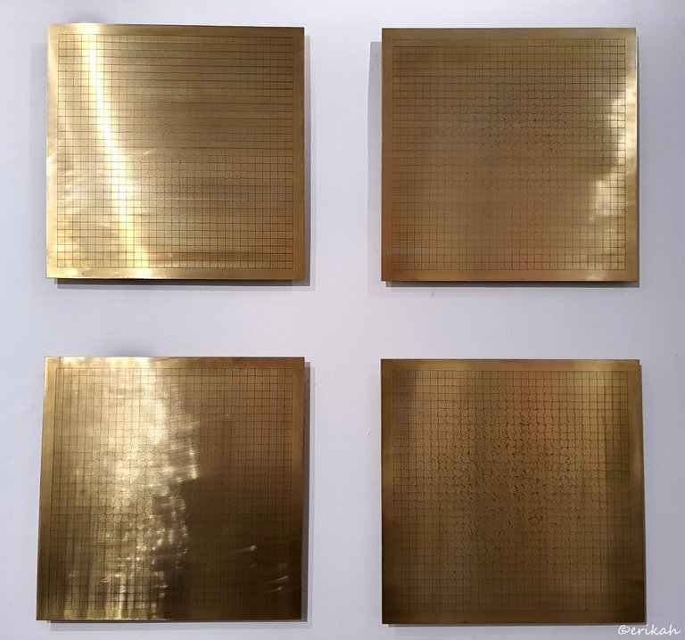
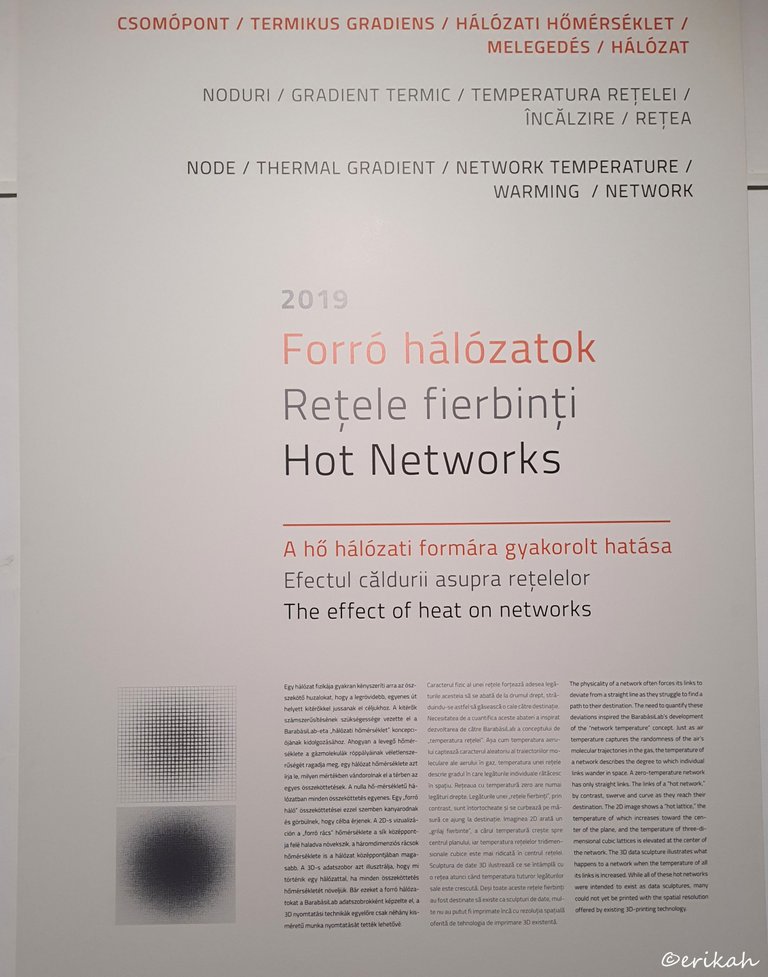
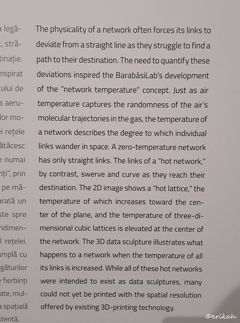
What you saw above were hot networks and the effect of heat on networks.
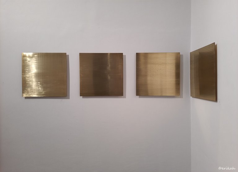
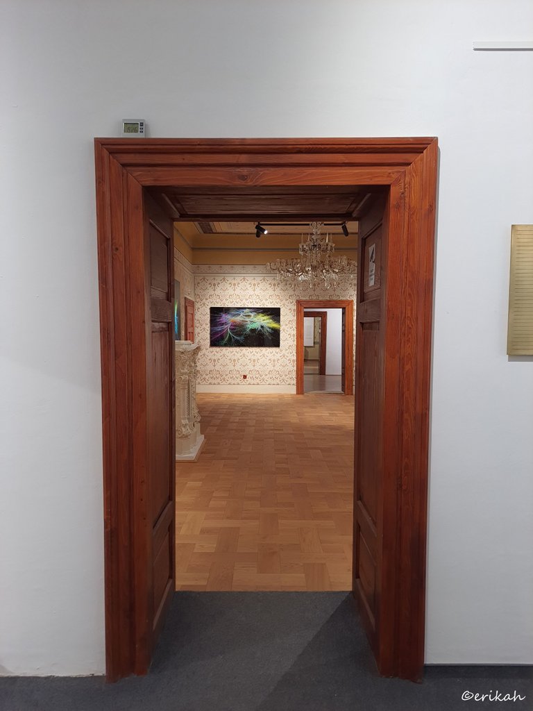
What you see in the photo above was the door to another universe.
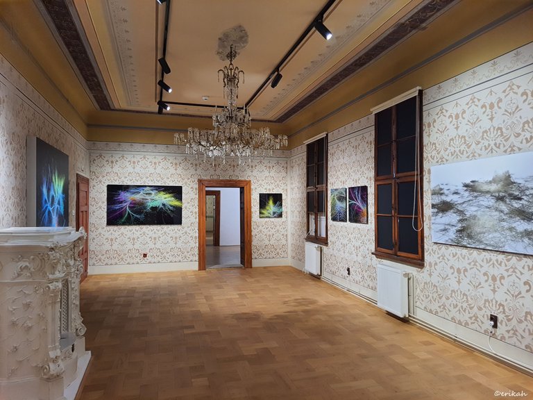
At first glance, all this looks like a mix of styles and eras. In a way it is but it's way more than that.
The room is in a building that dates back to mid 19th century if I'm not mistaken. Obviously over the years went through a lot of renovation works, but when it was given back to the city, somewhere after 1990, most of the rooms were restored to their original state and the walls were decorated accordingly.
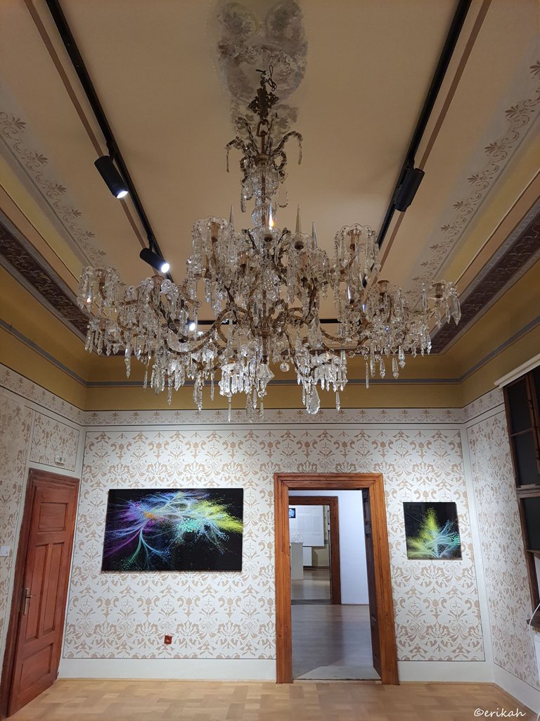
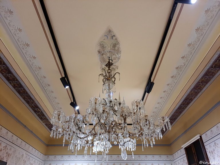
The chandelier is also a nice piece to pay attention to.
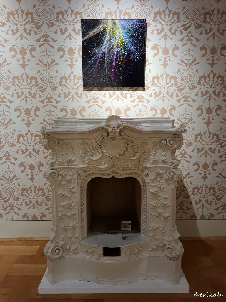
If I were to give a title to the photo above, I'd say Old & New. Look at that fireplace. A real artwork on its own, manually made as back in those days there was no mass production and there were no machines.
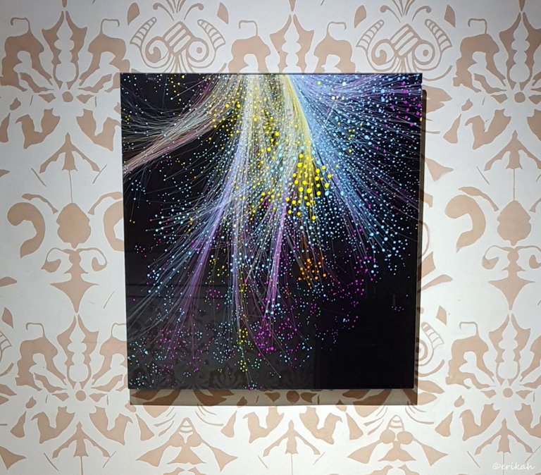
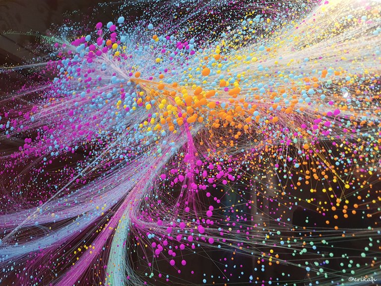
This looks like digital art, NFT maybe, and in a way it is, but this is data illustration first.
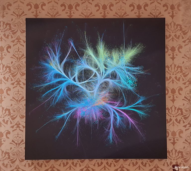
Usually I don't like too many vivid colors in one place, but this one is something to admire. The fineness of it is what I like the most. Standing there admiring it, was thinking how much people would pay for it, or maybe I'm the only weirdo who likes it.
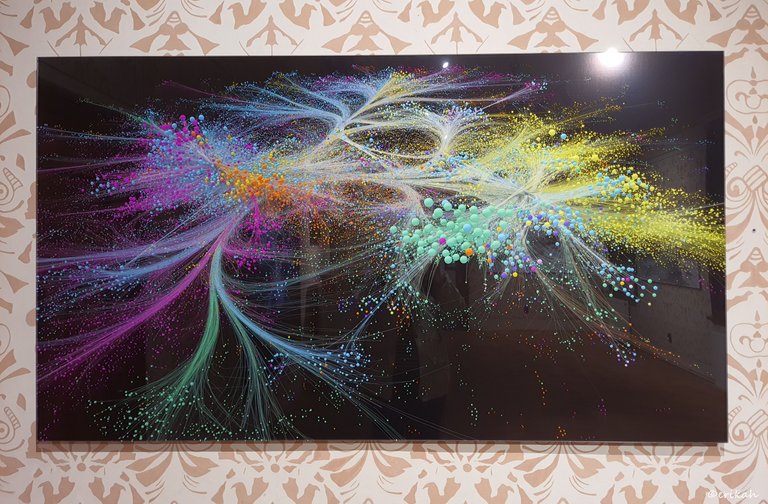
This one is just as lovely as the previous one.
This door has nothing to do with the exhibition, but I'm a huge door and window fan and I love it.
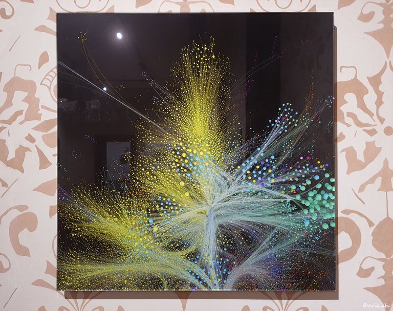
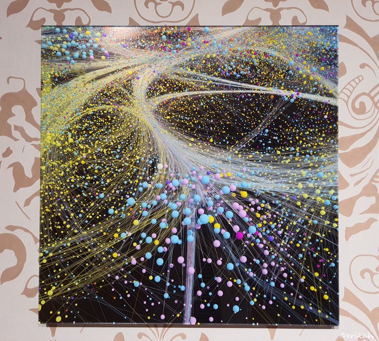
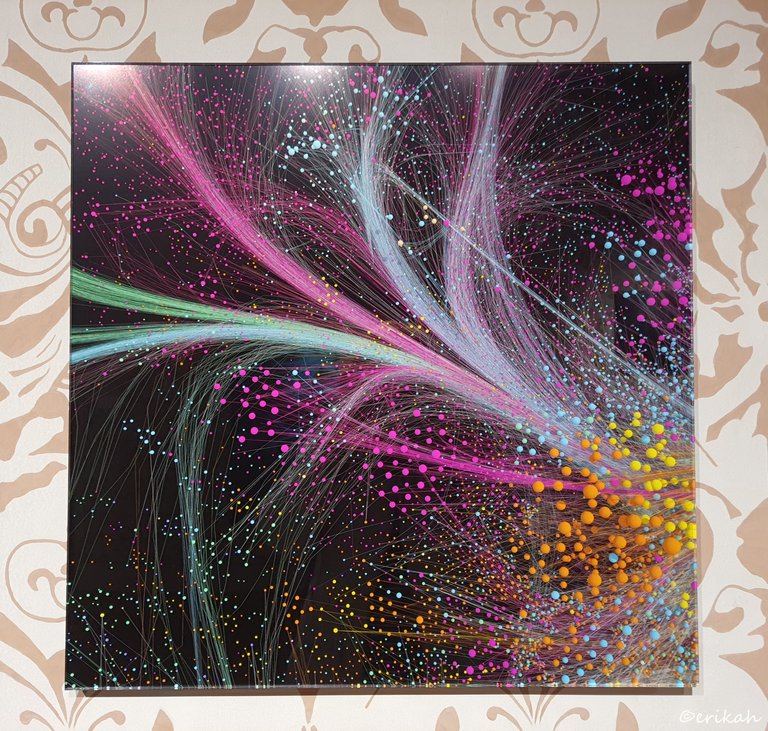
A different background would have been nicer, but since this is a historical room, repainting the walls is out of the question.
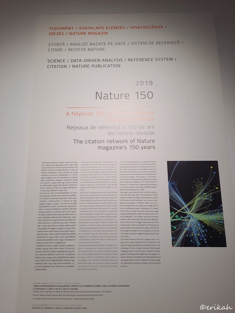
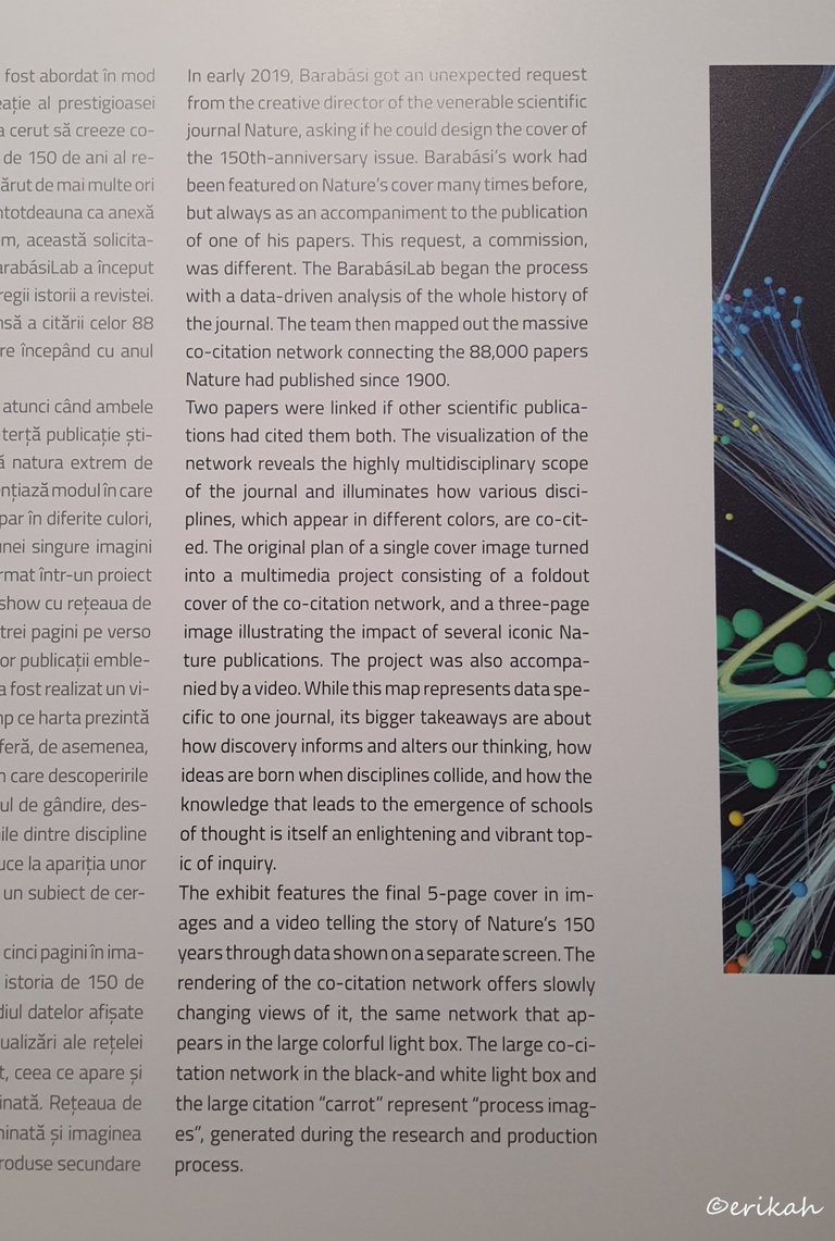
Now if you were wondering what those colorful digital paintings are representing, here's your answer. It's absolutely fascinating and I must say, hats off to the team. With technology developing with breakneck speed, I think we're going to see more astonishing representation.
It may look boring to some, but for me it was an exhibition that I will not forget easily. It's a whole new universe, many of us have no idea exists.
Have you ever seen such an exhibition?

If you're a newbie, you may want to check out these guides:
- Communities Explained - Newbie Guide
- Cross Posting And Reposting Explained, Using PeakD
- Hive Is Not For Me
- How To Pump Your Reputation Fast - Newbie Guide
- Tips And Tricks & Useful Hive Tools For Newbies
- More Useful Tools On Hive - Newbie Guide
- Community List And Why It Is Important To Post In The Right Community
- Witnesses And Proposals Explained - Newbie Guide
- To Stake, Or Not To Stake - Newbie Guide
- Tags And Tagging - Newbie Guide
- Newbie Expectations And Reality

