Good day everyone, hope we are all doing well, i must say i am really happy to be making this post because it has been a while since i posted or written anything now, i have been very busy with my new found love for User Experience and User Interface designing. I have spent the couple weeks learning and working hard to build and improve my designing skills.
So as a lover of writing i have decided to manage my two loved skills by putting both into use by writing on things i learn and put into improving my designer skills everyday so that other people can also benefit from i and maybe find motivation.
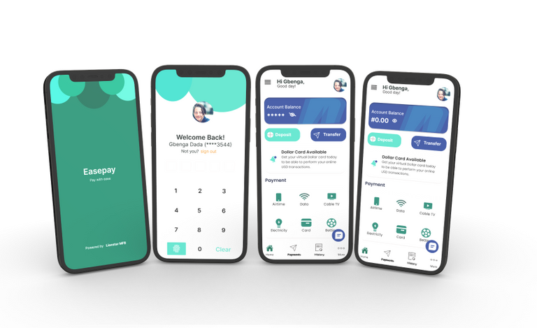
After 1 month of learning about User Experience i moved into the designing aspect which is the User Interface and after a week of learning how to use the Figma and Adobe XD tools and doing small designs, i finally decided to work on a three screen Fintech Online Banking App with simple User flow experience for user to be able to pay, receive and send money in the comfort of their home.
The first thing i did was ask myself as an online Bank app user on the challenges i face when using online bank app, i also talked with family and friends to get their opinions and complains in designing a app that will help solve their problem.
one of the frequent response i got was that most online bank have too much going on on the interface and it gets them confused while navigating the app. putting all the research response together i was able to come up with a wireframe for a app that will be about simplicity for users to carry out their day to day online banking activities.
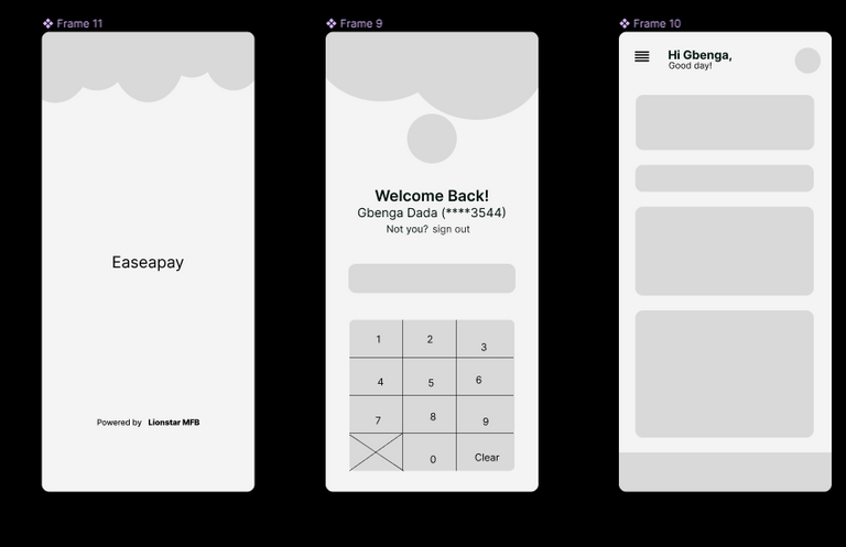
That is the quick wireframe i made to guide me on how i would be designing the app.
After that i started the designed and i started the splash screen that will welcome the user first, by the way i named the app Easepay because of the concept and inspiration behind the app.
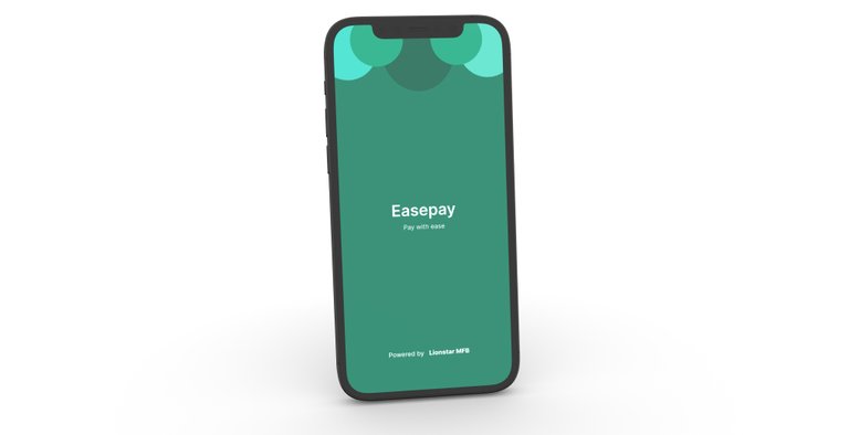
This is the splash screen for the app
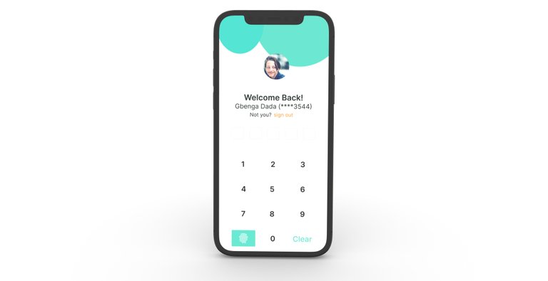
I designed the sign up and login screen next, i made use of medium and visible fonts and colour contrast so that users can be able to easily navigate their way into sign up and login to their account on the app, i also added a finger print feature for people who find it easier to user their finger print as security access.
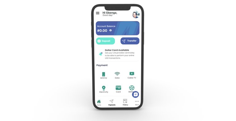
For the third screen i designed the home interface where user will be able to see their balance and also navigate through the various banking activities options available to them without feeling confused or lost. i made use of mostly blue and green colour with neutral colours like black, white and grey to blend the text in for a good user Experience.
so that was how i designed my first Fintech App using Figma, io will be sharing and updating you all with more of my projects i am currently working on, i will really appreciate to hear some advise and criticism on how to improve my skills, i am also open to work as an intern or project assistant to learn from lead designers and also render my services in return.
thank you all for staying with me, see you all next time, remember designing is all about knowing what the users need and creating designs to solve those problems and meet the needs.