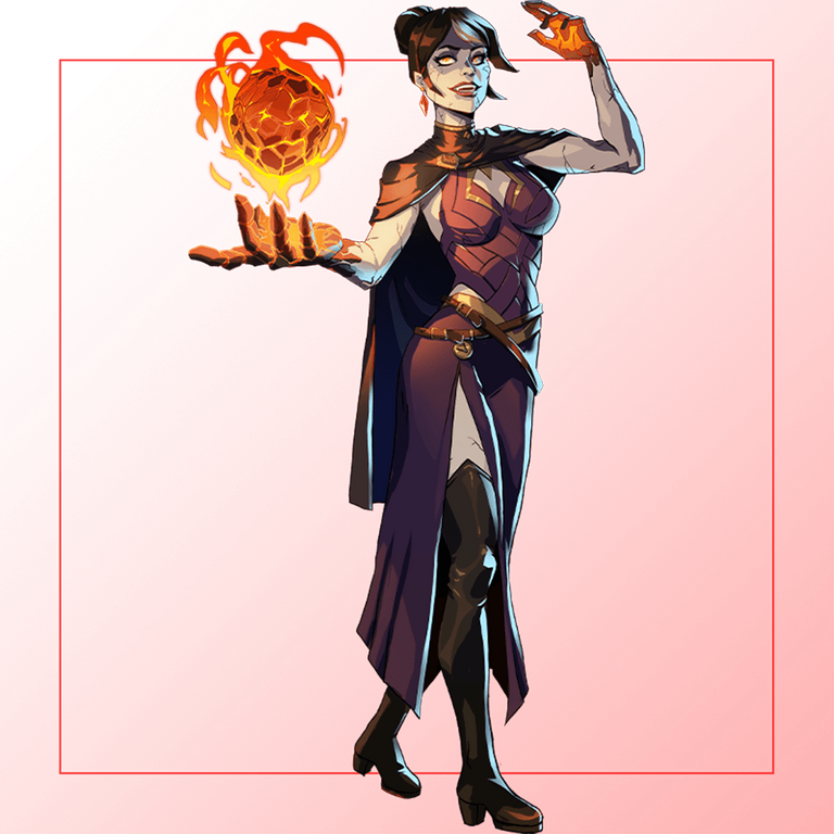
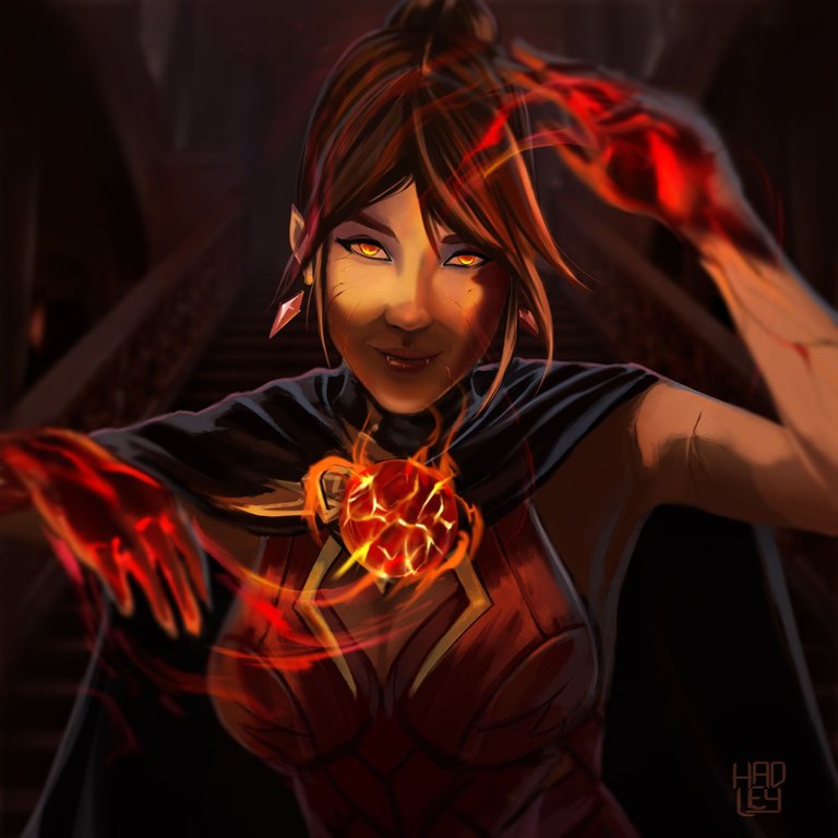
The week begins and I'm still in love with my Lunakari Mistress, so much so that I immediately started to draw a new @Splinterlands card, although this time I didn't do a full body scene because otherwise I would spend all week giving details, so this time it's more like a portrait.
What led me to draw Lunakari last week was the desire to paint magic, the magic came out of her hands, and based on that, when choosing which new card to paint I immediately decided on Countess Sinash, since her hands glowed in magma, being this the most striking element of her design and just what I wanted to paint for this week's contest.
So I also lit my hands on fire to portray this dangerous Countess.


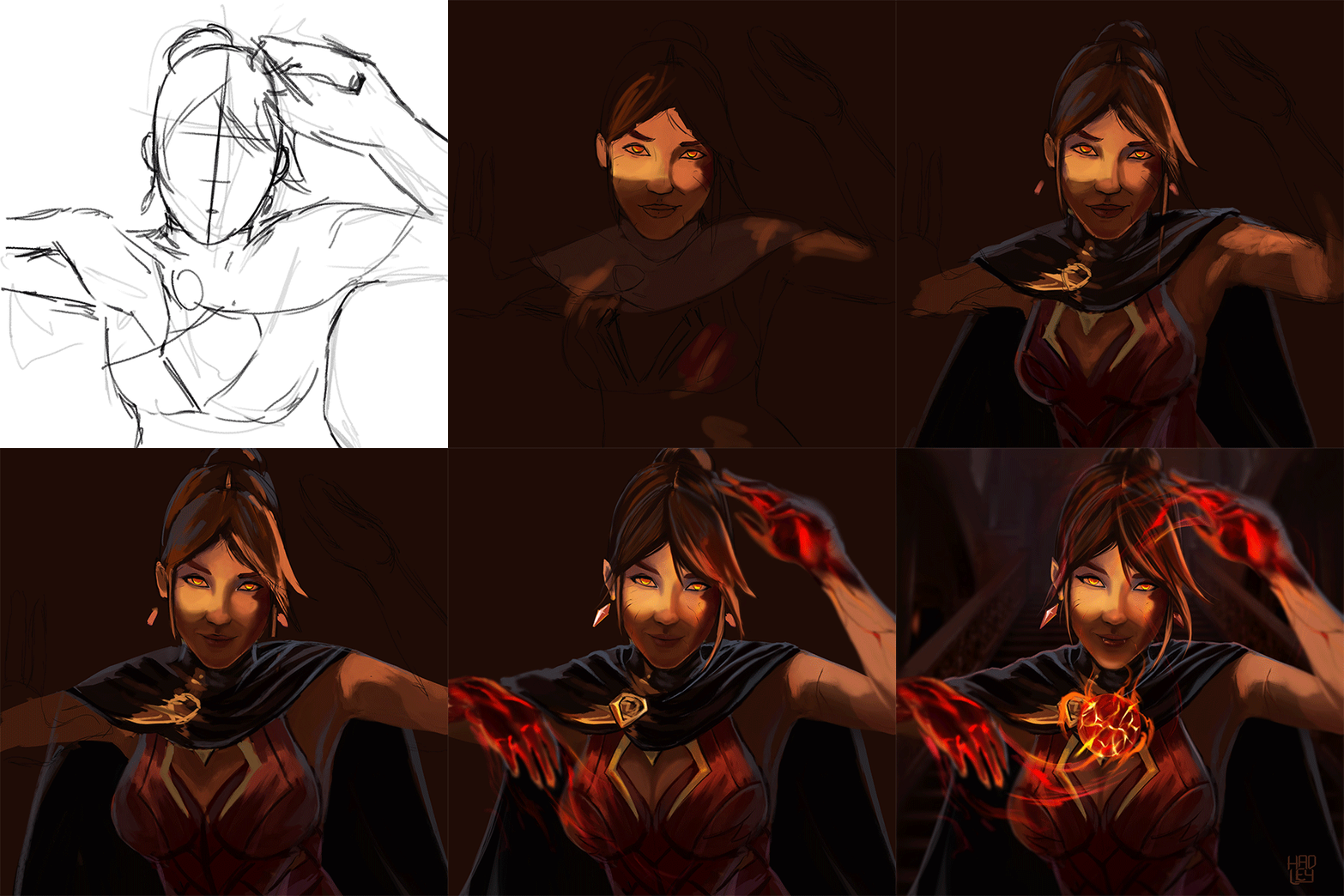
-Step 1:
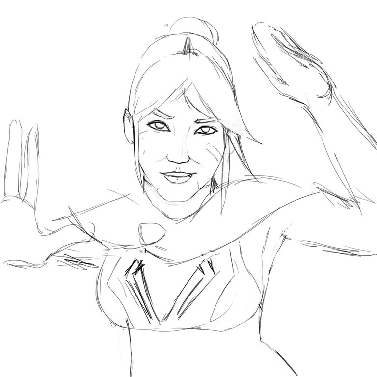
In the sketch I took care of fitting the proportions of the face and the silhouette of the character, although I managed two possible poses between the rough sketch and the final sketch, later while painting I decided that the ideal was to mix both poses.
 |  |
|---|

-Step 2:
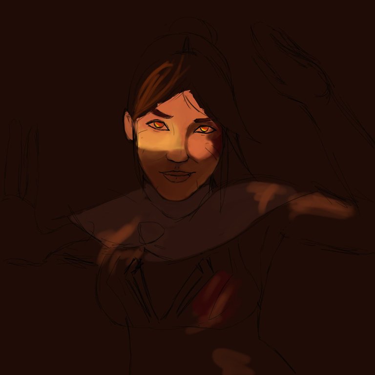
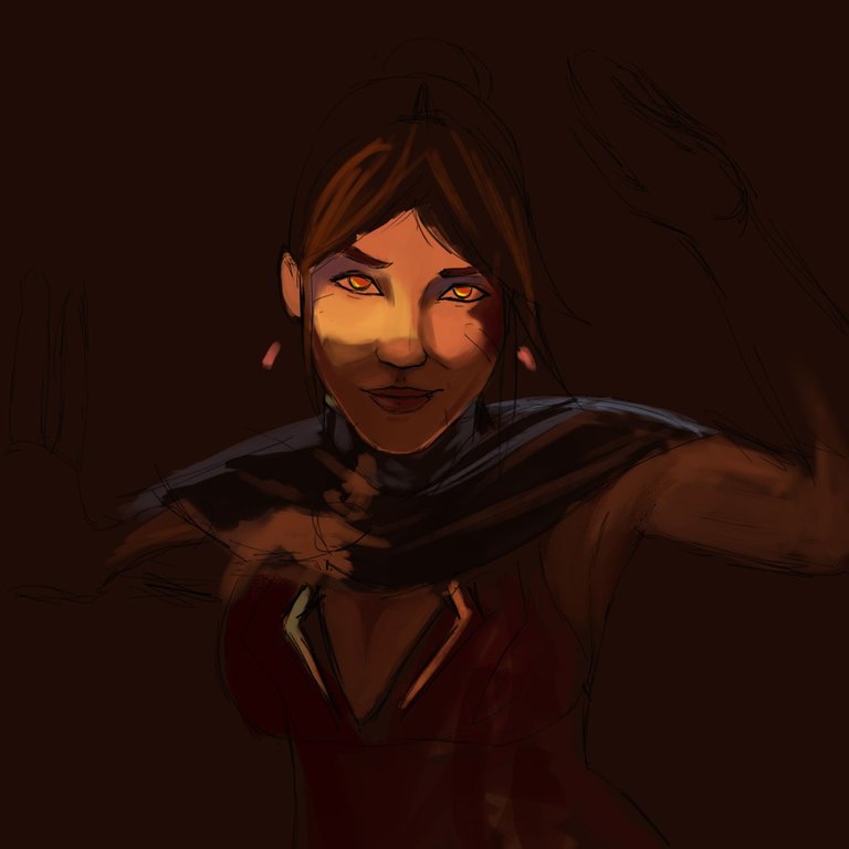
This time I wanted to try something new when painting, and this was to manage the least number of layers possible, since normally at the end of any artwork I find myself painting on layer number 70. So I decided to stay with only the 3 initial layers, one for the background, one for the sketch and right in the middle the layer where I painted the Countess. This was possible because I already had completely clear the color palette that I would use for the whole illustration.
 |  |
|---|

-Step 3:
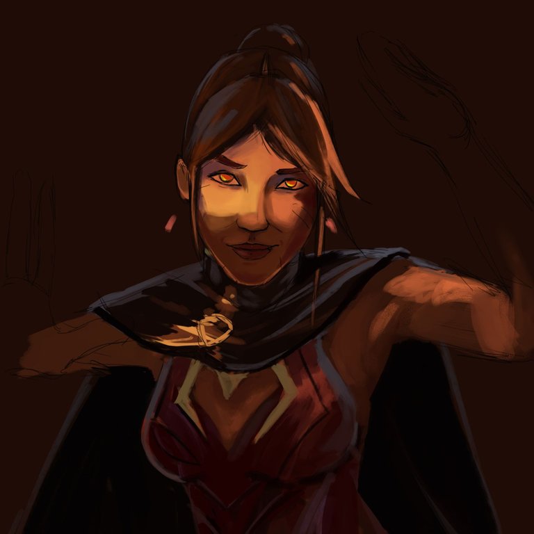
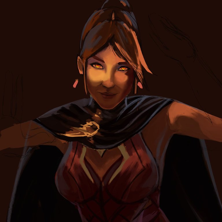
Using the background color for the shadows, I was able to define the features just by illuminating half of the face, and I was always using a brush with a strong texture to maintain harmony in the brushstrokes and thus not have any rustic strokes that clash with the art, but rather always use these rustic strokes and then soften them when I want to define an area.
In addition, I came to realize that the head was too big in relation to the chest, so to correct it, I mixed the outline of the face with the paint layer and liquefied and transformed the entire body of the girl quickly, This is something that usually takes longer when there are many layers.
 |  |
|---|

-Step 4:
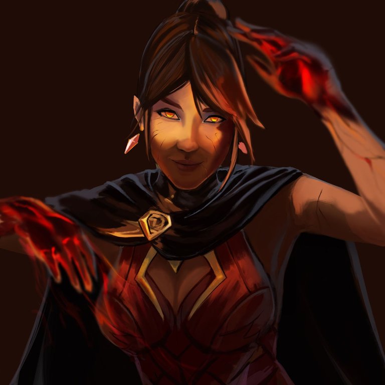
Now it’s time to create a new layer to make the arms. The reason I hadn’t painted them until now is that I wanted the spotlight to be on the face and I already planned for the hands to be out of focus, as if it were a photograph and therefore here it was completely necessary to create a new layer since to achieve this effect I had to paint the hands and then use the gaussian blur, and finally use the airbrush to make the details gently.

-Step 5:
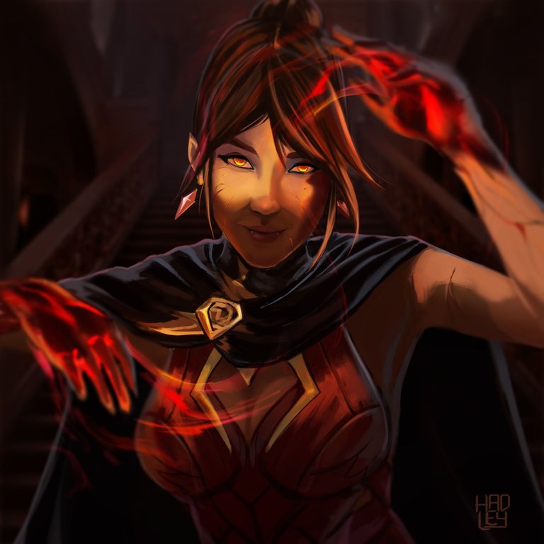
The countess was in an empty background, so I started to work on a background, and due to her title of countess, I wanted to place her inside a castle, so I added some stairs and gave them a gloomy tone since Countess Sinash is supposed to be a vampire, this is also the reason why I saw necessary to add her two fangs peeking between her lips.
I had already finished the art, but those threads of light coming out of her hands, made me decide to draw a small ball of magma floating right in the middle, this way my countess looks more like the original and I could cover the symbol of the cape, since I don't know how is her design. On the other hand now I have two versions of the character, which one do you like more with the magma ball or without it?
 |  |
|---|

I will leave you a GIF with the whole process on it, so you can better appreciate the illustration process.
Tell me in the comments that you imagine when you see this illustration.

See you in a future post!
Thank You for Supporting My Artwork
TWITTER | GHOSTMARKET |TERRA VIRTUA |NFT SHOWROOM | INSTAGRAM | FACEBOOK
⬆️ Follow ⬆️

