This is the 11th and I love it
Yes! I've already made eleven @Splinterlands fan arts, I started in April, exactly 5 months ago, which means that I've been making an average of two per month, not bad, but it could be better.
But I've been trying to do the best I can in each fan art, beyond the contest, I've taken this as a challenge of artistic growth and I've enjoyed it, there have been ups and downs but it's been great, I've just done last week a fan art of Zintar Mortalis that I didn't really like and I just finished this one that I LOVE SOOOOO MUCH!
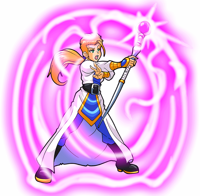
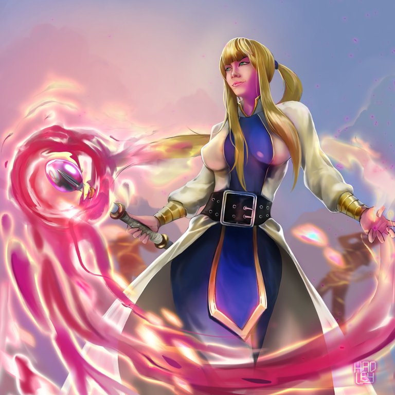
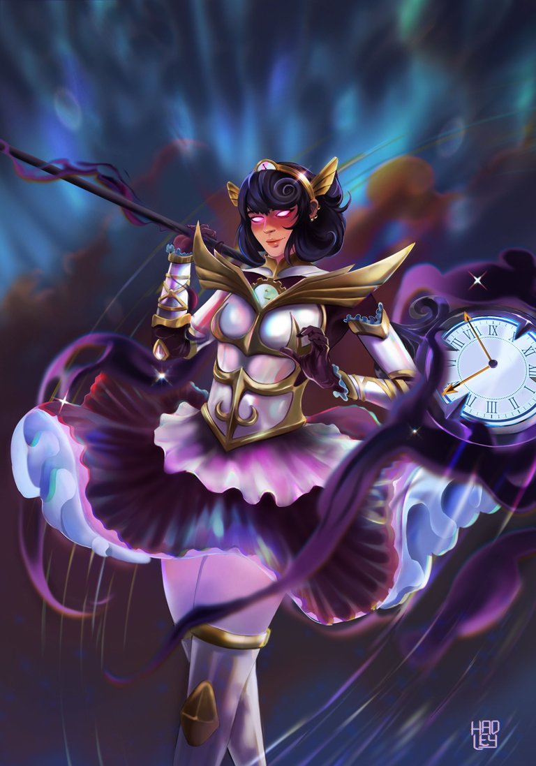
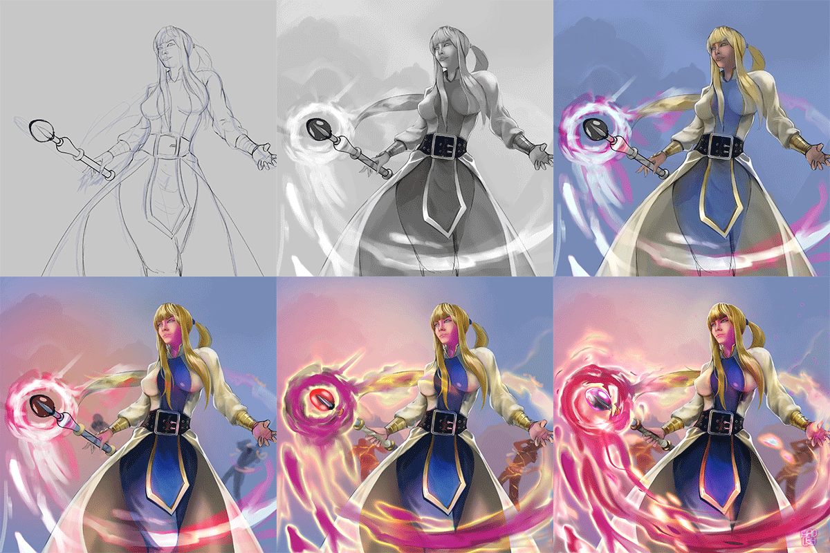
Today I present to you the Divine Sorceress, who more than a warrior is a very resistant woman, she can withstand absolutely everything, but she is not only here to resist blows and torture, no, she is powerful enough to defeat her captors and fulfill her role as a spy and to escape to complete her missions, definitely this is a very hard job and that is why I have given all of me to portray her in her greatness and power.
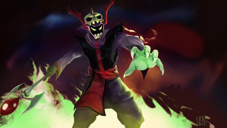
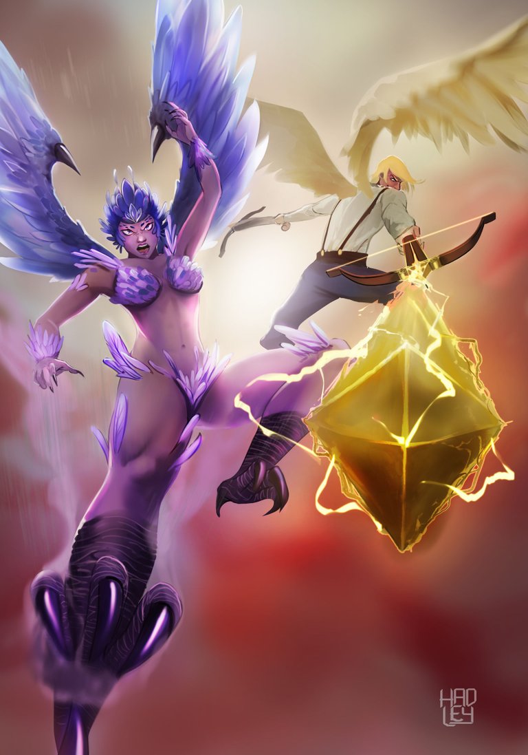
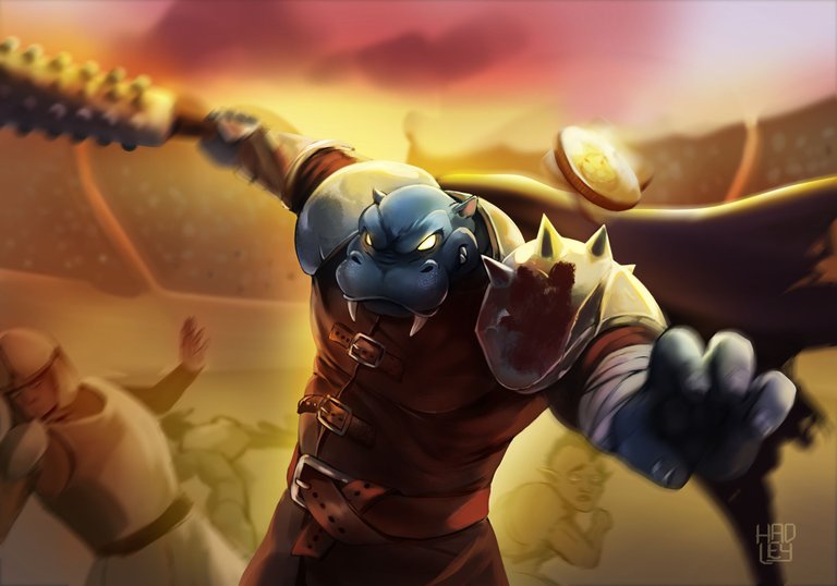
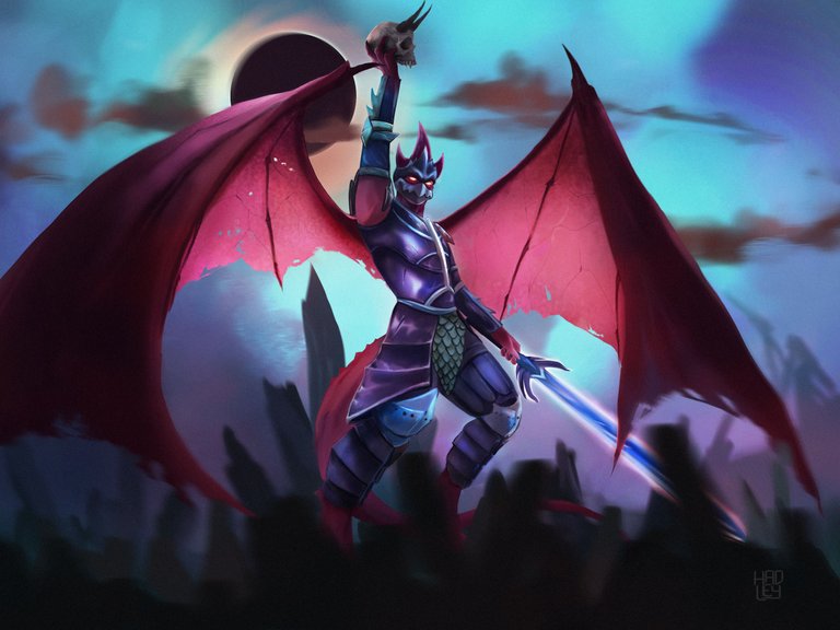
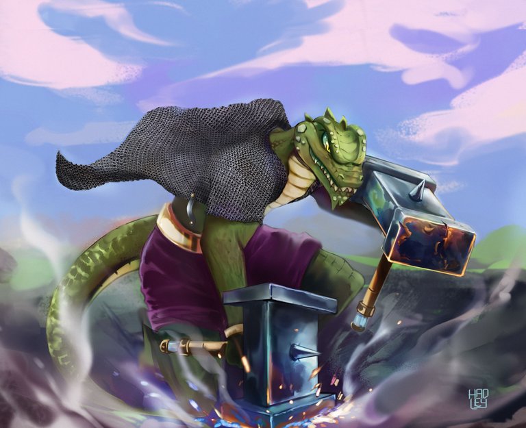
But before we move on to the step by step, take a look at all the fan arts I've done so far for Splinterlands and please tell me which one is your favorite one.
 |  |  |  | 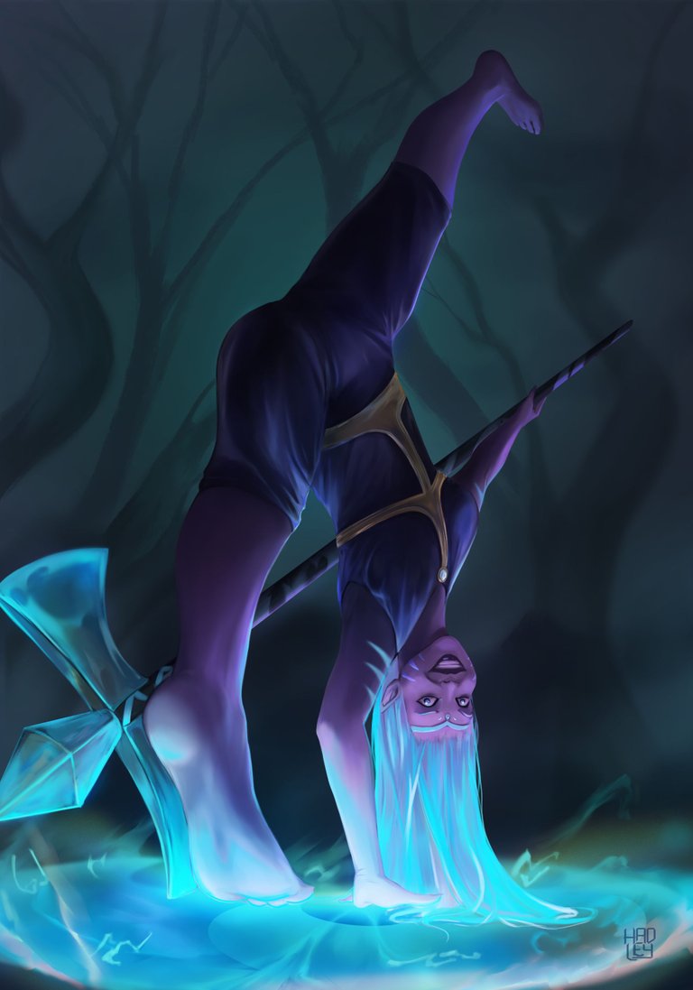 |
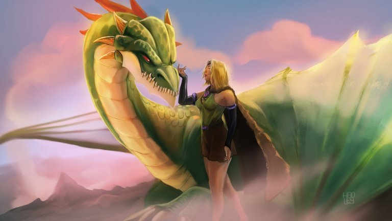 | 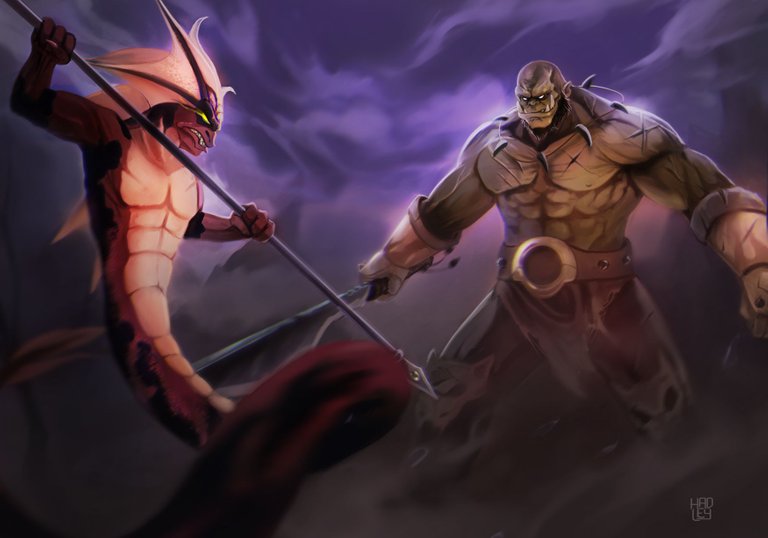 | 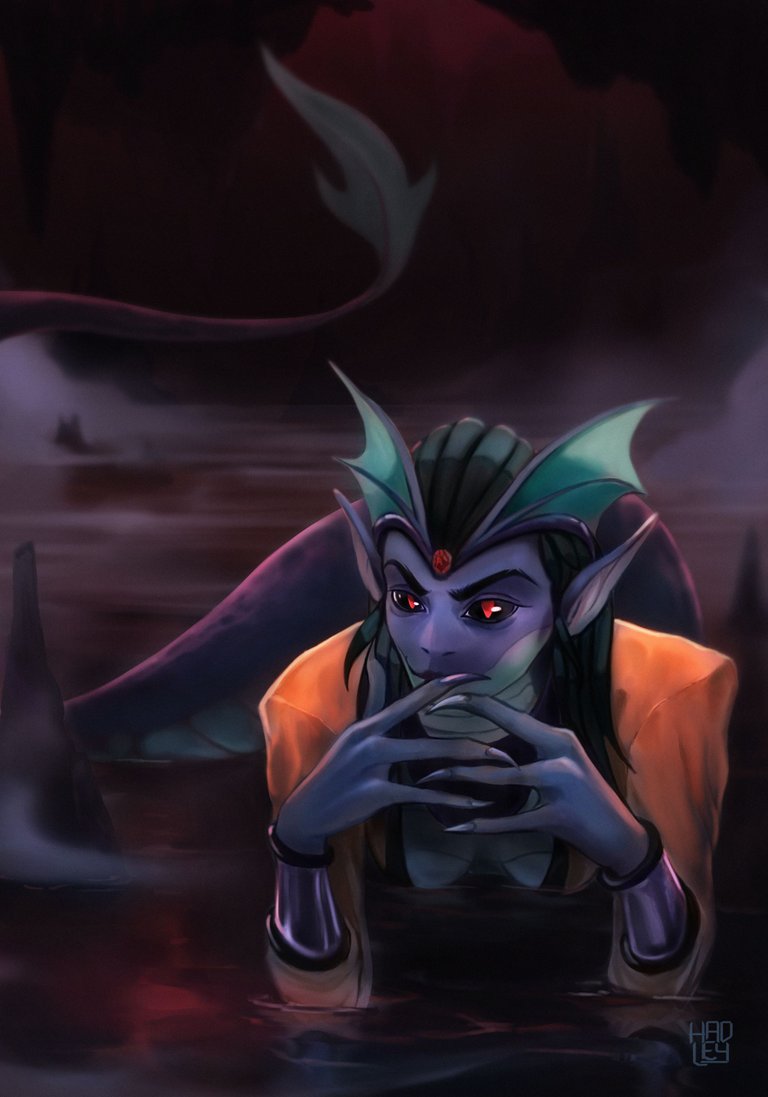 |  |  |


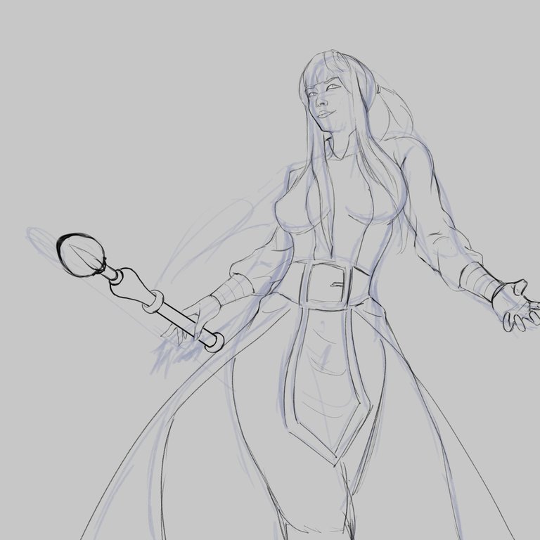
-Step 1:
And what should be done at the beginning? of course the sketch as usual, imagining that the camera is from below and she is in all her splendor and magnificence.

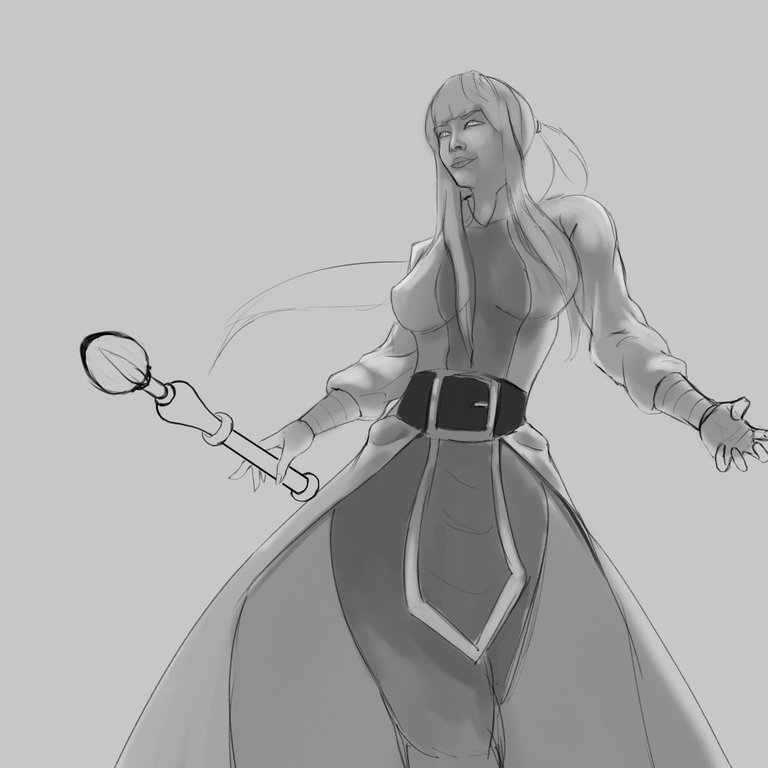
-Step 2:
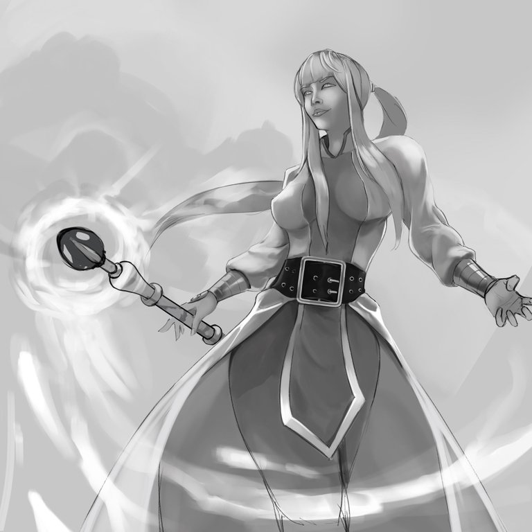
And of course I have detailed in grays to get volume and go correctly designing each element of the sorceress clothes, I especially liked to make the waist strap, it gives a special touch to her outfit.
 |  |
|---|

-Step 3:
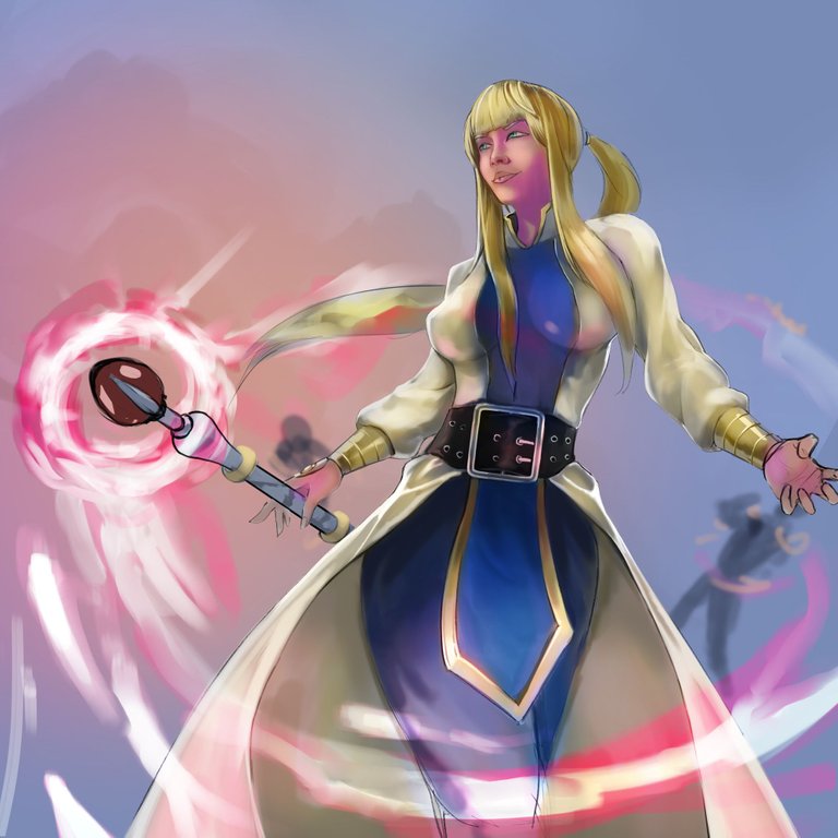
Using the blending modes "overlay", "soft light" and "color" I added the first base color layer to the illustration, of course following the color palette of the original design, although I have taken the liberty to change the hairstyle of the sorceress, although clearly there is not supposed to be only one sorceress, so the best way to differentiate them would be by their haircut.


-Step 4:
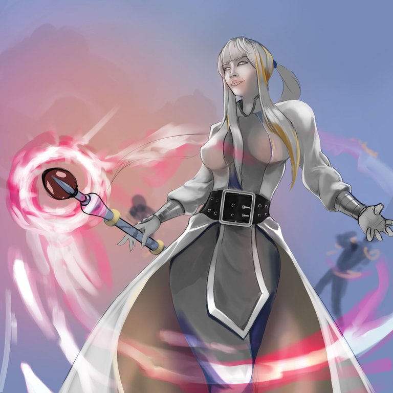
Just before starting the illustration, I have seen a speedpaint of Bon Chen, a magnificent artist that I admire, and based on what he does, I have put more effort in the details, his video lasts an hour and he spends almost 40 minutes detailing more and more every inch of his scene and it is really impressive to see, so in each new layer I have been adding small details, and a sample of this is the image in gray with a little color, because what I have done is to disable almost all the layers and just leave the gray and the new layer with the details just made to show it to you.
 |  |
|---|

-Step 5:
Something I haven't mentioned so far, is that I wanted to take a risk and try the shading of the skin in an uncommon color, something I usually don't do but it has turned out phenomenal, and I have seen this type of illumination in the Splinterlands cards and I was curious to try it.
And in case you are wondering, the way to make the magic more shiny is to add the outer glow effect, and I thought it was a good idea to do a combination of pink and yellow glows, since the main color palette of the artwork is a triad, which consists of three opposite colors on the color wheel, an excellent way to combine colors to have greater visual impact.
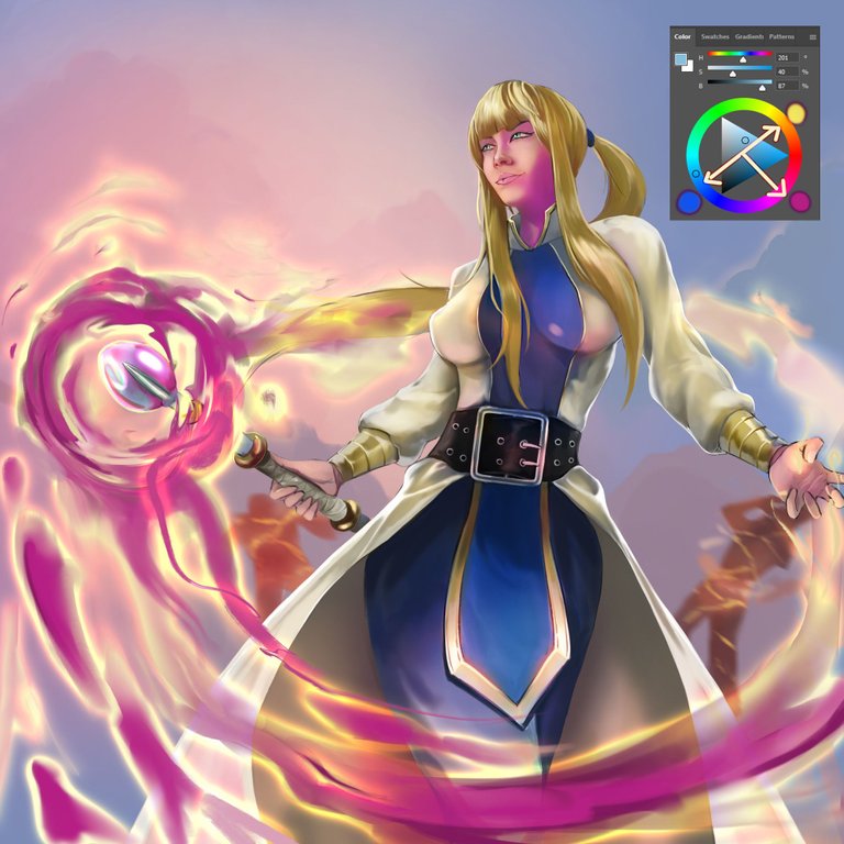

I will leave you a GIF with the whole process on it, so you can better appreciate the illustration process.
Tell me in the comments that you imagine when you see this illustration.

See you in a future post!
Thank You for Supporting My Artwork
TWITTER | GHOSTMARKET |TERRA VIRTUA |NFT SHOWROOM | INSTAGRAM | FACEBOOK
⬆️ Follow ⬆️

