Is there an art contest, and you doubt I'll participate?
Hello Hivers, it's been a while since I was invited to participate in an art contest (which I absolutely love, and you all know it), but I had been putting it off until now to make something great for this game. You also know that I like to give my best because I'm aiming to increase my artistic level and hopefully become a pro one day.
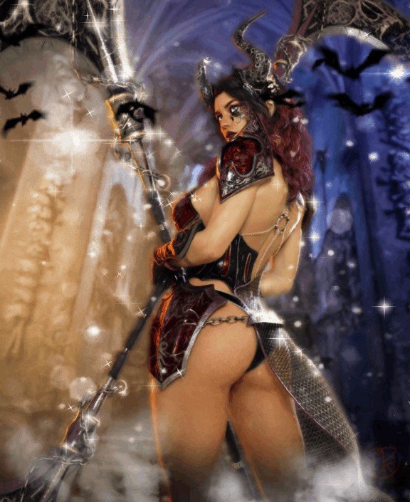
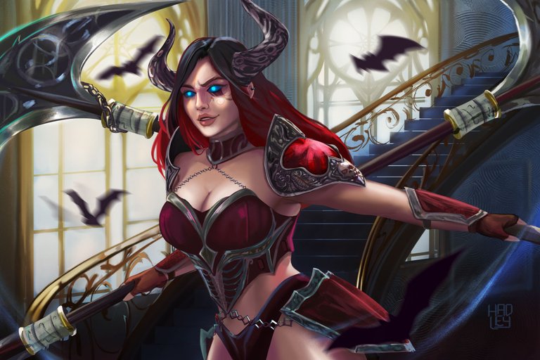
Alright, this contest is about Radaquest, a web3 game that I honestly don't know much about, and I've kind of gone in blind to participate in its contest. I'm not going to lie to you about that. But what I can tell you is that I've taken a long look at their characters, and I really liked the design. So, I went all out to make this fan art. This is Yelia, a warrior with very little clothing (had to say it), and in my opinion, she wields a pair of what I believe are double-edged spears/axes. These are weapons she must handle with great agility and skill, bringing death to those who challenge her. These are just my assumptions, so if anyone knows of a wiki where I can read more about the characters and their lore, I would be eternally grateful.

⚔️Play Radaquest Now❕⚔️

-Step 1:
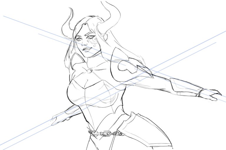
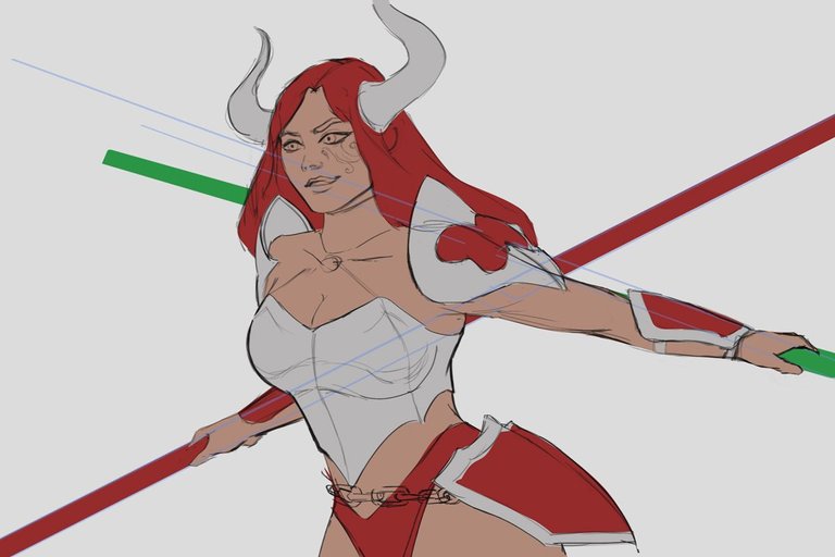
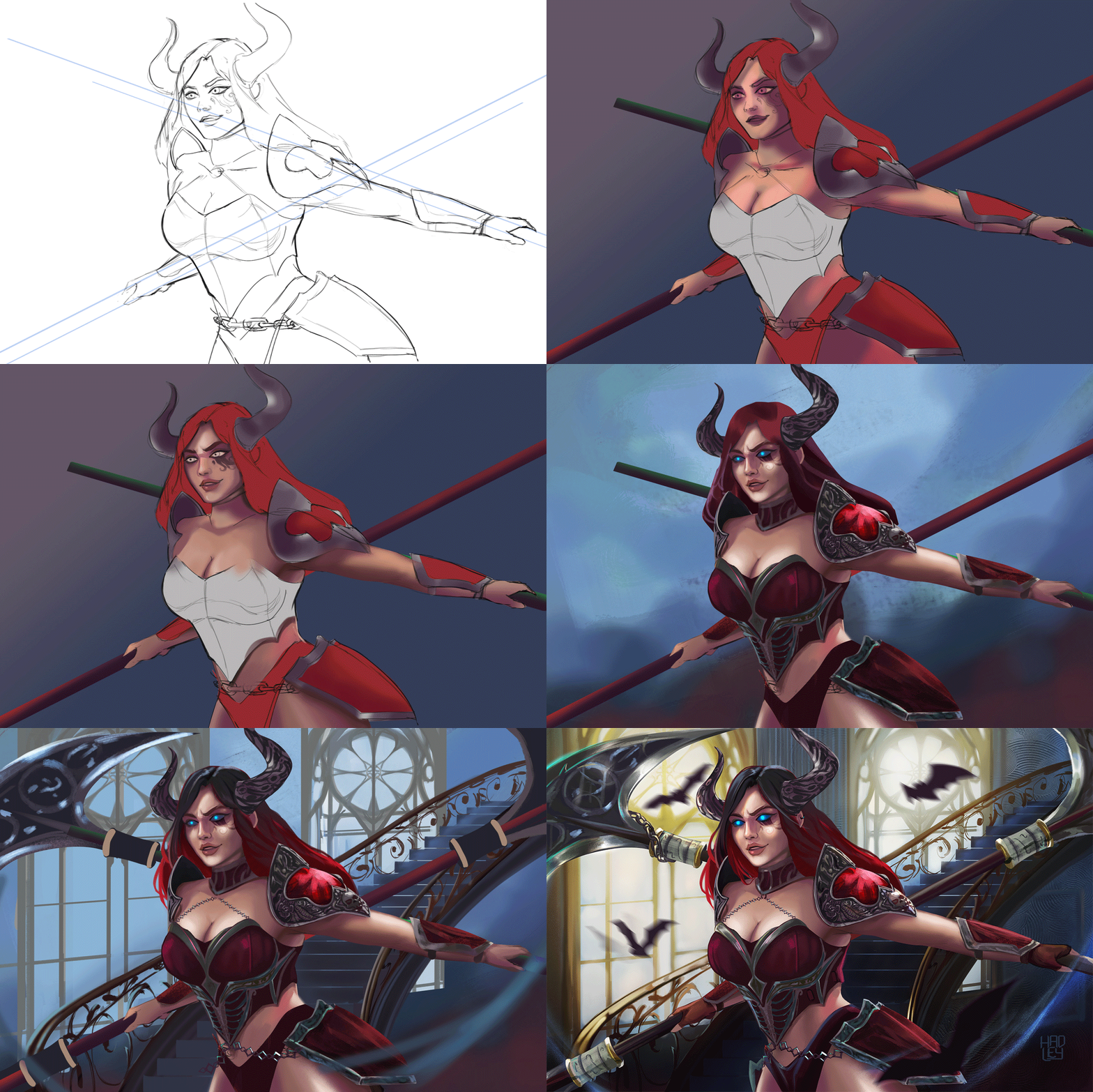
Of course, I started by sketching the character, focusing on capturing her corset, which is the major piece of clothing, but also a dynamic pose where she can handle both weapons without it seeming like their size would make them uncomfortable to attack with.
Once the sketch was ready, I used the pen tool to outline the shapes of each of the character's elements. This helps me maintain order within my PSD file and thus achieve a better workflow.
 |  |
|---|

-Step 2:
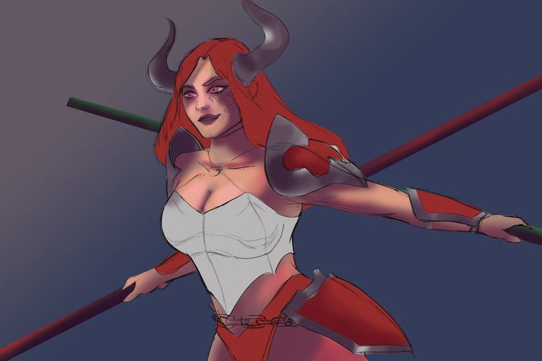
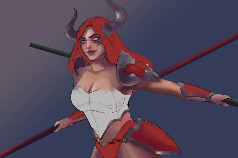
I wanted the environment in which the scene takes place to feel cold, so I used a violet color to shade the skin and desaturated blue tones for the background. I don't usually maintain the outline in my paintings, so I painted over them to cover them and give Yelia's face a better shape.
 |  |
|---|

-Step 3:
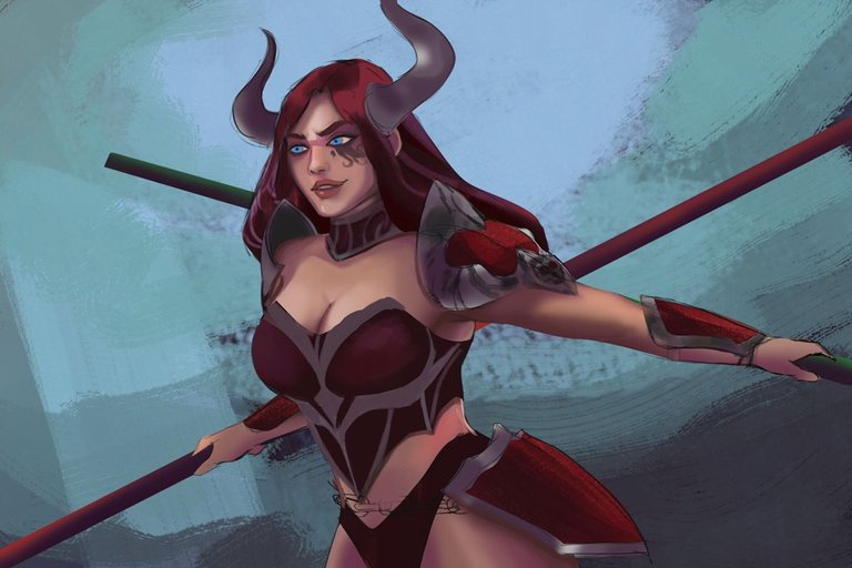
Something very noticeable in Yelia's design is the amount of detail in her armor. From the reference image, I couldn't capture and reproduce them exactly as they were, so I had to improvise and draw a bit from my imagination and other references to create something eye-catching that fit the character. However, what couldn't be omitted was the skull on her shoulder pad; that seems to me to be one of the most distinctive features of the character along with her horns.
If you watch the gif with the entire process at the end of the post, you'll see the changes made to the character's face. This illustration took me many days, which made me rethink Yelia's facial structure. With each iteration, I leaned more towards realism. However, I decided to give her that unique touch with her completely blue eyes since I had been trying to fit her light blue pupils with the overall red of the character, and I was never quite satisfied until now.
 |  |
|---|

-Step 4:
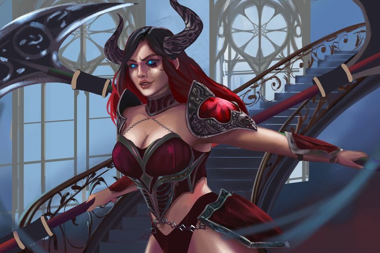
To add more detail to the scene, I opted for the interior of a kind of castle. So, I started building a staircase just behind the character, and some windows further back. This way, I had three layers of depth to build a good composition that would denote depth and not feel uncomfortable to the eye having the warrior in the foreground.

-Step 5:
Once all the elements were in place, it was time to render the scene. So, I dedicated a considerable amount of time to improve the lighting of the staircase and add more details to the wall and the windows in the background. I added more brightness to them using the "color dodge" blending mode, which immediately made the character stand out from the environment and become the focal point, directing the viewer's gaze directly to the blue of her eyes. Finally, I added details to the leaves of her weapons. Here, I also didn't know how to reproduce the marks that appear in the original illustration, so again I had to improvise until I achieved something similar and eye-catching.
And the icing on the cake had to be the bats flying around her because they were everywhere in the original illustration, and I didn't want to be the one to forget about them. Besides, they looked spectacular with the motion blur, turning them into black blurs in front of the windows full of light.

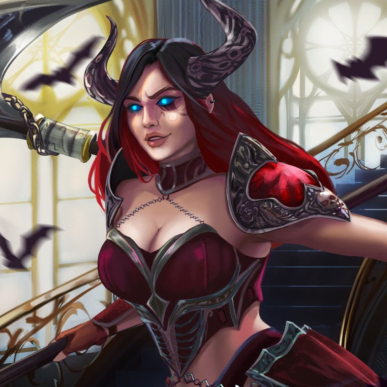

I will leave you a GIF with the whole process on it, so you can better appreciate the illustration process.

See you in a future post!
Thank You for Supporting My Artwork
TWITTER | GHOSTMARKET |TERRA VIRTUA |NFT SHOWROOM | INSTAGRAM | FACEBOOK
⬆️ Follow ⬆️

