Hey, everyone! I hope you all had a wonderful weekend!
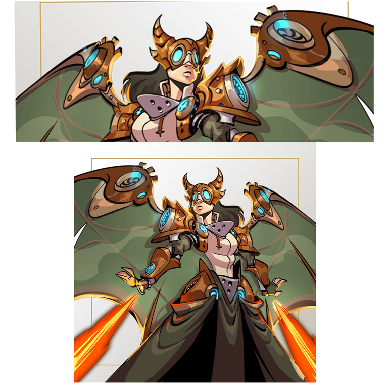
I saw all the entries last week and it is all freaking awesome! So nice to see the characters in different art styles of fellow artists in Hive community. Last time, I drew Dax Paragon in my chibi style. For this week's art contest, I want to draw a powerful female character. I was looking for a winged or armored character on the official website of Splinterlands. I was scrolling through the cards and Runic Skyclaw caught my eye. She is so charming and gnarly looking! PS. I really thought Runic Skyclaw is a guy! Whahaha!
Sketch (So detailed!)
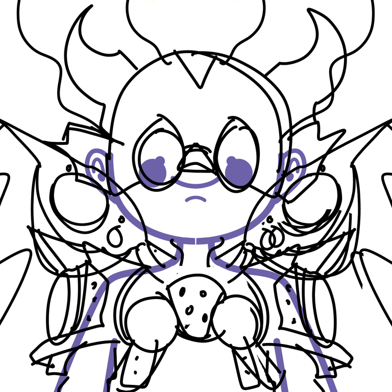
I find Runic Skyclaw's character detailed, so I have to really pay attention to the small stuff to draw the character in my chibi style. Actually, I already expected it to be detailed because the character is some sort of a mecha-type feel. I first sketched the head armor and the lower armor. For the wings, I made it smaller so that it will fit on the canvas. The background would be just a simple orange color since the character itself is already detailed.
Line art!
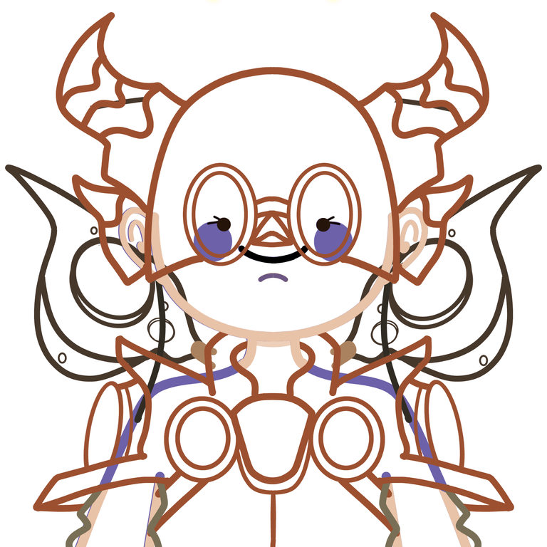
At this stage, the character is a bit clearer. I used a brown color for the armor and black color for the wings. The brush that I use is a pencil. I adjusted the thickness and thinnest depending on the detail. The inner details are thinner such as the rim lights, and circles. I make sure that it is symmetrical as possible. I think this is the part where I took a long time to finish. Runic Skyclaw is really a detailed character, gosh!
Flat Colors~
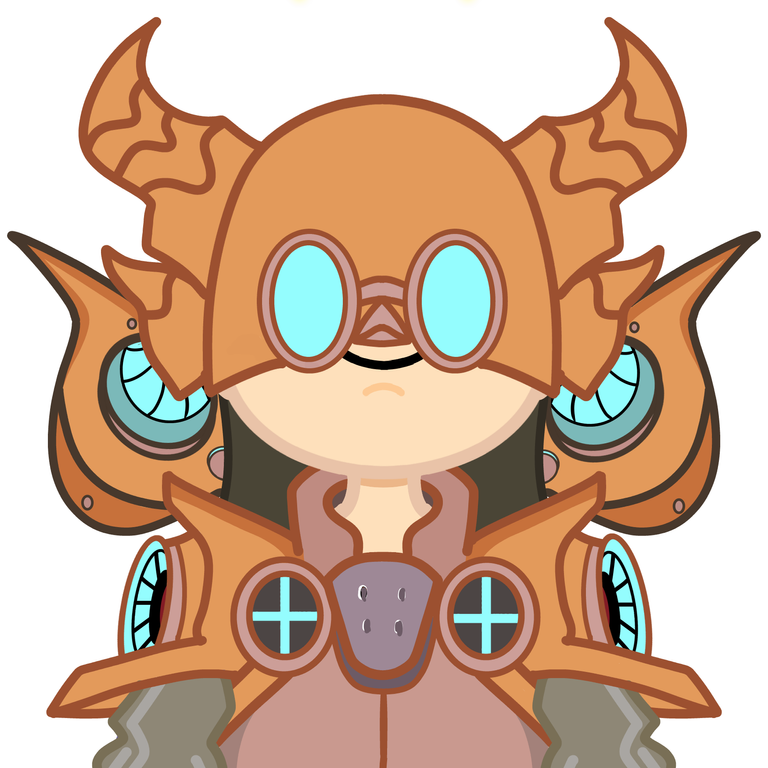
All right! It is coming to life! For the flat colors, I color-picked the dominant colors from the character. I adjusted some so that they will complement each other's shade. I make sure that the line art is in a darker color than the flat color to make emphasis. The colors feel like rustic metal, right? :D
Details (background, shading, and wings)
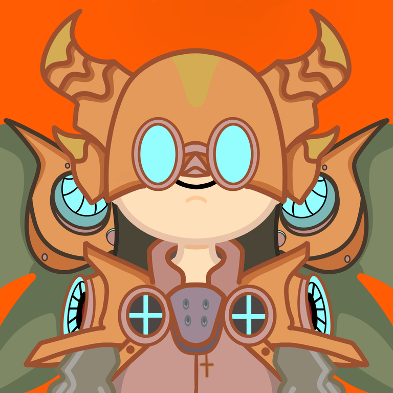
For the background, I chose a simple one for this character since it is already detailed. I do not like too much for the background because it will look cramped. Balance is everything! Sometimes simple details make art. Being simple or minimalist is not boring. It is a style! Agree?
The orange color compliments the green wings of Runic Skyclaw. I also added some details such as the cross. I also add some shadows in the armor and wings.
I just noticed the tiny dangling cross at the last minute. Being very keen on the character is a must! Though not noticeable, it is important to see the small details because that is what makes the character.
Final Art~ (Glow, toning the colors, and corrections)
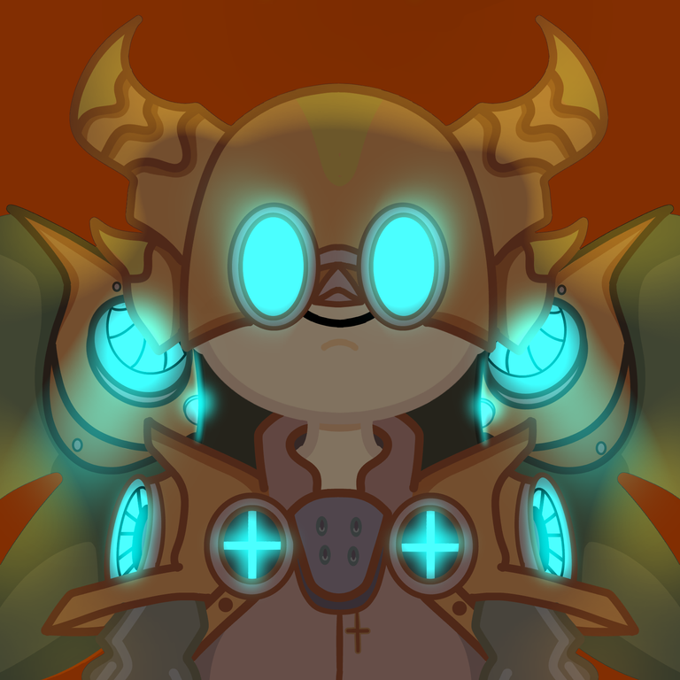
I want for the glow to pop, so what I did is I added another layer on top of the character. I masked it with black color and put it on multiply mode. I lowered the opacity to 50 percent. The cyan color is on top of the black mask. I also added a hint of yellow on the top character, I used the airbrush.
Tadaaa~ Runic Skyclaw in my chibi style is done! I really enjoyed this character because it is challenging. Can't wait for the next one!
Software: MediBang Paint
Check out their website here! https://medibangpaint.com/en/
You can check out my Chibis on Hive collection on NFT Showroom
👾 NFT Showroom: https://nftshowroom.com/jijisaurart
That is it for this art blog. I will see you at the next one!
📸 All photos are owned and taken by me, otherwise credited. The image is from the official website of Splinterlands.
©️jijisaurart


