Hello, this is my participation in the Hive Book Club Graphic Design Contest.
The contest is about creating a new graphic for the Hive Book Club community.
I don't usually feel very comfortable talking about the work I do, but I'll tell you a little about the process and the decisions I made to develop this graphic identity.
For the concept I took three key words or triggers: books, Hive and community.
I took as a base the shape of the Hive logo (hexagon) and transformed it into three books to reinforce the concept of community. At the same time, each book is a different color to represent the diversity of readings and readers. I added an element that helps to reinforce the concepts worked on, which is a bookmark.
Main logo

Circular logo
For this application I developed two variants. The first one is for cases in which the circular logo is used in large sizes and the second one for smaller applications.

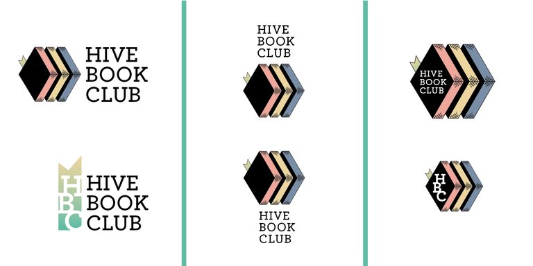
Variants
The marker, in one of the variants, is transformed into an isologo.
I developed, with the same elements, variants to contemplate different uses.

Grid

Color palette

As in the books the letters play a fundamental role, I decided to use graphically the letters to create the graphic identity.
Banner


Separator
For the separator I made three options that can be combined according to their use.


Complete graphic

Applications


Translated with Deepl


