The All-New LeoFinance is Live! | Dev Updates and Project Blank In Production

in #hive-1679222 years ago

It's official, Project Blank is live. We launched on Monday and honestly, it's been one of the longest weeks so far, ever.

There is much, much work to be done. We've been rolling out daily updates since the new UI went live. A mixture of bug fixes and new features.

Our focus throughout May will be adding missing features from the old UI onto the new UI (obviously with a new and improved flavor on them) and primarily on Bug Patching.

We were in Alpha for so long. 84 years, it felt like.

It was time to move to Beta. Beta is still Beta. Bugs are going to be present. Things are not going to be 100% smooth.

We made the final decision to say "f*ck it, we'll do it live". We know that the UI/UX is far from perfect, but That is OKAY.

We will gladly sacrifice the Month of May as our month to go live and squash bugs. This is an important time for LeoFinance. Our goal is to break things quickly and fix them even faster.

IF you are seeing bugs on the UI, please report them. That's how they get fixed. I've seen so many people complain in various places (especially discord) about things not working.

  1. Open a Bug Ticket
  2. OR post a Thread with #feedback hashtag in it

Regardless of which of those 2 options you do, the more info you provide, the better. If you provide us with ample information, you'll be amazed at how quickly we can squash bugs.

What doesn't really work well is just complaining in Discord general chat. We have a team and we have a process for collecting bugs, triaging and then fixing them in a prioritized and organized manner.

Please report and we will fix. I have spoken.

Dev Updates
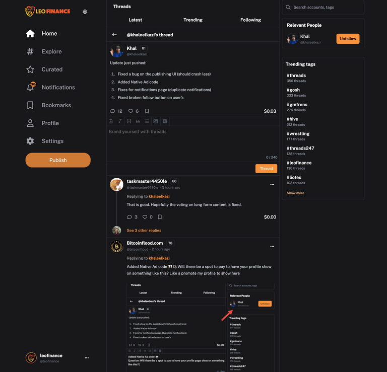
We've been releasing bug patches on a daily basis. Working around the clock since Monday. It's been 3 days but it's felt like 3 weeks.

Today, we released a major bug patch which fixed some big issues in core places:

  1. Fixed a bug on the publishing UI (should crash less)
  2. Added Native Ad code
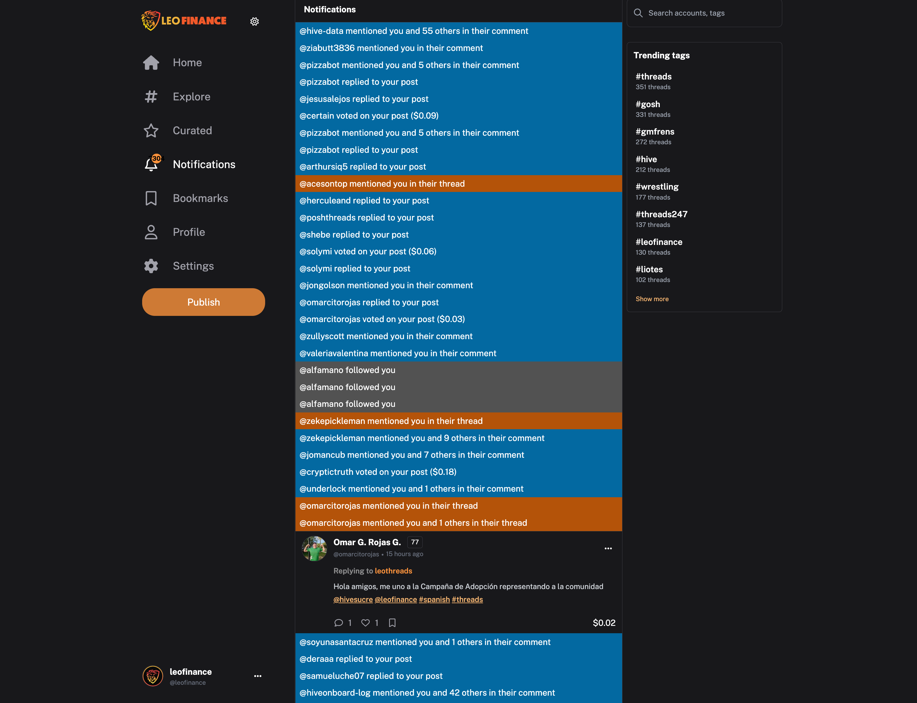
  3. Fixes for notifications page (duplicate notifications)
  4. Fixed broken follow button on user's

Publishing UI

We've been polishing the Publishing UI. Evidently, people were using the old UI and not the Alpha UI for the past 2 months. This didn't give us the feedback we needed to have a fully polished experience.

Now you see one of the major goals of moving out of Alpha and into Live Beta. This forces the community to discover all of the edge cases that our Alpha testing missed.

One big bug we found was if you used a $ in front of any ticker symbol. This caused the whole page to crash in your browser.

The reason for this was because we added Coingecko support to Threads but NOT to posts. Now you can call things like $LEO in your post and get them to work properly.

We've found a few other random edge cases and formatting issues. Most have been resolved and some are still being worked on. You should notice a much better experience overall.

Next up is fixing some stuff with the Schedule Publishing interface. It's not working as intended and we'll have an update for that shortly.

Added Native Ad Code
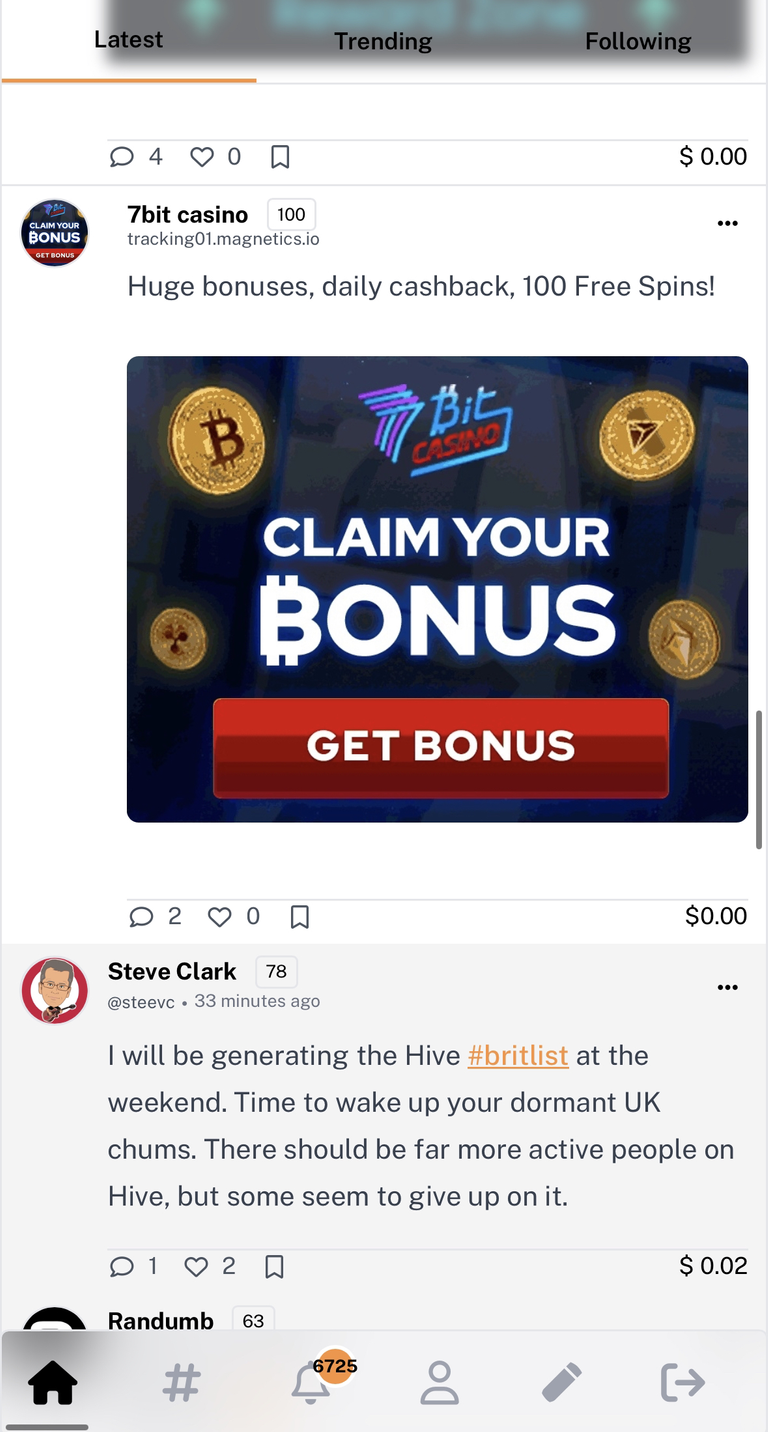
Okay this is pretty freaking cool.. It took a lot more work than you would anticipate but we've managed to get native ads working. You may notice that every 10 or so Threads, you see an ad.

The Ad looks like a regular Thread. It even shows "comments" beneath it.

The idea here is that we pulled inspiration from Twitter, Facebook and Instagram. When they show ads, they look in-line with regular content.

This greatly improves views and engagement with ads. Users are far more likely to actually read an ad (and potentially click it) when it doesn't disrupt their scrolling experience.

We have a few more ideas to polish this feature and optimize placement to get it into more places like:

  1. Reply windows
  2. Blogs
  3. Comment sections
  4. Profile pages

We want ads to be a non-intrusive experience. We also believe - after talking with our ad partners about our traffic - that we are only getting 1/10th of the ad efficiency that is possible. If we can better optimize placement, we could 10x our ad revenue with the current Userbase on LeoFinance.

As you all know, Ad Revenue -> LEO smart contract -> LEO POWER APY.

Gonna be yuge.

Notifications Page & Follows

We deployed some updates to the notifications page. This is one of my favorite features on the UI as it allows you to quickly reply and manage all of the inbound on your Threads.

There were sometimes duplicate replies shown and a few other bugs related to infinite scrolling. We deployed a bug patch.

Next Up

Like I said, this is largely a bug patching month. We also know that long-form needs a big update in terms of features on the UI. Yes, long-form is still there (hit the "Explore" button) but it definitely needs some work.

We're working on that and we also have a list of about 25 bugs that are currently being worked on.

If you guys keep providing feedback and bug reports with ample detail, we can keep squashing bugs. Keep that rolling in and come June, the UI will be polished AF and ready to onboard the masses.
About LeoFinance

LeoFinance is a blockchain-based Web3 community that builds innovative applications on the Hive, BSC, ETH and Polygon blockchains. Our flagship application: LeoFinance.io allows users and creators to engage & share micro and long-form content on the blockchain while earning cryptocurrency rewards.

Our mission is to democratize financial knowledge and access with Web3.

Twitter: https://twitter.com/FinanceLeo
Discord: https://discord.gg/E4jePHe
Whitepaper: https://whitepaper.leofinance.io

Our Hive Applications

Join Web3: https://leofinance.io/
Microblog on Hive: https://leofinance.io/threads
LeoMobile (IOS): https://testflight.apple.com/join/cskYPK1a
LeoMobile (Android): https://play.google.com/store/apps/details?id=io.leofi.mobile
Delegate HIVE POWER: Earn 16% APR, Paid Daily. Currently @ 2.8M HP
Hivestats: https://hivestats.io
LeoDex: https://leodex.io
LeoFi: https://leofi.io
BSC HBD (bHBD): https://wleo.io/hbd-bsc/
BSC HIVE (bHIVE): https://wleo.io/hive-bsc/
Earn 50%+ APR on HIVE/HBD: https://cubdefi.com/farms

Web3 & DeFi

Web3 is about more than social media. It encompasses a personal revolution in financial awareness and data ownership. We've merged the two with our Social Apps and our DeFi Apps:

CubFinance (BSC): https://cubdefi.com
PolyCUB (Polygon): https://polycub.com
Multi-Token Bridge (Bridge HIVE, HBD, LEO): https://wleo.io

Posted Using LeoFinance Alpha

Sort:  

Congratulations to the All-New LeoFinance! I enjoyed the launch video very much. Awesome guys. Barb

I’m glad we’re doing this. Thank you for the report 😊

UI / UX is far from perfect, but I see that every day it gets better and more stable

this is good to see keep the good work going. good luck team. The interface is nice and also I love the threads ever since we started it. Good luck once again.

Thanks for the update. Now it is up to the community to take part in the Zealy campaign and try to onboard as many new users as possible.

Loving the new UI. It works smooth and fast.

I DID spot a minor UI/UX fix.

This is nice, you guys are doing great. Thank you.

I didn't see ads at first because I use Brave. I turned off Shields and see them now. Great work.

So much work, you guys are doing great, the native ads added is do cool, Leo thread to the world!

Ótimo trabalho dos Dev

This is nice, let's keep going.

A lot to work no. The dev team are working tirelessly. Let's squash it hard and fast

We're on the way. Although I'm a little late to the party, it's better late than never! This is going to be huge, I'm excited to see the outcome.

It's exciting to hear that Project Blank is finally live! Congratulations to the LeoFinance team for all the hard work and dedication to making this project a reality. I appreciate your honesty about the challenges and bugs that come with launching a new UI, and I applaud your proactive approach to fixing them. It's great to see that you are actively addressing issues and adding new features to make the user experience even better.

I can only imagine how much time and efforts go into this behind the scenes, and I say kudos to you all!

looking hella fresh ! but a bit buggy for me but I know we gonna get it sorted, #LEO to the moon

Big kudos to the dev team for this beautiful and amazing update, I so love the dynamic and features

This is really amazing and kudos to all the entire leo team for this amazing project.

We move always

Let's keep marching forward

Having the community be the developers' foundation for every advancement is critical to your success, and what you are doing will be reflected quite quickly. Greetings, best regards.

It's a nice thing to see and I didn't realize that I needed to throw out my feedback on threads. I made a post yesterday about it so I will send it out later tonight.

Threading has become both civic and economic life for us.

i am seening moon of leo, that is the waiting moments boomboom

I wish I could use the interface if it wasn't clearly bad for iOS or mobile devices.

You are doing a great job

You are doing a great job

plz work XD

It looks like a lot of fun with lots of web3.

The leofinance team is always on top of the development and this is what makes you awesome.

Every little step in that direction is a big win. Kudos to the dev team. The future is getting closer than ever.

PIZZA!

$PIZZA slices delivered:
@ahmadmanga(1/15) tipped @leofinance

lets keep sqashing bugs. kudos to all the team members ensuring a that everything works perfectly fine in the new U.I

For a beta, you did a good job guys. Waiting for the proper launch.

This is the way. May the 4 be with the team working in so many things.

Wen moon?

Moon soon.

Honestly you guys are doing great work, not an easy one at all, we are have our parts to play to make this project blank the best ever, let's always give feedback. Thank you 👍.

Cool stuff and well done. I know what it's like to work on big software projects, but mine are not for public eyes.

It made me LOL to see my thread in the screenshot :D

This is a great improvement .
Let's keep going forward and onward.

Great updates and amazing to see the new UI taking better shape through iterative releases. This is the way!

It's been a long time coming and we are glad it's finally here

It's would be quite very cool to have a kind of smooth system . And along all of those features , it just going to be very unique to the core. Up Leofinance.

Super excited! Great job!

Its coming along nicely, keep fixing the bugs and it will be ok.

Great job done by the developers. These upgrades will definitely lead to a magnificent result.

Congratulations $leo team. The beta version is awesome

84 years 😂 an excellent reference. All the recommendations seem to me to be the best form of correction with feedback, in fact several threads I have put together have not been able to go live, but we always start small and end up with a treasure. Come on friends, if you can get the sky!!! 🦁

let's keep up the good work!

What a crazy design interface, good job done.
Funny enough is that i don't use this platform cause i don't understand sh*t. Am looking forward to the day i will make research about it and get to join them.

Congratulations on the campaign, I'm enjoying seeing the community engagement :D

It's exciting to hear that Project Blank is finally live! Congratulations to the LeoFinance team for all the hard work and dedication to making this project a reality.

I can only imagine how much work goes on behind the scenes! Kudos to y'all!

The interface is looking cool and I liked it very much. Still need improvement but I think within a short time everything will be fine.
I am waiting and hope that something amazing is coming in the upcoming days.

A great and nice implementation. A friendly and amazing interface. Thank you for bringing this to us and kudus to the team for the great work done.

Wen moon, Leofinance? 💪💪💪

we'll do it live

Sometimes that's the best way to do it, Billy 'O style. !LOLZ

Did you hear about the guy who threw his alarm clock while hosting a party?
He wanted to see if time flys while having fun.

Credit: reddit
@leofinance, I sent you an $LOLZ on behalf of @ironshield

(2/10)
Farm LOLZ tokens when you Delegate Hive or Hive Tokens.
Click to delegate: 10 - 20 - 50 - 100 HP

You are doing a great job. Thanks for the report.

this is just so incredible, i love the energy and flows put into making this a possibility, please keep up the great works, its awesome

This new Leofinance look might take me a bit to get used to. I only used the Threads feature once or twice so far.

But hey, there are a lot of features I never heard about before.

Have some !PIZZA with !LUV

@leofinance, @ahmadmanga(1/10) sent you LUV. | tools | discord | community | HiveWiki | NFT | <>< daily

Made with by crrdlx

Wow! It's called firing up to the utmost. I am excited to be a part and witness of
how leo evolved into a never stopping project in grandeur and style.

Let's keep up the good work! Looking forward to what comes next!

i have been trying to comment on this post via leofinance front end but have been finding it difficult, i know the webpage is been updated and bugs fix, but hoping it will be down fast as most people i referred here are usually complaining of lagging ,double text writing and website crashes, but in all this am very bullish on leo.

The effort put in on this project is evident. Great job and well done for this good work guys. The native ads included looks good as well. More engagement in hive through threads, let's get it going 👍

You know what? I don't hate this!

No wait. I can do better than that.

This is the best thing since we ditched Justin!

Ya. That's good.

As the saying goes "it's better done than perfect" and with time it gets better. It's been a lot of work I can only imagine how the team has been working... Congrats on the launch and the whole marketing campaign never seen before on hive and rarely seen on web3

Amazing initiative, although I was trying to comment on this post using the leofinance, but for one reason or the other it just wouldn't show my comment , probably one of those bug in the UI design .
I know it can only become better, good job team leofinance

Best of luck with the new launch guys. Fair play

To be honest, LeoFinance is the standard among communities. Site, UI, Community, Constant Communication, Ad revenue, prizes!

such amazing features and especially that one-click with 5% weight fixed upvote feature is really nice idea. Waiting for more updates to come.

Well done team leo
We can understand that The changing the comple UI is not an easy task.
Taking the feedback and arresting those issue will make the experience more user friendly.

Wow, Leo is going to have a Mobile App supporting IOS, that is a great feature indeed. I would be glad to wait for that. Bugs are always bound to happen in every new development the rate of correcting them on Leo is the best ever, this shows how the team is really putting up a great effort for this project. Kudus to all develpers and team members.

Otimo trabalho conseguido pelos desenvolvedores. Estas atualizações vão certamente levar a um resultado magnífico

Great, the work is hard but we are on the right track.

I beginning to love what I am seeing. This looks more catching than the other one and I want to thank the team for their restless effort to launch this new UI. Well done.

soon moon going to start after the launcho ui great great

Posted Using LeoFinance Alpha

Great update leo team. Its just I find it hard to comment or post since they take too long that I need to use other platform to reply on this post to be indexed or just gone that I need to use other platform to reply on this post so I hope you can fixed this and made it more user friendly.

onward and upward frens

We're over two weeks in and the improvement in just that short time has been immense. Hopefully it can continue because this place could really vault itself onto the map with the continued growth of the community.

https://leofinance.io/threads/view/ijelady/re-ijelady-9zsvu4gm
The rewards earned on this comment will go directly to the people ( ijelady ) sharing the post on LeoThreads,LikeTu,dBuzz.

You are doing a great job

It's exciting to hear that Project Blank is finally live! Congratulations to the LeoFinance team for all the hard work and dedication to making this project a reality. I appreciate your honesty about the challenges and bugs that come with launching a new UI, and I applaud your proactive approach to fixing them. It's great to see that you are actively addressing issues and adding new features to make the user experience even better.
I can only imagine how much time and efforts go into this behind the scenes, and I say kudos to you all!

big thanks for releasing the updates asap

i like the way the ads fall into the timeline and look native, im curious to know if there had been any talks of getting some leo from interacting with the ads or just for having them on in general?

good luck on knocking out those 25 bugs for the long post content, lots of ppl are ready to hop back on it.

Let's go! To the moon Lions!

The effort put in on this project is evident. Great job and well done for this good work guys. The native ads included looks good as well. More engagement in hive through threads, let's get it going 👍

I love all these new developments. It means a lot to the whole crypto community. Leofinance keeps growing even at these hard times. More fire🔥

Wow I love love the native ads included, so cool and it definitely shows a lot of effort put in.

The team are amazing, these updates are putting smiles on faces 😊

Well done to you all... We keep moving forward, threads is the present and future of engagement on Hive 🚀

Quite excited about the constant improvement around the Leo Community hoping more we unfold as time progresses.

It's exciting to hear that Project Blank is finally live! Congratulations to the LeoFinance team for all the hard work and dedication to making this project a reality. I appreciate your honesty about the challenges and bugs that come with launching a new UI, and I applaud your proactive approach to fixing them. It's great to see that you are actively addressing issues and adding new features to make the user experience even better.

I can only imagine how much time and efforts go into this behind the scenes, and I say kudos to you all!

that is a very cool thing what you did with the native ads to give users a smooth scrolling experiences. I admit that I definitely would’ve been one of the users a cut in appearance between ads and content itself would’ve bothered and I definitely wouldn’t pay attention to the ad in this case because my eyes are rolling to the next content-looking thing:) Good thinking, guys.

this is really awesome news!

I think we are almost done squashing up bugs, the new U.I is user friendly and it has been fun all the way.