Hello guys,
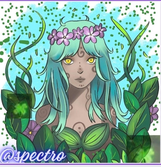
As you've seen, this week I decided to go all out with another completely different style than I have previously done.

The coloring/shading might be less varied compared to my previous works, but I really like the new vibrant colors used in this piece overall.

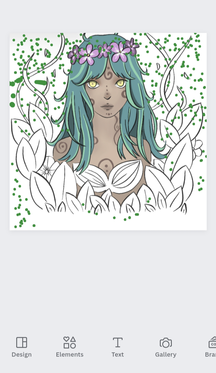
The line art is entirely different from the monotonous thin lining I used to do in my previous work and I feel like it gives this work more of a stylized feeling than the others - like it belongs to an indie videogame or something.


For coloring, I decided to put aside the linear gradient shading and instead use flat colors for different shades - I still did some shading here and there, but I mostly stuck to using solid colors to avoid making too much shading and deviating from the style I chose in the beginning.


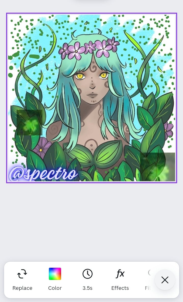
The final outcome,
And here's the result as you've seen in the first pic. I chose that background for here since the color matches the other colors used in the work, and it looks like a few brush marks that fortify the feeling of this piece being a stylized artwork and a thin dotted green at the end.