Splinterlands Social Media Challenge!
Hello guys and welcome to my blog😋. I hope everyone is having a great day. For this week I decided to draw Time Mage as my entry for this week's challenge. Yesterday night was quite peaceful and no one was there to disturb me so I completed this artwork by 5am today. Who cares about sleep, right😂? I don't even feel tired anymore XD. I think I'm turning into nocturnal being like Batman (excluding all his impressive qualities🤣). Well, here is the result and I hope you guys enjoy the process below!
Time Mage
The process...
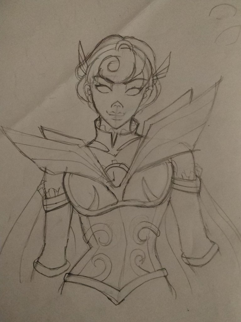
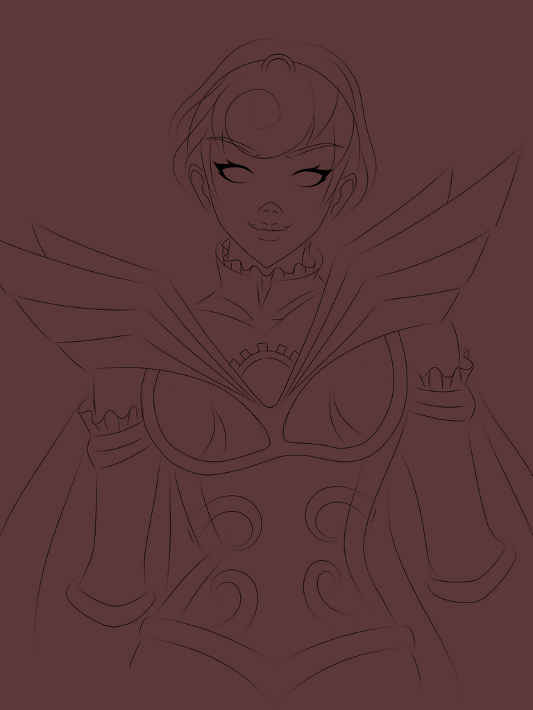
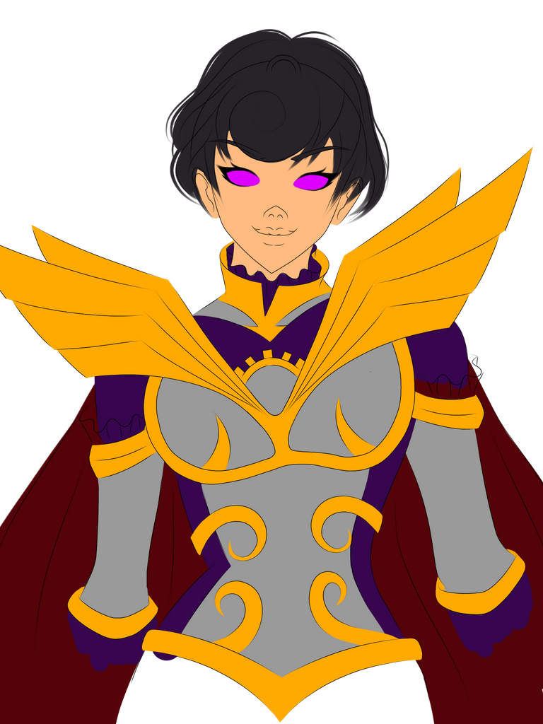
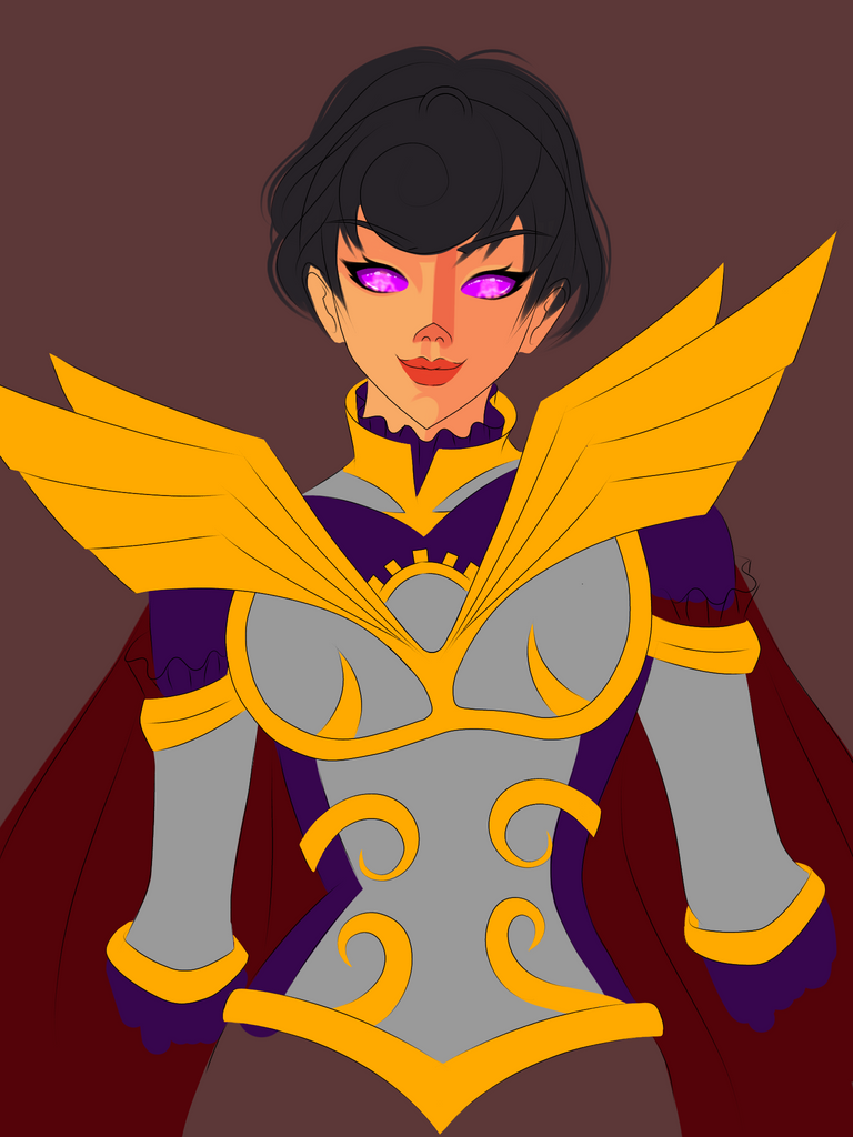
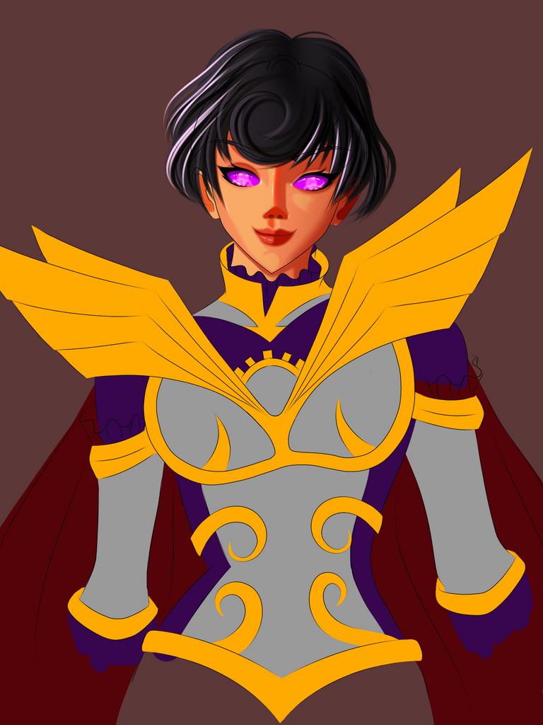
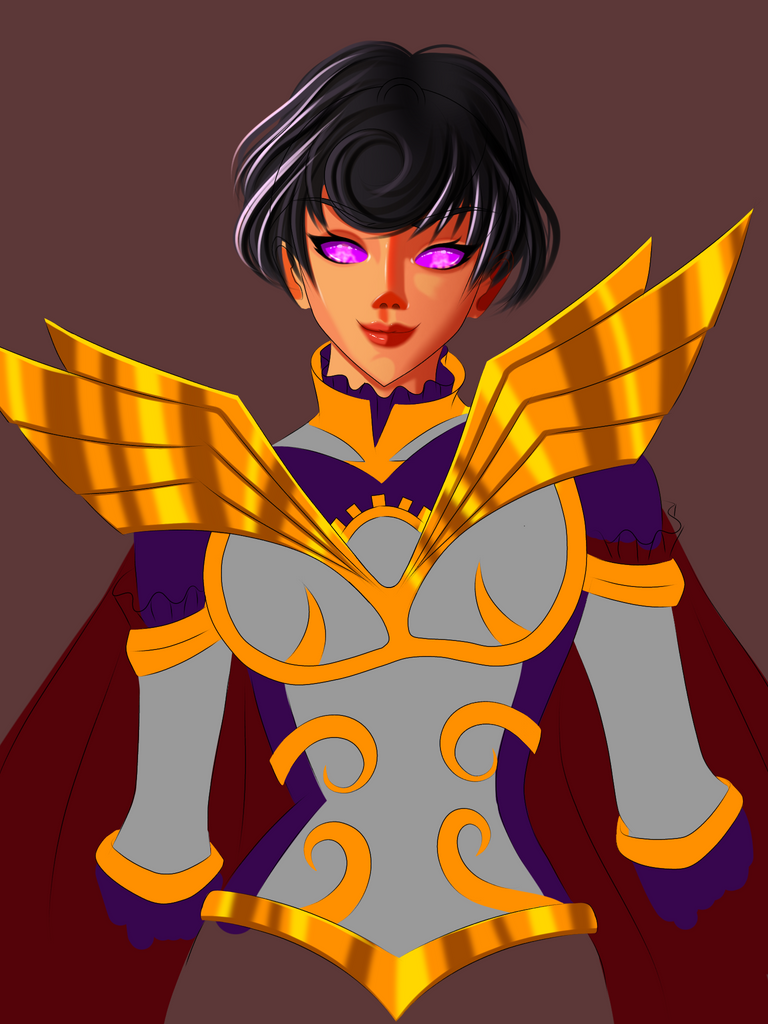
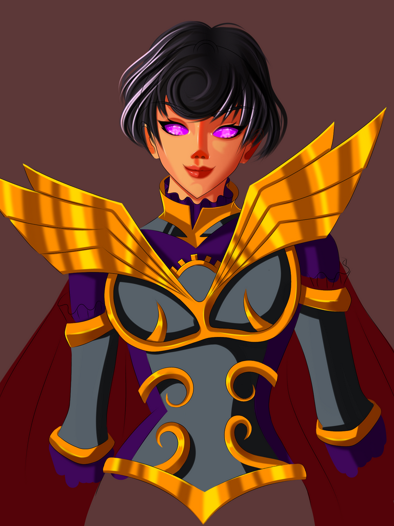
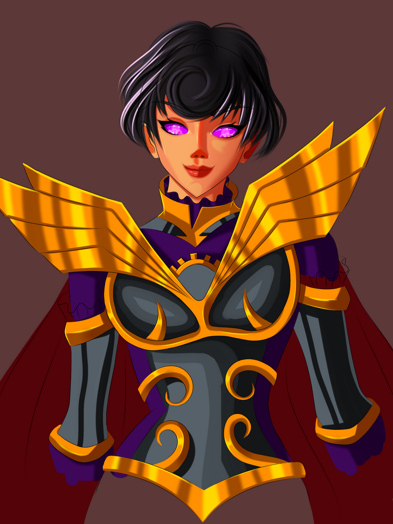
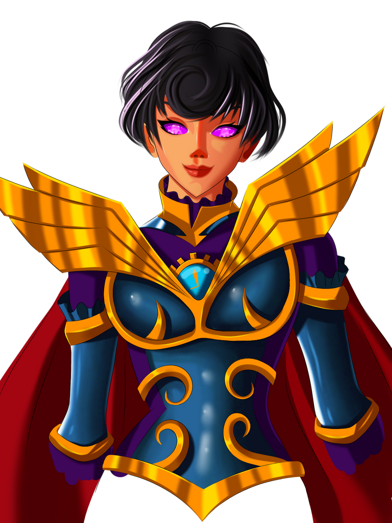
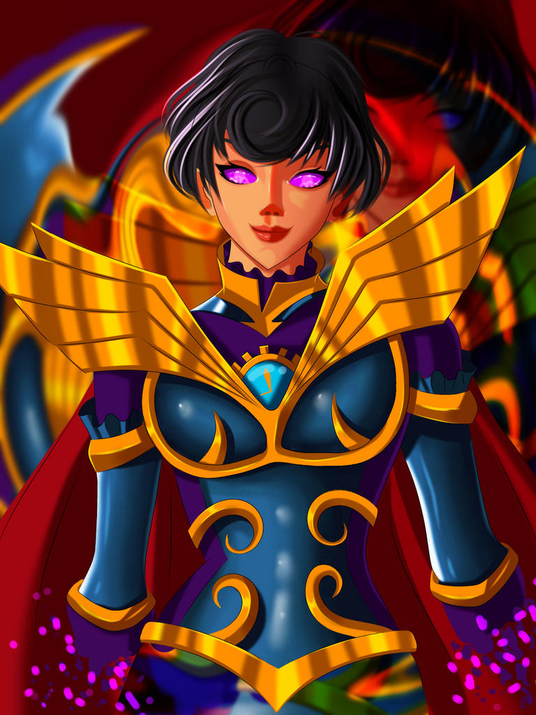
From the work in progress shots its very clear that I did something different with the colour scheme of the character. Aside fome that I wanted to create the lineart for this painting close to anime style. It's been a while since I did that most of my recent paintings were created in a way that makes the character look older. I wanted to bring that teenage aspect so I drew this to satisfy that condition. After I was done drawing I was happy with the results so I proceeded to paint it.
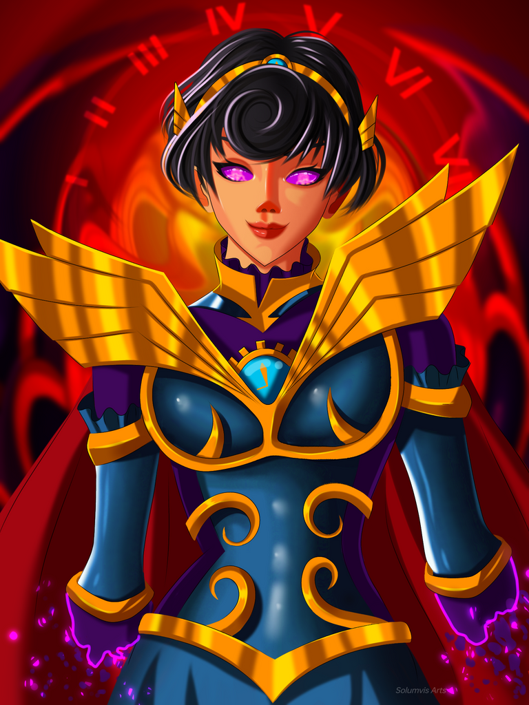
I painted the base colour first and decided to finish the eyes in the beginning. Her eyes are quite different. Highlights had a significant impact on eyes like this. I kept that in mind and painted accordingly to make it pop. I hope I did justice to her eyes. I also added some patterns inside her eyes as well to create an aesthetic feel. Plain looked very boring and I didn't want to copy the original design so this is what I made. This was done pretty fast and I started shading the face. I decided that it's best to shade with vibrant colours because I noticed that some of my recent paintings used dark shades. I wanted to make something fresh so I experimented with the colours and I got some great results.
I rendered the face with 4 layers of shading and applied a 4% Gaussian blur to it. The best part about rendering the face was adding those highlights. After I applied them on the highpoints of the face the face looked much more aesthetic to me. Once I was happy with that I moved on to rendering the hair. First I painted the basic shape and then I added some strands here and there to make it look realistic. Her hairstyle is very different so I decided that it's best to turn off the lineart while rendering the hair. I added highlights and shadows on necessary ares to show the flow of the hair and the direction of the light source. Then I turned on the lineart and erased all the hair lineart. I think it looked better this way.
Painting the armour, clothes and the background were the things that's left to do. I didn't waste any time and proceeded to render the armour first. Metals in a light source shows strong contrast so I painted the shades and highlights accordingly and applied a Gaussian blur to it at the end. I did this from my memory and I'm happy with the results. The cloth areas were small so it was completed under a minute. It was also shaded according to the direction of the light source.
If you notice the rough sketch on paper, you'll see that I didn't draw the hands fully. I had an idea but I didn't know if it will work or not because I haven't tried it before so I decided that iwas best to do it at the end and if it it works then great otherwise the plan was to finish drawing the hands fully. Since she is a Time Mage the idea was her generating her body and to create that effect I choose the hands. I painted it in a way it looked like it was she was creating her body out of thin air. The glow effect I applied here helped me achieve that goal. The background is made with the character's colour palette but in a blurred state. Now I can't finish the painting without adding some elements of time in there, right? So I added the Roman numbers in the background in circular form imitating a clock. I turned overlay mode on this layer to blend it with the background colour. Now the painting was finally complete and ready to be shared with hehe.
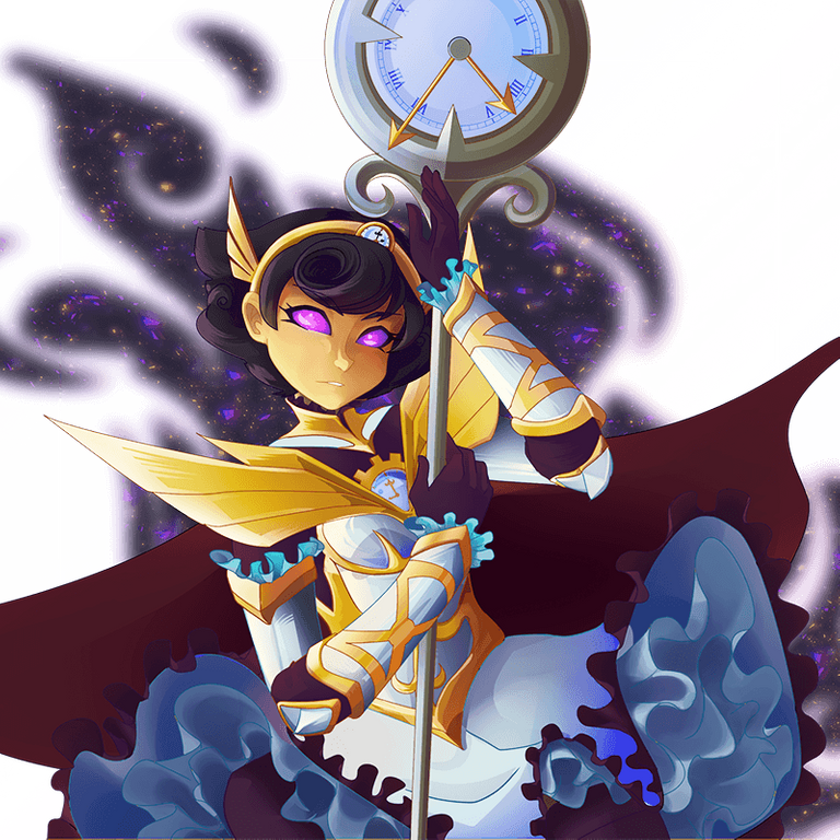
To explore Splinterlands fascinating characters, visit their official website for detailed information about the game. If you're interested in a specific card, follow this link to discover its attributes and additional details.
Official Design
✨Result✨

Tools used: Ibis paint x, Notebook and Pencil
Duration: 6hrs
Thank you so much for your time 😇

