Good morning, Street Art Lovers!
I'm back for another entry in the CCC's Street Art Contest #145, hosted by @digi-me.
While I was heading to the Metro station in Matosinhos city, I saw a mural with plenty of interesting and beautiful works. And it looks like some of them are very recent. They were painted this year, just a month or so ago. Others are a couple of years old.
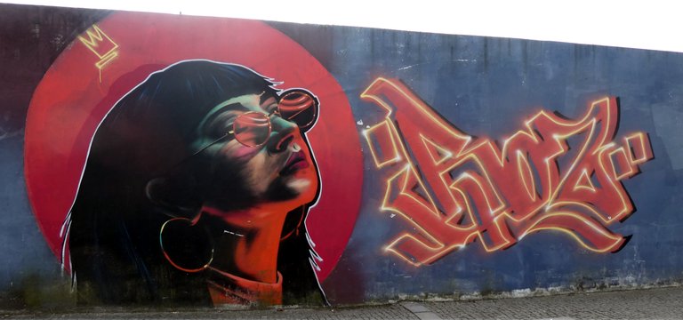
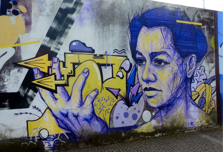
This one was one of my favourites. I have no clue what those hieroglyphs say but I loved the colours and details of the girl's face.
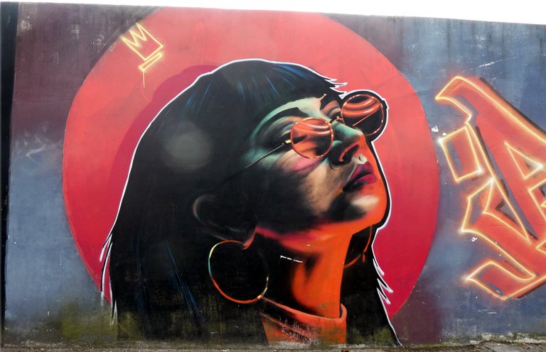
Here's a close up of the work. Her expression is so serene... and the effect on her glasses is amazing, really well done!
I wasn't in a rush and decided I would skip the next Metro and wait for a later one, thus I took enough time to shoot the rest of the wall...
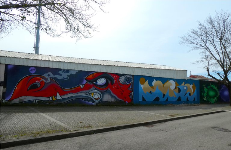
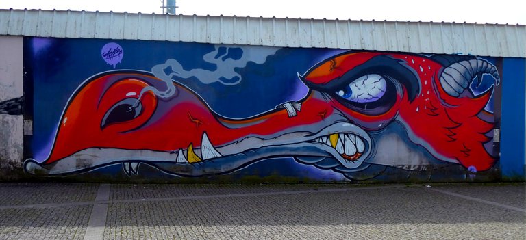
This furious dragon was particularly good. I wonder who or what has pissed him off that much. They better beware for he looks quite mad and ready to kill! 😱
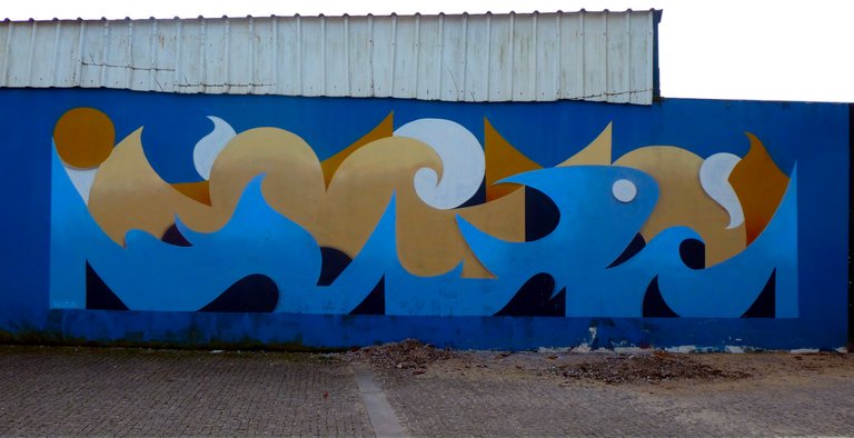
Next there was a simple drawing of the sea, including a little fishy. This is a good theme, since this city is well known for its fishing industry. 🎣
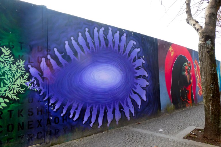
The following piece was impossible to catch in a single shot, since there was a tree in the way... which is a pity since the concept is rather cool.
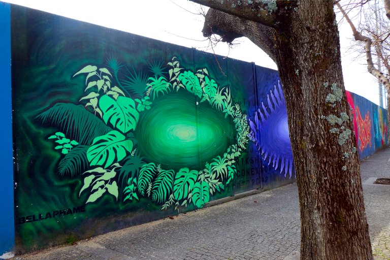
It looks to me like the centre of both images depict our planet and on the orbits we see different subjects, which I assume represent the past and present. On the past we see the Earth surrounded by vegetation and on the present we see lots of people taking over the green part of the globe.
I guess this artist wanted to pass a message about our impact in the world we live in.
A little bit ahead there was a cute drawing of a boy with a red scarf flowing with the wind. On the background we see some trees, mostly naked or with barely any leaves, maybe this is about Autumn?
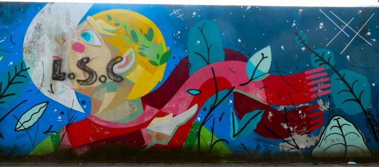
This following scene was very eye catching, the use and combination of colours here are amazing. It really looks like a piece of art... and the tree in front of the mural almost seems to make part if it! Very well done! 😎
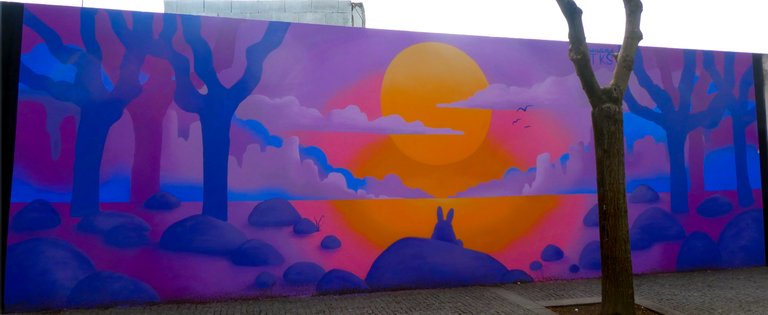
Moving ahead, there was a mural which appears to be inspired by Japanese Anime or something like it. 😁
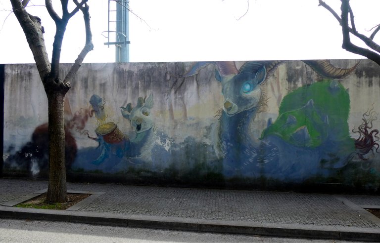
The scenario seems to be a post nuclear world inhabited by some crazy looking creatures, resembling a deer and a goat...
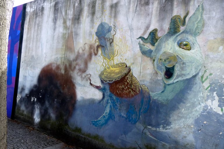
But that was just their heads, their bodies were more similar to serpents...
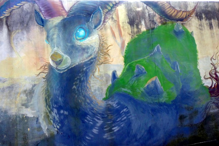
I was in the middle of the street at this point and a few cars were coming my way... but that didn't stop me from taking the next shot! 😂
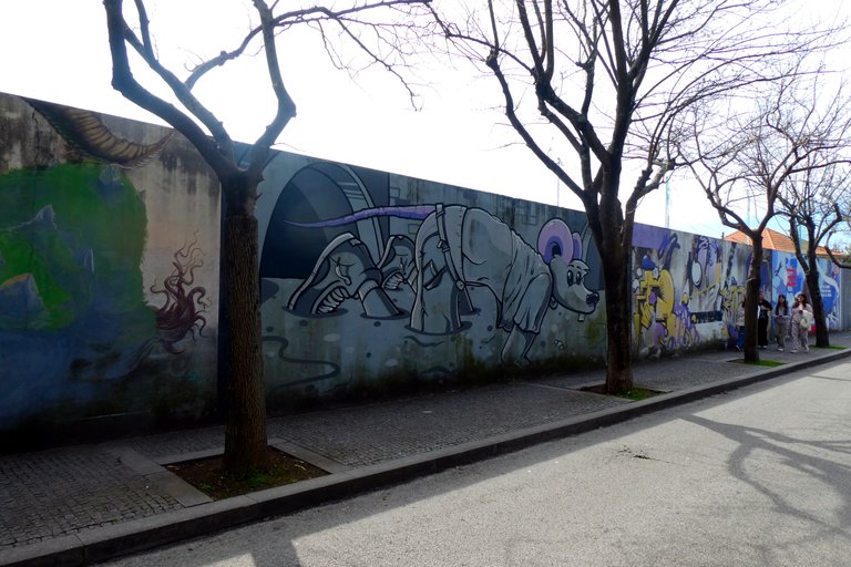
With all those trees it wasn't possible to grab the entire scenes but I did my best to grab the largest part of each work in a single shot.
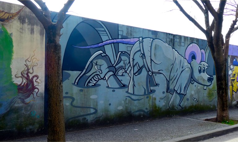
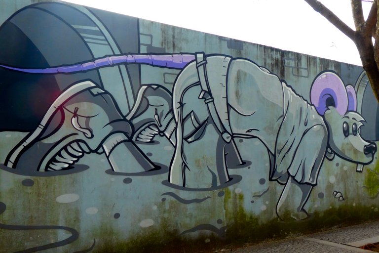
I wonder what the artist meant with this drawing. Maybe this is how he sees the next step in the (d)evolution of our species...? 🤔
The next piece was very beautiful, even though I have no clue who that girl is supposed to be...
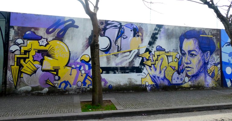
Here's a close up shot of her face. Maybe some of you will recognize her?
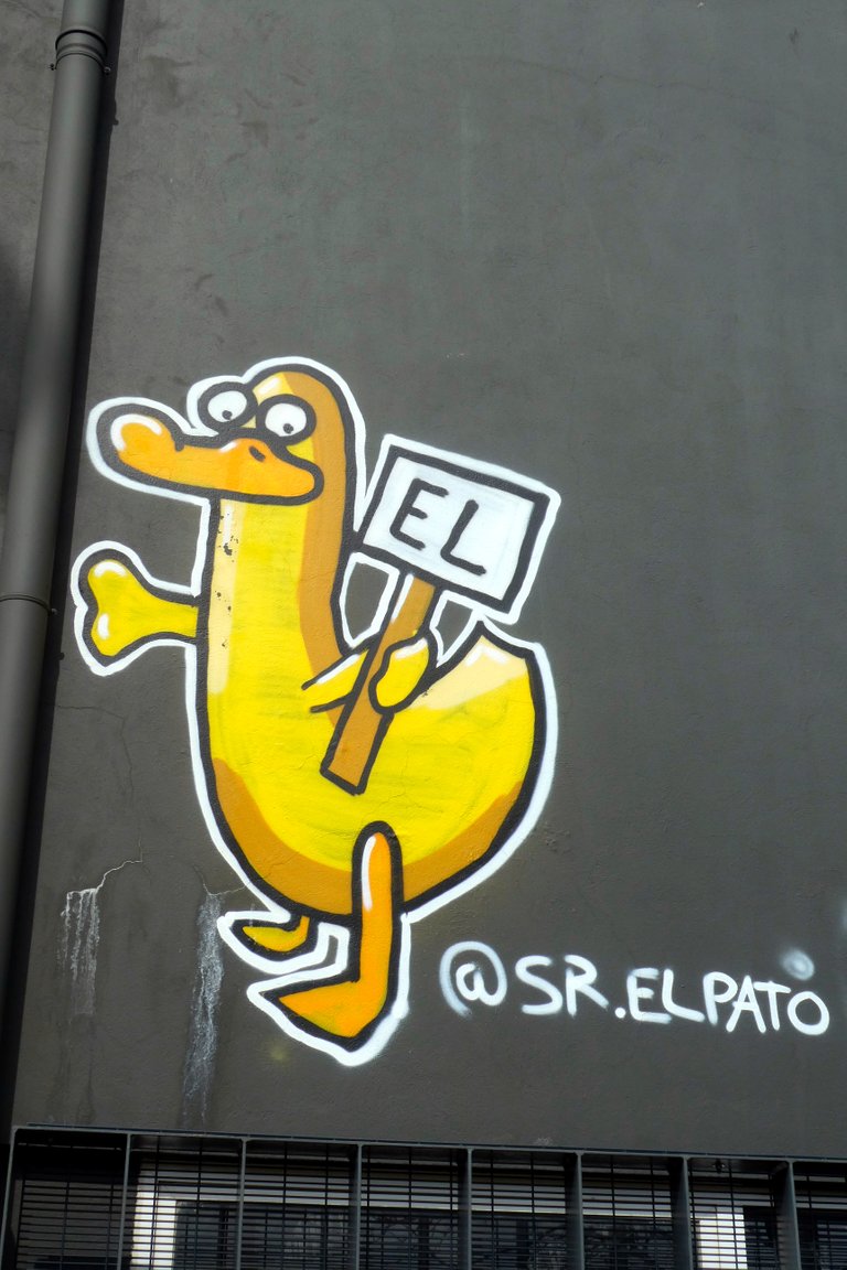
This yellow duck made me smile. A simple but cute piece. And for those who speak neither Spanish nor Portuguese, Sr. El Pato means Mr. The Duck. 😊
There were just a couple more drawings in this long mural... but that doesn't mean the quality was going down. In fact, the next one is probably one of the most well done, complex and interesting works of the whole lot.
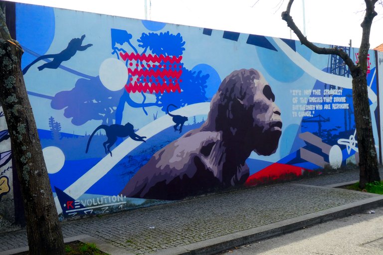
It seems that the Theory of Evolution was the inspiration for many of these works, including this one.
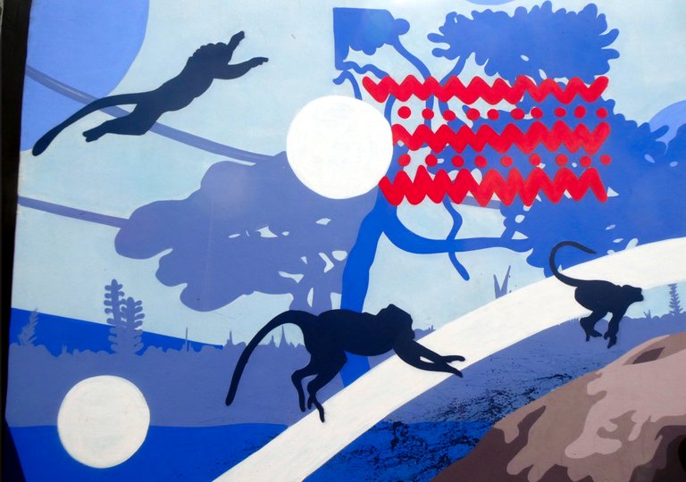
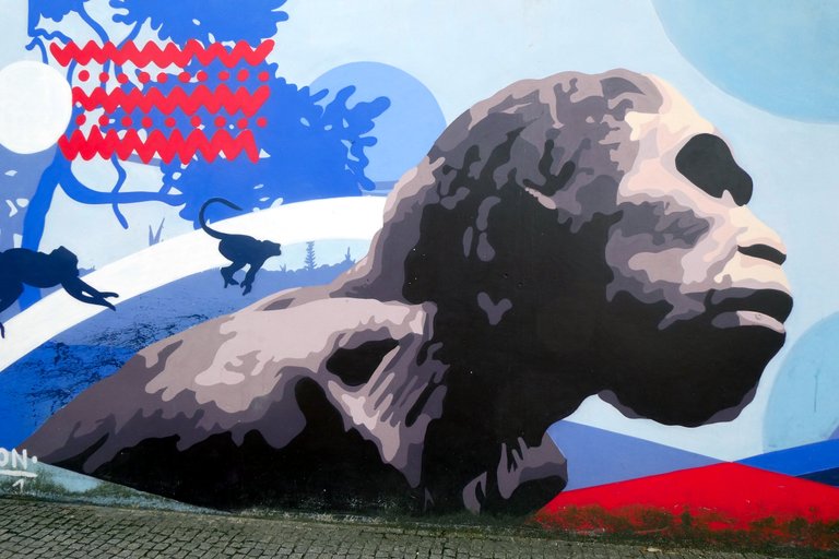
In the background we see a jungle and a few monkeys jumping around. On the foreground a large humanoid, a creature halfway between monkey and human.
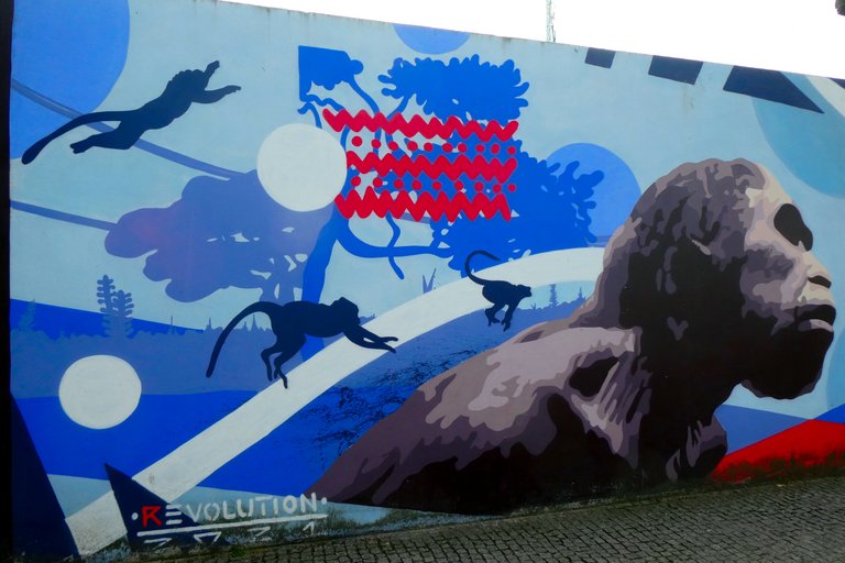
Here's a closer look at the amused monkeys. They sure seem to be having fun! 😄
... and also a close-up of the main character. A bit more serious, isn't he?
On the right side of the image there was a reference to our modern society... with an oil refinery and some construction cranes present in the scene.
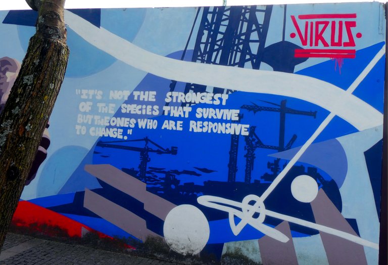
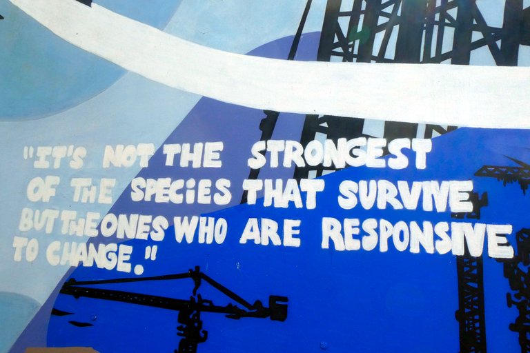
An interesting message was included in this piece... saying "It's not the strongest of the species that survive but the ones who are responsive to change." In other words, "Adapt or die."
Finally, a very actual concept, even though I think Joe Biden could easily replace Trump in this picture... they're not that different, despite of what mainstream media tells you.
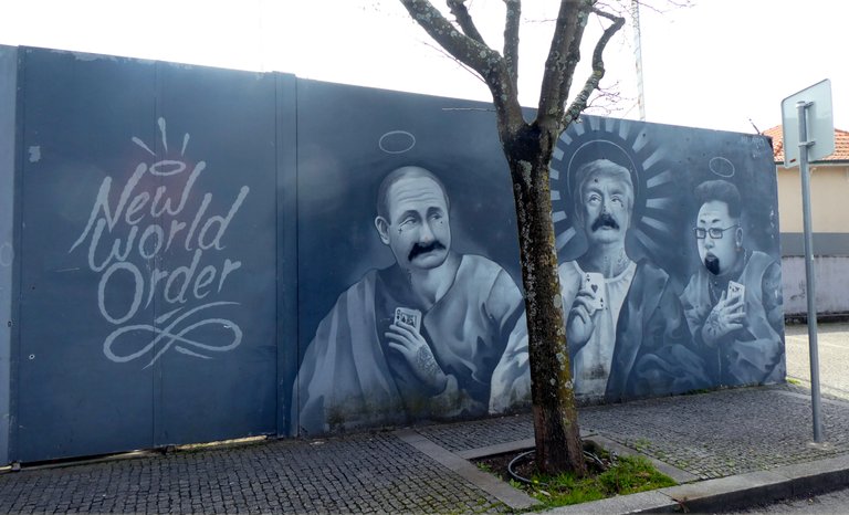
The artist behind this drawing took a few creative liberties on this work. All three of them are represented like monks or saints... definitely a way of provoking the passers-by!
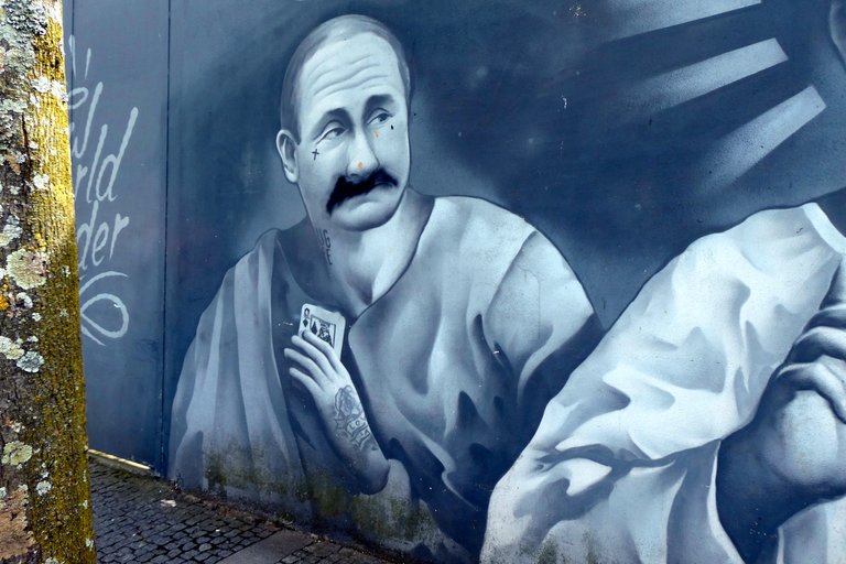
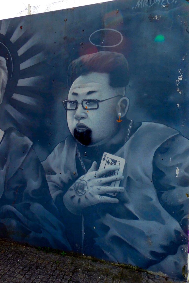
I'm not sure about their moustaches and beard. They seemed a little off. The paint and style looked different. It's very possible that wasn't part of the original piece but added by someone else later on. 🤔
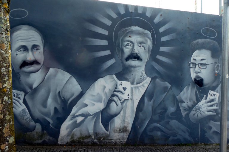
If my feeling is correct, then the artist got the intended effect: to provoke people by representing these guys as the opposites of what they are. The more I think about it... the more I'm pretty sure someone was triggered and defaced the mural. 😁
Here's a final shot of this mural, with the 3 stooges.
I hope you enjoyed this article and my photos. See you next time!
| Location | Matosinhos - Portugal |
| Camera | Panasonic Lumix DC-TZ90 |
| Photos | 28 (Edited with GIMP) |


