As a user who snuffles through the internet, one of the most satisfying things we'll most likely expect is to delve into a website, app, or interface and have a seamless connection without any form of glitch or bug popping up. However, it's understandable that while a team continuously works towards improving their interface, the chances of coming across a few bugs by users are certain, which understandably is for the greater good, but overall, when it comes to Inleo UI, I must say that I'm thrilled by the improvement thus far, although there is still room for improvement.

The Inleo team came up with their UI at a time when I was deeply in love with another interface on and the hive blockchain, and even after the launch of the INLeo UI, I still prefer that other frontend due to how comfortable I'm using it and its friendly interface, and normally I came to Inleo to check out their newly launched interface, but it wasn't too cool with what I saw, as at then you can hardly do navigating through 5 slides without encountering a bug, and that put me off.
But as time goes on, I'm pleased with the fact that the Inleo team set up a feedback tag that they usually monitor to hear from users experiences and observations about different happenings on the UI. Personally, I believe that aspect was one of the most impressive things I admire here because listening to the user usually leads to building an interface that's fashioned to the taste of the users and ultimately having a user-friendly interface that's enjoyable to all.
Unlike previous months where we experienced loads of bugs to the point where at a time I couldn't even publish a post but could publish a thread, this month of July wasn't so. Although there were a few cases when I encountered a bug, it's usually fixed within the hour or one feedback is laid to the team via thread or discord chat, and after critically thinking about my journey of using Inleo UI this month, I must be honest to say I didn't experience as many errors as I did in previous months.

Screenshot from Inleo.io
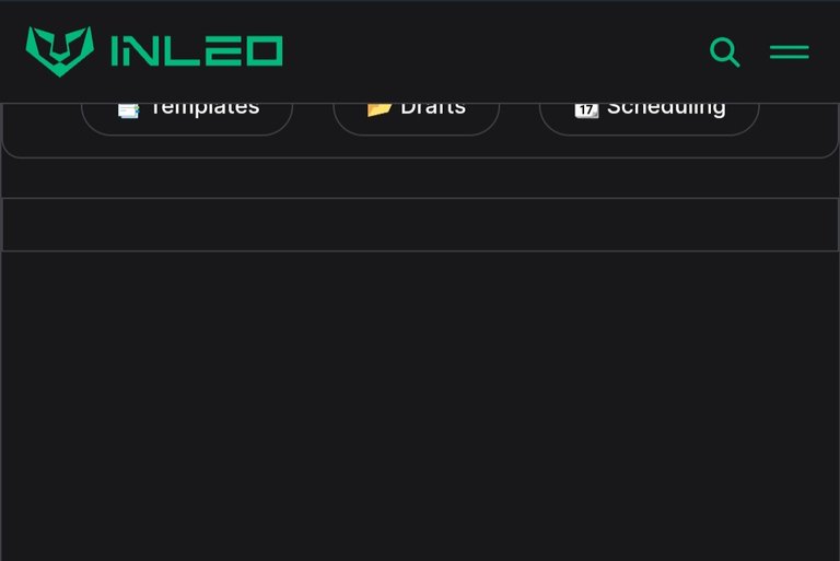
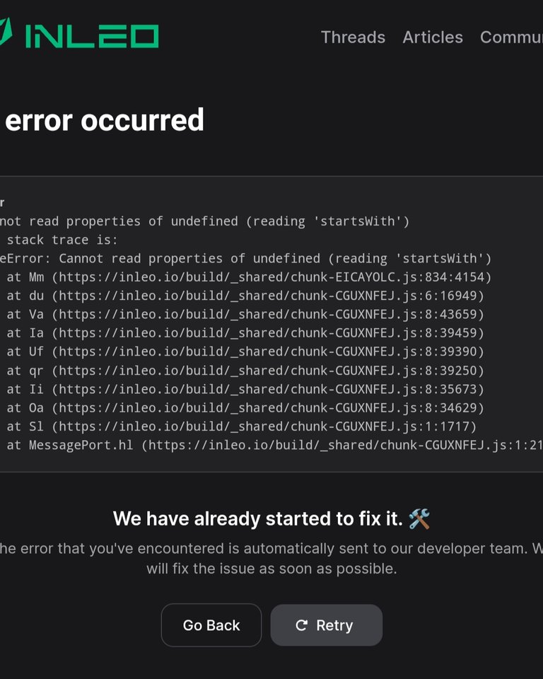
And one of the errors I encountered was regarding draft at the posting section of the interface. When I saw the draft feature, I was excited and had high hopes that now I can easily save my in-progress content on the Inleo UI draft, but that wasn't the case after I gave it a short; in fact, each time I click on the draft button, it usually just takes me to a blank page, and after a few seconds it'll pop up an error message. In a nutshell, the draft isn't accessible, and I'll love for the team to look into this and fix it so I can easily save my draft on the blockchain via Inleo rather than using other interfaces or Microsoft Word.

Screenshot from Inleo.io
On the positive aspect, I'm excited to see that the wallet segment of the INLeo UI now has columns for hive wallet and hive engine wallet; unlike initially when it was just the Leo token that could be seen and monitored there, now I can easily, via the Inleo interface, know my total hive power, liquid hive, HBD, and the like. I can also navigate to the hive engine to see all the hive engine tokens I've got in my account.
This is a wonderful improvement, and I'm saying kudos to the team for that. However, I noticed that the estimated account values shown in the hive wallet are far from being correct, and I hope the team looks into it to correct that. Also, it'll be nice to have a real-time value of each hive engine token begin stated beside them, so everyone will know the value of each token and can easily be aware when a token pumps or dips.
Overall, I'm pleased with the improvement thus far on the Inleo UI and hope to see more improvements going forward, so the interface will be user-friendly and free of regular bugs and error messages. That's about it on my feedback of the Inleo UI this month of July.
First Thumbnails designed and edited on canva.
Posted Using InLeo Alpha