How To Be Successful On Hive

in #hive-1893063 years ago

Untitled.png

Do you constantly struggle with your growth on hive? You probably have been here for a few months, or one, two years, and you still don’t attract a lot of upvotes or the big curators. It’s discouraging I know, that’s why I’m here to help you today. I do have the keys to being a successful blogger on hive, this is all the self-help you need because I know it all.

Okay scratch that, I’m just kidding. I don’t know it all and you’ve probably read over and over how to get the big guns to upvote your blog posts. I’m only here to share my experience and what I’ve read from others that I think are useful for making your blog look good, good enough to have people interested to leave an upvote.

I hope you pick at least one thing that might be of help. I don’t exactly have a list or remember from who and who I read all these, but they’ve stuck with me so I’m just going to spill it as it comes.

Your titles are too long

I got to know of this one early enough and it did make a lot of sense to me. As a reader, I am completely turned off by long titles so why would I expect others to check out my post with long ass titles?

Your title should go straight to the point or be something catchy that immediately grabs attention. I remember reading from this author that 7-8 words max is ideal for a good title. I try to keep mine to around 5-8 but I sometimes make exceptions if I think the title can still grab attention.

There’s also the issue of including the translated version of your title right there in the heading. This makes the title unnecessarily long. I read about this one only recently and I totally agree how unattractive that can be. I used to do this initially when I’d have a bilingual post but then I had to stop because the long title didn’t sit well with me.

I learned that simply indicating that it’s bilingual e.g ESP/ENG, is just enough instead of writing the whole translated version in the title heading.

Too many dividers/footers

This is one that personally pisses me off. I find it so distracting because do you really need all that to make your post look good? I understand how a cluttered post is unflattering so dividers help make it all organised, but putting dividers after every paragraph is not cool. I find it exhausting and I quickly exit the post after a few lines. This applies to a very long footer also, some people use as much as five footers!

I thought I was being too critical about it but then a few days ago I came across a tweet by AcidyO talking about how using too many footers on your post makes it harder for curators to reach the upvote button. It was hilarious but I see how that can be true especially if you’re upcoming and haven’t found your ground yet.

Why do you have your life history in your footer and trying to show us all of your design skills? I’m sorry but I really would forget to give you my ginormous 2 cents after reading your post because you have me distracted by the damn footers. I personally think easy does it, one footer is enough or maybe two if you really want to be a footer maximalist.

Trying to sound like someone else

Originality is priceless and it’s way easier to do. It’s awesome to learn from other hivers and take a cue from them but you don’t have to be them. Do you because if you do otherwise, it’s noticeable. Some people might even be able to tell who you’re trying to sound like at a glance. I’d appreciate whatever personal opinion you have in your own style of writing rather than a copycat version.

Do not ramble too much

Well, I do ramble sometimes because that’s simply me but I try to keep it concise and still drive a point. I have learned that your first paragraph should convey what your message is about, just as we learned back in school.

You should be able to pass your message in a number of paragraphs and there’s no need to trail off-topic over and over just so you can lengthen the post. You know that saying, it’s not how far but how well, or something like that.

These are the few pointers that come to mind right now and I would probably do more of these subsequently. I would love to know what you think about these points and it’s okay to disagree with me.

Cover Image - Pexels


Discord - wolfofnostreet#4939

Twitter - wolfofnostreet_
Sort:  

Really helpful and insightful,thanks for sharing.
I learnt a thing or two already.

Awesome

Why do you have your life history in your footer and trying to show us all of your design skills?

I thought it was just me cause I seriously have a problem with the fact that I have to read ones life history over and over again in Every post...

Even worst when the life history is longer than the post itself

SIGH

Well what do I know 🧐

Even worst when the life history is longer than the post itself

Omg...I hate that 😅

Lol

This is an eye opener. Thank you so much!

Thanks for reading

You're welcome

As insightful as this post is
It’s comical too
Heheheheheh

You’ve made valid points, and the last one should be on a billboard lol.
If I read the first paragraph and it’s lengthy and complicated, I’d just upvote and leave. Life shouldn’t be that hard.

Life shouldn’t be that hard.

Exactly 😂

Helpful content. Thanks for sharing your knowledge

Thank you for sharing your knowledge, I will put it into practice. 😉

Ģreat!

Thank you 🤗👌🍷 it was good to read this info.

This has been simple and easy!
I agree with you, sometimes I get to see posts that include a lot of mumbling or either a millions pictures as signature and that kinda takes your attention away... I'm a lot more into posts that are text and sometimes I see that either pictures or videos seem to be a lot more appealing, so I'm still having some hard time trying to balance those two things...
Great tips, will take them into account! Specially the one about the titles!! Hahaha

Happy you found it simple and straight to the point. I think one signature is enough, anything more than that is a clutter and doesn't look presentable. Thanks for commenting!

Hi, I just made my post and well, I wish I had come across this post sooner hahaha. The title was very long and when I copy the link to leave it in the message it looks very ugly, because it is outside the title I chose for my post. Thank you very much for your contribution, I will keep it in mind.

Hola, acabo de hacer mi publicación y pues, ojala me hubiese topado con este post antes jajaja. El título me quedó muy largo y cuando copio el enlace para dejarlo en el mensaje se ve muy feo, porque queda fuera el título que elegí para mi publicación. Mil gracias por tu aporte, lo tendré presente.

I tend to agree with all of this, but at the same time I’m definitely a repeat offender on the Too Many Footers point. I use the footer to put links for my own reference, since the Ecency app still doesn’t support pinning a post in my blog. There’s more in there than that though, that’s just one part. I respect @acidyo as a level headed individual with good content and a fair perspective too, so that doesn’t hurt.

I’m going to try to cut down my signature a bit thanks to this article.

Do you use ecency only?

Pretty much. I’ve looked through I think Steem from end before, but I do everything from my phone, and Ecency has been good for that.

Actually, come to think of it, I think I used Steem to pin the Albus Index at the the top of my blog, since it’s supported there. It’s strange to me, the Ecency web app let me pin, but it doesn’t show up as pinned in the mobile app.

I track literally every single post I make in that index, so I can reference things quickly and share the full breadth of my work at will, I sure do wish the @ecency mobile app supported this feature. I’ve asked a few times, they say it’s coming. So for now I’m being patient and using the signature in whatever is my latest post as a quick access to the index.

It should be working on mobile app already. From what I see, you don't have anything pinned on your profile.

I reposted the index and was able to pin it. Thank you so much for all the hard work you do - @ecency is the best!

Holy smokes, thank you for this response!

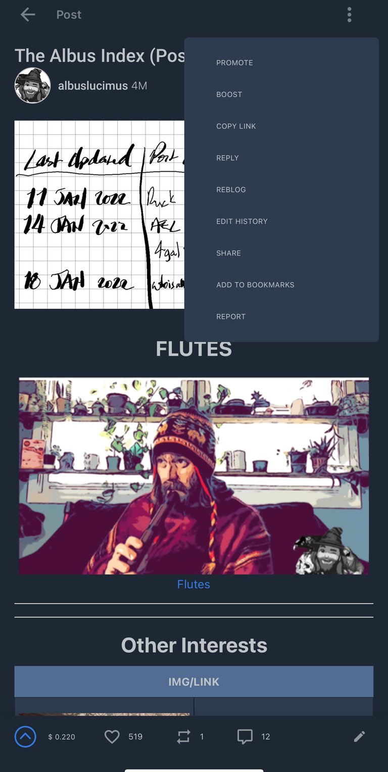
I checked the menu on my latest post and saw that this is possible. Then I figured, this feature must be new! So I went to my index post that I want to pin, but the option isn’t there:

img_0553.png

…is this not available for posts that went up before the update was made?

Loading...

…and here’s the new one. I must admit, I like this a lot better.
Thanks for the words of wisdom!


Thanks for checking out some more of my work! As always, I hope you enjoyed witnessing as much as I enjoyed creating!

© Photos and words by @albuslucimus, except where otherwise indicated.


img_4821.png


If you enjoy my content, check out the Albus Index!

Here you’ll find links to various post-groupings, so you can find all posts related to a specific topic quickly. Topics include lists of brewing recipes, different flutes, rucking posts and an index of all acoustic covers. The lists are updated as new content is added, so they can always be used to quickly navigate my content.


Yes! This is wayyy better. There are no repetitions unlike the previous one and you still pass the message. I'm glad you understood my point.

Thank you for visiting my blog.

Thanks! I did keep the separator bars, but I don’t tend to use them as often in the body of the post.

I always like seeing advice posts like this from people with more experience here. Learning from those who were here before us definitely makes us stronger, o I appreciate you taking the time to do that :)


The rewards earned on this comment will go directly to the person sharing the post on Twitter as long as they are registered with @poshtoken. Sign up at https://hiveposh.com.

Thanks for sharing the experiences that you have. I really needed it ;)

You're welcome. I appreciate you reading through.

This is very informative and educating. Consistency and interaction in the Hive community, will guide and educate one. Aside being rewarded for post. One tend to learn a lot.