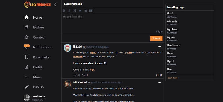
The new Leofinance user interface, which puts #Threads at the center of everything, was finally given to us by @khaleelkazi and the rest of the team working on the @leofinance ecosystem as a gift of love for Leofinance users and the potential onboardees that would soon be trooping into the Leofinance ecosystem.
Let's continue discussing the new user interface, shall we?
It is a Twitter knockoff, that's for sure! But it is more!

Although others may disagree, I think that is what makes the new user interface so beautiful. To begin, nothing is actually new anymore; rather, every product takes a feature or two from one of its rivals or from one that is already successful enough to make it to the forefront of the market (we all copy successes). Thus, imitation is a natural and necessary component of living, learning, and growing.
But the new user interface is more than just a blatant replica of Twitter; rather, it is an effort to provide everyone with a user interface that is recognizable to them, as well as a very familiar user experience. Users of Twitter that are opting for the censorship-free experience Leofinance offers will not have the impression that they are experimenting with something new because they will simply be able to transition into the new Threads without any difficulty. As a result, all I can say in response is that the new approach with the threads is that it is ingenious and very much appreciated!
What becomes of the Long-form content?
Long-form content are going to continue to be the weapon that Leofinance uses to establish one of the most powerful crypto and finance-based communities on the internet, and this is not going to change any time soon.
You should be prepared for a few tweaks here and there before the new UI exits the alpha stage, particularly one or two ways to present long-form content more on the front or integrate it somehow into the new UI (that's if both would coexist in a single URL). Although short-form content appears to be the way to go, the choice of long-form content would be one significant differentiator of the new Leofinance from the rest of the pack including Twitter and others. Long-form content continue to be the bread and butter of Leofinance.
Remember Leomobile? The new user interface is exactly what it required all along.
It is not surprising that the Leomobile app did not turn out to be the game-changing product that was anticipated because it appears to be over-engineered to the point that it gave a significantly different user experience than merely utilizing the Leofinance website from the browser. But with the new user interface that Leofinance has implemented, Leomobile might be brought back to life with very little effort.
In order to accomplish this, we could once more take cues from Twitter. There is a Twitter Lite app, which is essentially just a redesigned version of the website's mobile layout with only push notifications added. Twitter offers this app on the PlayStore and must user's prefer it over the full-fledged app.
Therefore, @leofinance team, just as has been suggested earlier is expected to follow the same route. In fact, the last time I questioned about the development of the LeoFinance mobile app, I was given comments that was very similar to what is being describing here.
For most of us, we cannot wait till the next update to the app, which will put Leofinance in the hands of even more individuals (y'all will be surprised as to how much difference it actually makes).
—-
The new user interface is undeniably revolutionary; it delivers an exceptionally one-of-a-kind user experience (UX), and I am convinced that it will be a significant tool in accomplishing the goal of 5,000 MAUs and even more. I will proceed with testing the new user interface for Leofinance and provide updates regarding it. As a quality assurance engineer in training, my goal would be to apply the knowledge and skills I have acquired to provide quality input that would help elevate the new Leofinance product from tier B to tier A status. I would want to express my gratitude to the hard-working crew that was responsible for this. This is definitely a step in the right direction.
Posted Using LeoFinance Beta