After a meeting with @steddyman last Saturday, I concluded that 'Tales of the Urban Explorer' was ready to go LIVE. A 'Bacon and Eggs' breakfast is a Saturday pastime we occasionally indulge in while talking some serious 'geek-chat'.
But was it really ready?
It might have looked OK on a desktop but I was no longer living under the shelter of a fancy WebBuilder app, a framework which would include code for re-sizing content to look great on a phone or a pad.
...the day after...
“Use a simulator”, @steddyman advised me, using the Chrome Developer tools. I use Brave but F12 takes you into the same mode and to my dismay it looked like something from a horror show.
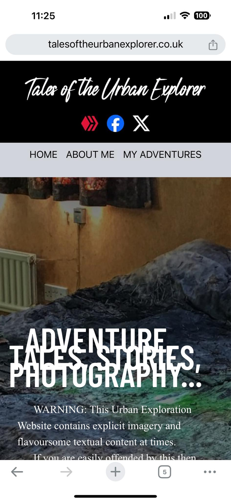
…’some screens were totally unreadable, while others needed some tinkering like this one’…
For fuck sake, now I have to re-code it all for mobile devices as well as 4k desktop screens (which I am sure many potential viewers don't have). What a ball-ache this was proving to be.
Having purchased a lease of 'talesoftheurbanexplorer.co.uk' for two years as it was half the price of '.com', uploading the files utilising FTP to a free web space provider, adding an SSL certificate and seeing it LIVE, I was committed to spending Sunday on fixing this shit show.
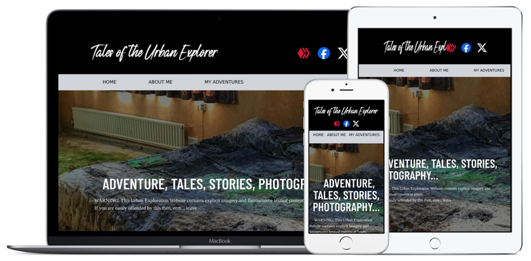
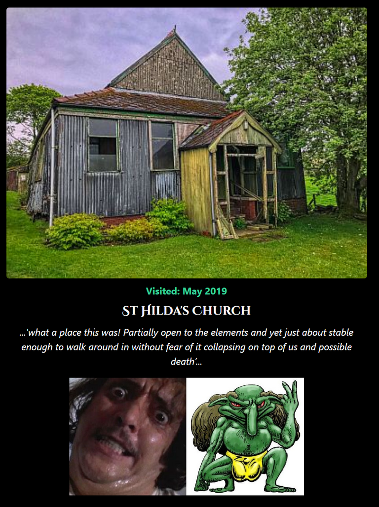
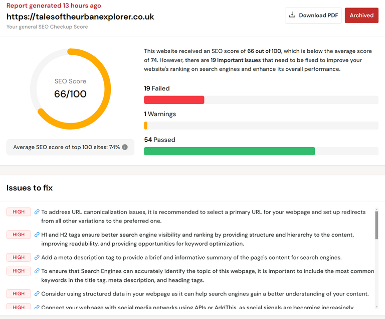
The result is the cover (above)screen, and below is what an SEO site thinks of it. They do generate a nice looking image on all three types of screens, I have to give them that.
Source
'this is wrong, that is wrong, pay us loads of money and we will have your site looming toward the top of the Google search ranks'
I want to spend 'minimal' money, and the £8.80 for 2 years of domain rental is as far as it goes. This is website building on the CHEAP, in terms of financial outlay, but not so on your personal labour.
    <div class="bg-black p-2 text-white text-center rounded-lg">
        <a href="https://peakd.com/hive-104387/@slobberchops/tales-of-the-urban-explorer-seacroft-hospital" target="_blank">
            <img src="./images/locations/asylums/SML-SeacroftHospital.jpg" alt="Seacroft Hospital" class="w-full h-[300px] object-cover rounded">
        </a>
        <p class="text-green-400 font-bold mt-2">Visited: October 2021</p>

        <div class="cinzel-decorative-bold">
            <p class="text-xl mt-2">Seacroft Hospital</p>
        </div>

        <p class="mt-2 italic">...'"you're like a bloody cat burglar", exclaimed @goblinknackers watching me struggling to get through a window that was not exactly easy. If anything, I have become slightly more adept at ‘burglary’ without the burgling’...</p>
        <div class="flex ml-16 mr-16 mb-8 mt-4 px-10">
            <img src="./images/avatars/slobberchops-goblinknackers.jpg" alt="Icon" class="w-[150px] h-[75px]">
        </div>
    </div>
In fact, it's extremely demanding. While I can add a quartet of explores to the 'Education' section in a short space of time, it's the design tweaks to the Phone, Pad and Desktop experience that eats into your time.
For now, the Pad experience has taken a back seat, and as you can see from the SEO shot above, the HIVE logo sits on top of the end of 'Explores' and is not optimal.
It’s yet another tweak I have to make and HTML (with Tailwind) is getting more like regular coding as it gets more mature. Take this within the ‘about.html’ file that removes the dashes from the Phone experience but retains them for the Desktop one.
<div class="bg-sky-900 py-8 px-4 text-white">
    <div class="max-w-7xl mx-auto text-center">
        (html comment removed:  Larger heading for desktops )
        <h2 class="hidden sm:block barlow-condensed-semibold text-4xl lg:text-5xl mb-4">------ ABOUT ME ------</h2>
        (html comment removed:  Smaller heading for phones )
        <h2 class="sm:hidden barlow-condensed-semibold text-2xl mb-4">ABOUT ME</h2>
        <hr class="border-white w-64 mx-auto mb-0 md:mb-8 block md:hidden"> (html comment removed:  Horizontal line for mobile )
    </div>
Soon there's going to be 'if' statements, and I would welcome them!
I can understand why many people opt for the lazy-arse solution of using Site Builders with add-ons such as Elementor.
…’but I am never going to learn a thing if all the juicy code is hidden from me?’…
SEO..., it costs to be seen, and according to @steddyman, 'nobody will look at your website unless you send them a direct link'
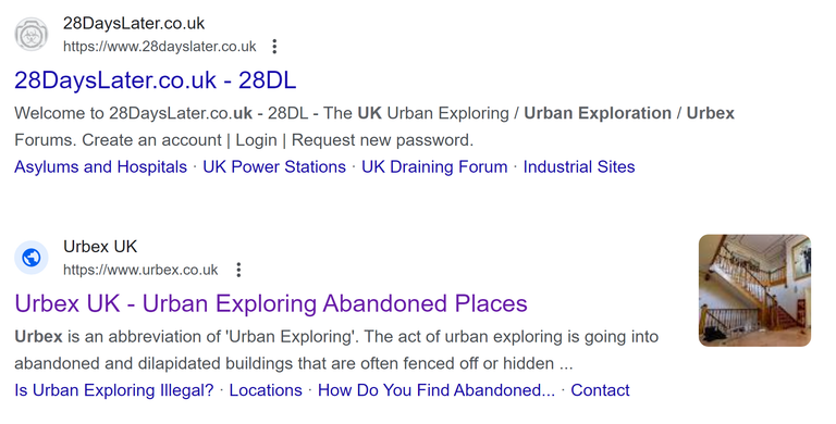
Well, isn’t that depressing? I fired up Google and entered the keywords, ‘Urbex UK' which I figured could be a common use, this is what I found.
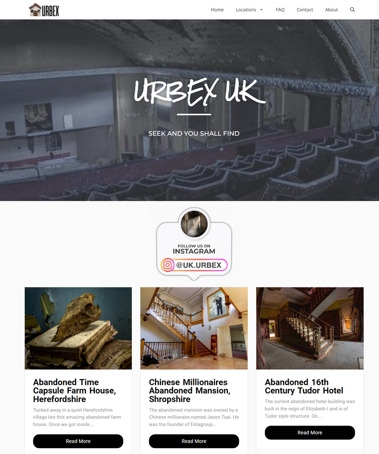
Apart from the dreariest website ever, that being ‘https://www.28dayslater.co.uk/', I was intrigued to find the second slot belongs to another explorer with a similar site (and better looking) to mine.
How did he get so far up the Google rankings?
The domain name is short and sweet, and the presentation looks good, but his footnotes lack profanity and satire. Surely it's better to have a caption containing the words, 'vagina, breasts, dildos and drugs', than 'Tucked away in the Zzzzzzz'...
I looked at his code, out of interest and that told me a lot. It’s a WordPress site (another SiteBuilder) and uses the Elementor add-on which I used for the original ‘Tales’ site in 2021.
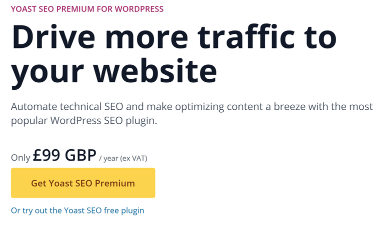
He’s also using Yoast to boost his SEO. While it takes him high for specific searches, it’s also £99 a year to use it, fuck that!
@steddyman criticized my adding of 'stupid faces' to each of my explores. These donate who attended each outing..., though it may not be obvious if the reader does not ingest the 'about.html' page first.

...and who is that madman?...
HIVE readers know, but everyone else does not. It’s yet another issue I need to fix.
This is never going to earn me money, it's never going to be a revenue generator, ads are not going to be part of the finished product and it's likely never going to be far up the Google ranks, despite my using Analytics and Google Search Console to index the sitemap and establish all the indexing.
The amount of shit you have to learn is staggering and I secretly love it, despite all the moaning you read about here. This time, I am fixed with 2 years of a website, that’s already been paid for and won’t financially cost me anymore.
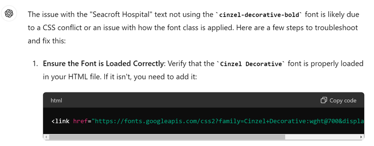
I suggested to @steddyman that I have not learned much as ChatGPT has given me much of the code. He rejected this idea and asked me if I was aware of the Tailwind CSS classes.
‘Of course I am, I use them all the time and tweak the sometimes dodgy pseudo-code that Chat feeds me’, I responded.
Yes, I have learned a shitload about Tailwind CSS. He was right to contradict my assessment.
Visitor numbers surprisingly are low, and that's to be expected from a new website that is not optimised properly, and indexed correctly, but this time I am in no rush and the site will remain online and active.
Please give it a whirl at ‘Tales of the Urban Explorer.

Do you like posting your Urbex content and photography for FREE on Facebook and YouTube? I like to get some form of reward for my work and every time I create I do just that. Take a look at The Urbex Community on HIVE.
If you want to keep creating for FREE then ignore what you are reading. If you want to be like me and gain something other than BUGGER ALL for your work then click here and learn about posting on the HIVE blockchain.
My Urban Exploration Tales can be found directly on the internet via my Website 'Tales of the Urban Explorer'.


If you found this article so invigorating that you are now a positively googly-eyed, drooling lunatic with dripping saliva or even if you liked it just a bit, then please upvote, comment, rehive, engage me or all of these things.
